7 Best Lessons on Web Page Design That Apple Can Teach Us
6People have a habit of holding Apple up as an example of business and technological excellence, and for good reason. Apple has gone from being the cult choice to being the No. 1 option for handheld devices, from smartphones to tablets. Now it has even re-emerged as a major contender for laptops, thanks to its PowerBook line.

But one element of Apple’s success that people tend to overlook is what it has done for graphic design. There has been a rather specific tone set and maintained consistently by the new and improved Apple of the last decade. Through this image, you can learn a great deal about effective presentation and marketing through design.
Whether it is the look of its main site, its iOS interface or the now-classic design of its iTunes store, here are seven lessons that we can learn and utilize in our own graphic design projects in the future. I guarantee they will be amazingly applicable for any commission.
Lesson No. 1: Always Keep It Simple

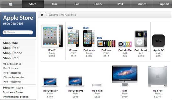
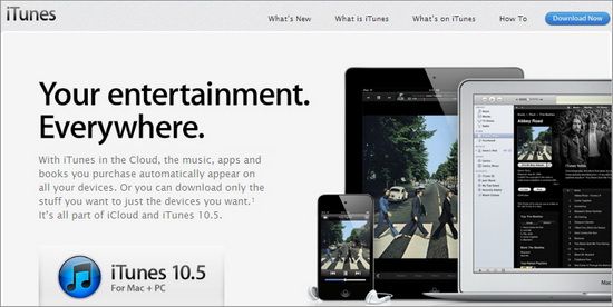
Apple never overstates its designs. It keeps things ultra simple and very clean, taking advantage of solid backgrounds on white or black, in order to better contrast the sleek look of its machines. Most websites or ads will have the solid color background with a product shot of one or several of its products. The screens will be turned on, showing off the graphics effectively.
It always looks modern, almost futuristic, and beautiful. Even the descriptions and categories use a quiet font and take up an appropriate amount of space. Nothing looks cluttered.
Lesson No. 2: Spend the Time Finessing for Better Results

Every single page in Apple’s site looks amazing. It is perfectly crafted and consistent, and nothing is out of place. You rarely (if ever) come across a broken link or a glitch that makes it appear out of line. Everything is in its place, with interesting logos that have obviously been created with the utmost care. In fact, I would go so far as to say the interface used in each Apple design is very carefully planned and launched.
Too often we skip out on doing the very best out of laziness, lack of time or lack of necessity. But Apple has shown us that there is a benefit to putting the time in to finesse the design for the best possible results. Does it have to? No, it would be fine with just making things look good. Instead, Apple goes the extra mile to make it look incredible.
Lesson No. 3: Avoid Flash
Nothing from Apple uses Flash. In the past, many people have seen this as a con and complained that it limits usability. But the fact is, Flash is glitchy and buggy and is always crashing. It is worse for mobile clients and browsers that have Flash as an add-on. Adobe has never bothered to fix the problem, nor even seemed to care that it was there.
Further proving this (as well as Apple’s point about avoiding it), Adobe announced recently that it is ending all development for mobile web applications. That seems to be the next step in the demise of the product. Because, let’s face it, everything is becoming mobile these days.
Lesson No. 4: Utilize Grids for Clean Layouts
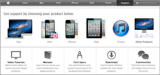
One of the best things you can do for a website design is use a basic grid system for the layout. It creates clean, simple columns that can hold a ton of information without appearing cluttered or running into the next section of the page. It looks good, is functional and makes it efficient to build a page on a boilerplate.
Apple pages use this a lot. They have the top categories in the border along with drop-down menus at the top of the screen. Then, everything else is put into side-by-side columns with a header. Finally, there is a breakdown beneath with a different link and a picture – elegant and informative.
Lesson No. 5: Maintain, Maintain, Maintain
Always keep up with regular site maintenance. That means regular usability testing, checking for broken links, looking for alignment issues with text and categories, updating information and keeping up with any social media associated with the account.
Apple has whole departments dedicated to this purpose, and you should be able to build your own, smaller-scale version of that. Get someone to keep up with social media profiles and blogs. Have someone else regularly go through the site to check for errors.
Lesson No. 6: Make Interaction a Core Focus

Apple has learned that interaction with consumers is crucial. Not only does Apple make it very easy for users to contact it, but it makes it easy for them to interact with each other. This dialogue has become a central focus of its design themes. Users can contact each other, the company and important people within departments and seek specific information.
Apple suggests in its helpful Web Design Guidethat web owners also allow for contact with well-known people, such as celebrities. It is an easy way to create interest in a site, which Twitter has proven very effectively.
Lesson No. 7: Always Cater to the User Experience

Finally, you should always remember for whom you are designing your site. It isn’t for the company or the site itself. It isn’t for you. It is for the user, who will want to enjoy his or her time spent there. Your design should aim to be helpful, easy to navigate and all-inclusive. Anything that can make things easier for the user should be utilized to the best of your ability.
Conclusion
Apple can teach us a lot about graphic design. What are some of the lessons you have learned about website creation from the technological megagiant? Let us know in the comments.


…and make sure you use QT, as it belongs to Apple.
I disagree with “Lesson No. 3: Avoid Flash” just because Apple refuses to support flash on there products does not mean it is a bad product, Flash does have a lot of uses and always will until HTML5 can replace the functionality of Flash
Very valid points bought across in this post of which i do agree with. Apple’s website seemed to be the main focus point of this post and i thought i would just point out some other very nice examples of clean fresh design that apple have bought through. Their UI Designs iPhone/iPad UI is very clean and well mapped out icons they also have a great attention to detail especially within their icon sets they design.
This is one spectrum of graphic design the simplistic clean feel but i do agree their site is definitely great inspiration to many a web designer.
Thanks for the post.
I still agree with your point of view, but after the recent Adobe updates to stop Flash production on mobile browsers. I believe it is good idea to switch to HTML 5 in smile animation usage. But flash is still the best for high interactivity sites, cartoon animation and other interactive elearning projects.
Some thought provoking tips mentioned by Sonia. Though would have liked if Apple had done something by making Flash run on their products.
I agree with you