5 UX Elements You Shouldn’t Ignore When Designing a Mobile App
0They say it is better not to have a mobile app than to have one which functions poorly and has a cluttered screen layout. But given the rising popularity of apps across sectors, it is difficult for businesses not to interact with their target consumers on mobile.
Google states 82% of users prefer using mobile apps to mobile sites. That is because apps offer essential information without annoying pop-ups, CTAs, and excessive scrolling. And, if designed well, mobile apps can ensure impeccable user experience.

So, which UX elements should you remember when designing an app for your business? In this article, we have listed the top five points to remember:
1. User onboarding
It is unfair to assume that once consumers download your mobile app, they will get instantly hooked to it. According to a Google study, 29% of users immediately abandon an app if they don’t find it valuable. An interactive onboarding experience can bring this number down.
Comprising a series of flash screens guiding across the app’s interface, user onboarding is a type of walkthrough tutorial which enables consumers to comprehend the app and its functions.
Many a time, they are unable to familiarize with the mobile app features. Onboarding not only explains what the app does and how consumers can interact with it but also directs them to take any action on it (say, check out a feature or sign up).
Avoid making the onboarding process tediously long and text-heavy. Keep it compact and use app screenshots and illustrations to showcase the app benefits. Introduce one feature on each screen for faster comprehension.
For instance, if you are designing an eCommerce app, you can guide the consumers through the product categories you sell in the tutorial and enable the sign-up or login option once onboarding is complete.
That instantly improves first-time user interaction and increases app retention as they know how to get started and effectively leverage the app features for their excellent.
If you are a bit clueless about the process, use Toonimo, WalkMe, or any WalkMe alternatives for efficient onboarding. Such tools will help you create and update all the user onboarding and training materials quickly and efficiently.
Please also don’t forget to track or analyze where you need to improve your onboarding to provide a seamless experience.
2. Empty states
Empty states denote the screens on which no content is to be shown as yet. This happens in situations such as the zero-data state and first-use state. For instance, searching your inbox for a specific contact or subject line and getting no results, as shown below:
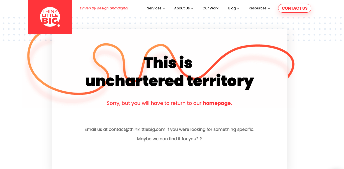
 The 404 Error on websites is also a classic example of an empty state. Think Little Big Marketing has a simple but attractive way to let visitors know they have arrived at the wrong destination. Imagine staring at a blank screen instead? That is boring!
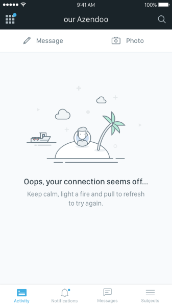
Empty states encourage designers to use free space for better user engagement by using creative illustrations. The same logic can also be applied to mobile apps. Azendoo, a work management platform, has a funny but helpful error message. You can’t help but smile on reading it, and the pain of not arriving at the right page also reduces.
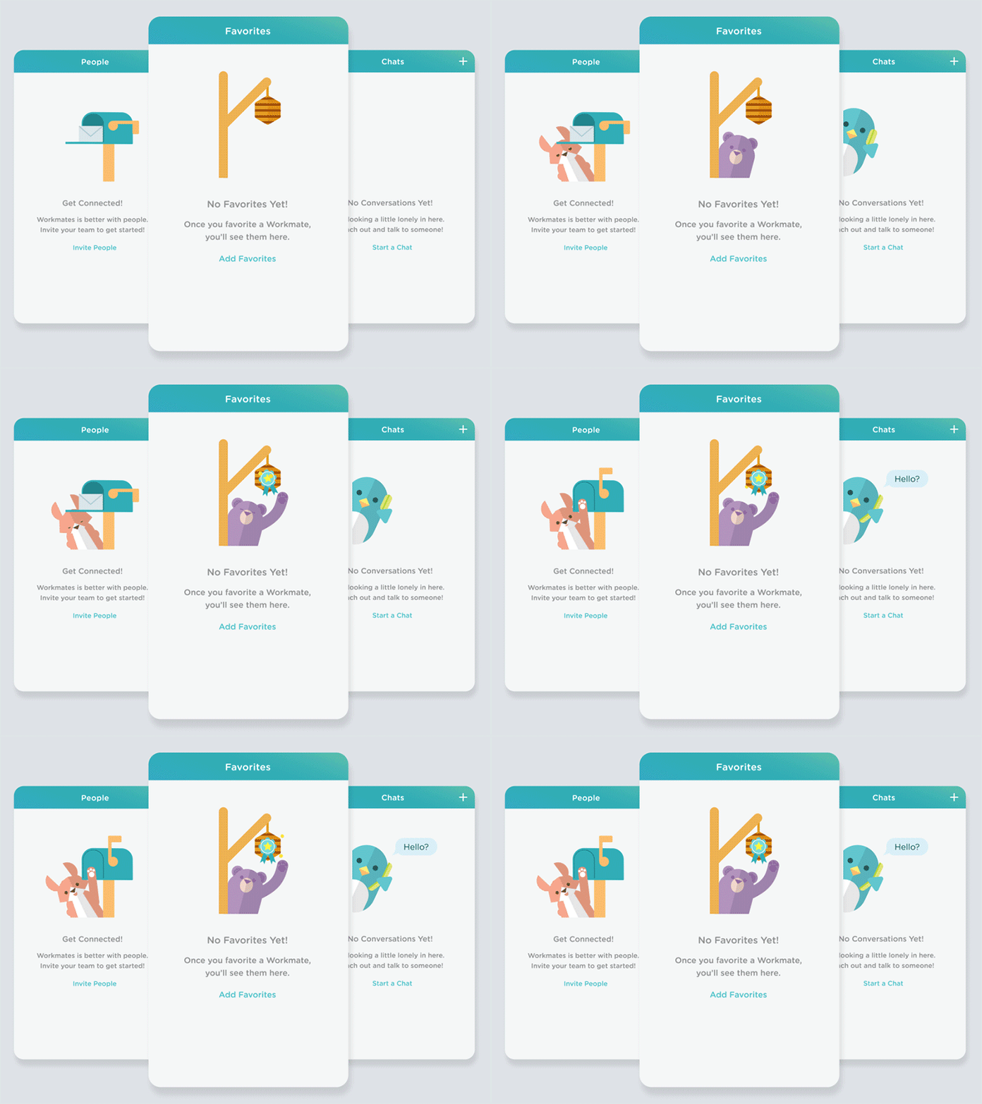
Similarly, Workmates has incorporated animals to greet the user at individual sections with cute hi’s and hellos. This gives you a chance to introduce your brand elements and leverage positive emotions to make the user experience memorable.
Even though only 2%-5% of consumers notice an empty state, blank screens confuse and disappoint, leading to higher bounce rates and abandonment ratios.
When this space is used creatively, it ensures a compelling user experience. Consumers have something to look forward to even when they can’t find what they need on the app. You can add a surprise factor and delight and engage your users.
UX designers indeed have many opportunities to create meaningful experiences for mobile app users. An empty state is one of them!
3. Minimize data input
Imagine if you have downloaded an app, but you have to input a lot of information to register and use it. That will hamper your experience, and you might even uninstall the app. It is simple – the more data a consumer has to enter into a mobile app, the more likely they will abandon it.
Filling out a contact form with 4-5 fields is not a big deal on the desktop. But on mobile, you want to make your target consumers work less hard. Therefore, please make sure that every single field in the form being filled out is necessary. Eliminate irrelevant fields.
To make things easier, you can even give the option of using any of their existing accounts (on Google, Facebook, or LinkedIn) to sign up or register. All the consumer has to do is authorize access, and they are set. This is much easier than creating a profile from scratch.
Adobe Lightroom instantly hooks the users as soon as they land on the first screen of the app. The photo editing app gives three options to proceed, presented in clear and short explanations.

You can either sign up by giving your email address and password or authorize access to either your Facebook or Gmail account.
However, you can’t always rely on external apps for consumers to sign up on your app. They might be distrustful of linking their accounts. Therefore, the most efficient way is to design the sign-up form concisely.
4. Loading elements
Given that internet speeds are not always guaranteed, you can’t make consumers wait for images or content to load on the app. It would help if you filled the gap owing to the loading time to ensure superior user experience.
Sure, adding a loading spinner will help, but they are often perceived as annoying as the users do not indicate progress or time until the screen will be fully loaded. Therefore, make the loading time seem more natural – use progress bars.
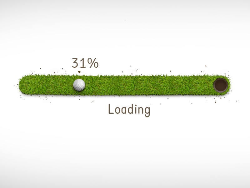
This will not only alleviate the pain of waiting but also highlight the current progress on the app. You can even disguise small delays in your progress bars by moving it instantly in the beginning and then showcasing a steady pace towards the end.
Another way to soothe impatient users is to use placeholders until the screen fully loads. Facebook’s gray placeholder is an excellent example. It uses a template of the actual screen when the content loading is to familiarize the consumer with what they can expect once the loading time is complete.

When images on a Medium post take time to load, the online publishing platform blurs the image using its predominant color. This signals the consumers that something is coming with the content, and they should stick to the page if they want to view it.

5. Micro-interactions
On-off slides, pull-to-refresh, swiping up – take any mobile app, and you must have indulged these and more. Such popular but small interactions may seem trivial on a mobile app. However, they have a significant impact on user engagement.
Defined as small responses and behaviors, micro-interactions on the app dictate how the consumers should use the UI. This involves three significant steps:
a. Action
The user does something like flick, tap and hold, swipe, or slide. They are not physical switches, but they appear so! That is the power of animation.
b. Reaction
Swiping a screen to move back in the browser history or tapping an ON/OFF slider is based on the user’s action.
c. Feedback
This is typically what the user sees as a result of the interaction. For example, the ON/OFF slider might grow larger when pressure is applied to the mobile screen. Or the color of an icon might change on getting clicked. This is the feedback received to the app when a user interacts.
Some popular examples of micro-interactions include:
a. Swipe
It eliminates tapping and does not force the user to do a lot of hard work. Swipe makes it easy to switch between tabs and access information smoothly. Swiping up on Instagram is very popular. You must have tried it too.
b. Animations
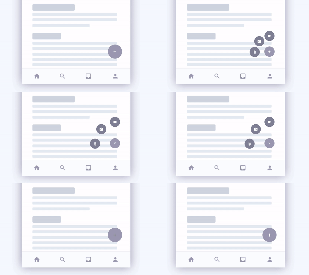
Such innovations can make the simplest of processes addictive and exciting. Check out below how a click of a button can showcase so many (hidden) options for the user.
The user might not be looking for it. But the abundance of options triggers them to stay longer on the app and engage.
c. Calls-to-action (CTAs)
CTAs, if done right, can ensure an action out of the users quickly. In fact, they are known to nudge them to interact with the app or content. They also instill a feeling of achievement apart from enticing user interest.
Such small actions breathe life into the interface and offer a realistic feeling to the flat mobile interface. Your micro-interactions must be simple, engaging, and include animation. This will ensure they are used every day and do not drive the consumers away.
Wrapping it up
The goal of using a mobile app is probably different than accessing a desktop site. For example, the user of a restaurant app will most likely view the menu, make a reservation, call the place, or get directions.
They won’t look up the business’ full history on their mobile – the type of content hidden in menus or submenus. Therefore, think through how the consumer would prefer using the mobile app. Your end goal should be to simplify the experience, not make it tedious.
What other UX elements would you want in your mobile app? Do let us know in the comments below.

