Elements of a Well-designed Website
4
The internet is a very crowded place. It houses tons of information stored in various locations across the globe. This information is actually provided by the web’s basic element: the website.
Before continuing reading this post did you already join our Twitter and subscribe to our RSS feed? If not, rush and join us now to receive updates of new posts and free resources.
Given the huge number of live websites present today, it is definitely hard to tell which site is perfectly designed and which is not. However, despite the vast array of these sites, reliable and well developed criteria can be used to gauge websites’ design elements. Based on these criteria, you can then rate the overall design, presentation, and effectiveness of the website.
Good and bad design elements

Image by shutterstock
It is often said that “beauty is in the eye of the beholder”; but, design is not about beauty. It is far more than the eye can see and perceive. It is an expression and even more than that. This is basically the reason why some designs are favored and appreciated by some but despised and criticized by others. In web design though, web elements matter. They can definitely make or break your site.
Website elements are basically useful tools. They are conceptualized and built to serve certain purposes. These could simply include enhancing the look and feel of the site, inducing dynamism, providing interactivity among users, optimizing performance, providing intelligent navigation, promoting good online experience, and a lot more.
In order to understand how website elements affect the overall website design, we should familiarize ourselves with the different elements of a website and why we need to include or integrate them to our websites.
A closer look at website elements
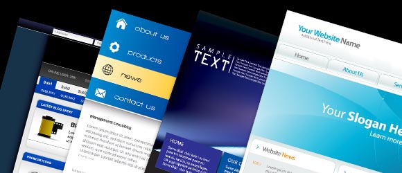
Image by shutterstock
Basically, there are so many elements involved in designing a website. These elements can fall into common design categories like navigation, functionality, aesthetics, dynamism, and SEO. However, for the purpose of this article, we will solely explore each particular category with their significant design element to establish conceptual design framework.
Navigation
Every site has to always provide a means of easily browsing through the site contents. This is globally known as site navigation tools. This tool or element can be built dynamically using a piece of program code. It can also be setup logically by manually defining the navigation menu links using predefined site keywords. In same manner, it can also be made categorically by using carefully chosen category or taxonomy words in the menu links.
However, no matter how this navigation element is setup, it is the role of the design to present the navigation tool in an eye-catching and non-obtrusive manner. Common ways of creating the navigation links in modern websites include flash menus, 3D buttons, hover menus, drop-down menus and the simple text menu links.
Functionality
The basic nature of a website is to have its contents categorically hyperlinked and properly rendered through a web browser. It is a one way communication tunnel. What if your site visitor has something to say about a particular content or the overall website appearance? What if he or she wants to express his or her gratitude or disgust about what you have written on your site?
With the advent of content management systems (CMS) and other similar website tools, new and exciting functionality features have been used. These functionalities are normally present in a website with dynamic contents driven with a database backend.
The commonly used features that extend a website’s functionality include user accounts which allow users to sign-up to your site. And when they sign back in to your site, they get some cool stuff like permission to view other user profiles, post comments and a lot more. Web forms (web forms) are also used to present a graphically enhanced questionnaire for users to fill out and storing their answers to the database for later use.
Another exciting feature is commenting, casting of user votes on contents and pages, and collaborative content writing and editing which allow several users from all over the world to write content or edit existing ones. Lastly, social linking is a very powerful tool to post links of your website to several social networks known today.
Aesthetics
The major factor affecting the overall look and feel of a website is web aesthetics. This comprises a lot or even a majority of the design work. Aesthetics refer to everything visual, anything that the human eye can see and perceive. It is precisely within this design category that web designers should pay good attention to in order to produce an elegant, feature-rich, and strikingly powerful website.
Aesthetics cover the overall appearance of the site. These include theme color or the overall color swatch for the entire site, font family for text elements, text styles, images and icons, placement of every piece of content, and all of the visual stuffs. A good mixture of these aesthetic elements can definitely make a dream website come to life.
Dynamism
Having a dynamic content for a website is a big plus. But having dynamic elements in the pages of your sites is also of great importance since it adds up to your web aesthetic components. Besides, these dynamic pieces of information attract and engage site visitors in one way or another. These moving parts of your web pages normally make a site alive and enticing.
The common form of dynamism in terms of portions or parts of a website’s contents is the use of flash animations instead of a flat image file. Flash is widely supported in almost all web browsers therefore it cannot present a usability issue. Also, animated gifs are also effective way to present information in a dynamic way.
Other forms of animated contents or content chunks include dynamically changing blocks created using bits of scripts and other kinds of program codes. This is usually available in content management systems in a form of plug-ins or modules.
SEO
Web masters have really spent a lot of time, effort and money in achieving a favorable search engine ranking for their sites. They build links through several sites and forums. Some engage in paid article marketing through posting tons of articles with back links to their sites. Others even pay network advertisers to post their site ads to relevant online contents. They also pay ad spaces directly or indirectly to website owners just to post their site links to some busy sites out there.
All these stuffs are geared to drive traffic to their sites instantly or over a short period of time. But a website in itself can be built to be search engine optimized. This is to exploit search engine bots and crawlers that eventually and gradually build up your site’s search index.
The SEO elements basically include the content. Duplicate contents with duplicate links in the same domain drives search index downward resulting to lower search engine rankings. Another design element that affects SEO is content tags or the ability of your site to include tagging capability or the meta tags. Lastly, giving images a descriptive caption and alternate text is definitely a best practice to help the SEO campaign.
Trends on design elements

Image by shutterstock
Modern websites are dynamic, feature-rich, aesthetically beautiful and programmatically equipped. Web design nowadays has become so challenging and engaging. Tons of web tools are built to make a page beautiful, to make a user get involved, to gather intelligent data from users, and to massively promote a website in social networks.
Since high internet bandwidth and fast and sophisticated computers are now common among the online people, design elements can easily be exploited. Web design elements that define the trends today include flash and action scripts for the entire site, the massive use of flash animation, enhanced image resolution, and programmatic inclusions of javascripts, Ajax, PHP and other web protocols just to achieve additional functionalities for a site. These additional functionality features are commonly integrated in content management systems known today like Drupal, Joomla, WordPress, Mambo, and a lot more.
Things to consider in web design
Image by shutterstock
Like in any other design projects, web design also requires parameters to achieve preset design goals. These parameters fall into two categories: designer’s preferences and end-users’ preferences.
Designer’s preferences solely rest upon the designer’s creative ability and perspective. These include common and preference in color and color combinations for the site theme. Graphic element preferences like rounded corners, gallery mockups, hover behaviors, and other CSS attributed controls purely rely on the designer’s creative strength.
However, end-users’ preferences should also be given a higher consideration in the design process and even a higher priority. These preferences are the broader and tougher part of the design since you have to really consider the target audiences’ preferences like browsers, internet speed, display sizes or resolutions, and even geographic locations. In case of a client’s website, most of the time designers should follow the client’s preferences and specifications in almost all design elements including text font family, sizes, rendering locations of information, theme colors and functionalities, and other design stuffs which the designers have a greater grasp and knowledge about.
A nice blend of these two preferences can help create a best designed website that everyone will surely love.
What makes a bad design
Image by shutterstock
Given the vast collection of web design elements and tools to choose from, there are still loopholes and pitfalls that prevent a designer from building a well designed site. Provided that the designer is perfectly creative to build a visually appealing website interface, the loopholes and pitfalls can only rely on the misuse and overuse of web design elements.
Misuse of web tools and elements is very common in several sites in various site categories. This is usually committed when a designer chose aesthetics over SEO, functionality, or any of the other design categories. Concisely, misuse of design elements is largely attributed to the designer’s focus on the visual aspect of the site over all the other factors of web design.
For instance, failure to integrate social networking tools to avoid that “similar look” with tons of other websites. Yes, the resulting site would be different from the rest. But the site is also deprived of the functionality to easily promote the site among social network.
Overuse of web design elements on the other hand is commonly committed when a designer prefers one single tool or element over similar tools for reasons of ease in terms of integration, or the designer’s limited technical knowledge on integrating the other similar tools. Another common instance of the overuse of design element is using similar tools over a number of websites that the designers have created making them appear somewhat alike or proportional design wise. The most fatal overuse scenario is simply noticeable: plugging in a lot of Google Adsense blocks in the pages of a site causing similar ads to appear several times.
What makes a good design

Image by shutterstock
A website could be well designed based on some critics and could be lame based on some others. This is a globally accepted truth since design itself is an art appreciation of which largely depends on who has laid an eye on it.
Considering the design elements discussed in this article, a good design can be achieved by using a perfect blend of the designer’s preferences with the end-users’ preferences. Also, a good mixture of the different design elements giving the website an aesthetic appeal equipped with functionality features definitely enhances the overall look and feel of a website.
Creating your next best website

Image by shutterstock
Given the different web design elements, tools and technology, you are now ready to build a website that does not only satisfies your own aesthetic pleasures but, considers your target audiences as well. If you opt to have a database driven website, then using a content management systems like Drupal, Joomla, WordPress, Mambo or any other CMS would be your best option to take.
If you will be building your own website, then your own design preferences would rule above all things along the course of the design process. However, good critics could always help to make you see things other people do see.
Always consider to make a simple touch of aesthetics to beautify your site coupled with the native SEO elements and enhanced functionalities. Flash animations could also enhance your site’s look and feel that would dramatically boost trust and confidence among your target audience.


Great post… 🙂
nice post
thanks
Thanks for u r information
its very useful
Good list of elements to make a website.