Political Campaign Art: Trends and Examples
4
We all know that pictures speak a thousand words – and the political campaign art – with its bold illustrations and smart typography decisions – is the best prove.
This is why political design is the awesome source of inspiration: it teaches us to be persuasive and to make our point straight; it teaches us to be clearly convey our message and to be straightforward.
From the Republican presidential campaign poster in 1856 to the Democratic slogans of 2008, campaign art has one common message somewhere in the design: Old Glory, the red, white, and blue. The words vary, the times change, the haircuts definitely have gotten the hair off the collar, – and smiles come easier today.
Campaign Art to Win
No matter what political party the art is for, the pressure is always on to win. Politicians use the best minds to design the most dramatic or eye-catching message in order to capture the attention from voters, donors, and those undecided. Successful political campaign art focuses on the following things:
- Colors;
- Message;
- Design.
Each part must work together to be effective. Symbols, including buttons, banners, posters, donkeys, or elephants, can find their way into campaign artwork. Voters will see campaign artwork in the political TV ads showing a compassionate community man or woman in a suit with a flag lapel pin clearly displayed.
Campaign Art to Change the Voter
There are voters who will vote Republican no matter who the candidate is, and there are Democrats who will vote for the Democrat candidate no matter what. The campaign art design may not sway them one way or the other: however, a talented art master may create a design strong enough to sway the “dyed in the wool” voter.
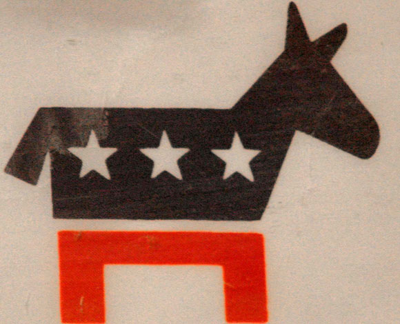
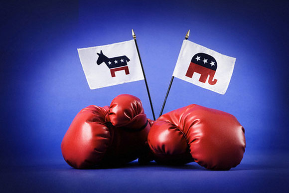
Successful campaign artwork can show conflict and contrast. The donkey and the elephant have engaged in more than one head-to-tail combat about the following things:
- Who will win;
- Who can talk faster;
- Who can drive a point home better.
Using a donkey may tie in a claim that the Democrats serve the American people with more programs for the poor. Using the elephant can help back a campaign to provide jobs or cut taxes. These two mammals fight it out on signage everywhere the human eye looks during campaign season. The art design can say it all, or it can leave something for the imagination when the cunning politician doesn’t know for sure what he or she stands for.
Campaign Art to Create a Message
The work of art is to make something into what you want it to be whether that is what it is or not. There is a silhouette of a man against a brightly colored red, white, and blue backdrop with the shadow of a donkey in front of him. You will find the same design with the same silhouette of a man only the shadow is an elephant. The man stands the same and the backdrop is the same, but the shadow changes according to what the campaign art creator wanted.
Showcase: Creative Approaches to Political Campaign Art (Around the World)
The power of font:
“The most important thing is to remind voters what the party stands for, and to encourage them to vote.”
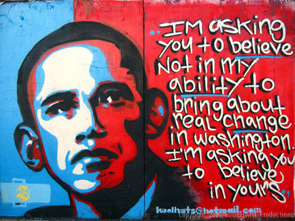
“I’m asking you to believe not in my ability to bring about real change in Washington. I’m asking you to believe in yours.”
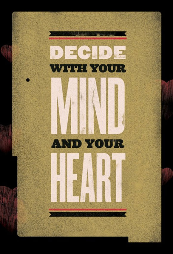
“Design with your MIND and your HEART”
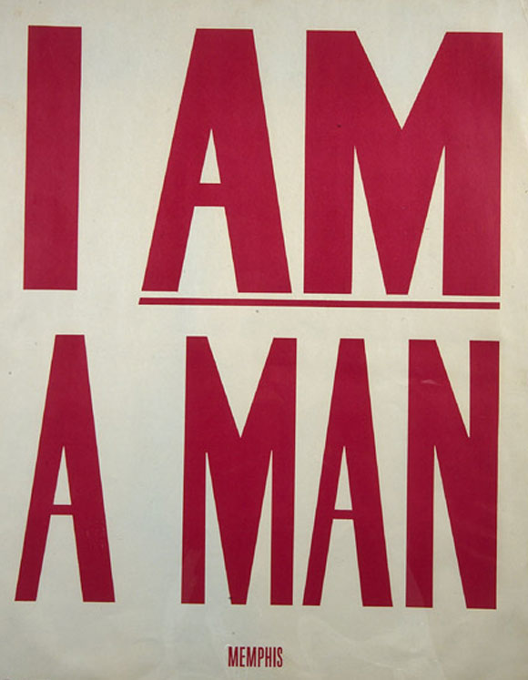
“I am a man”
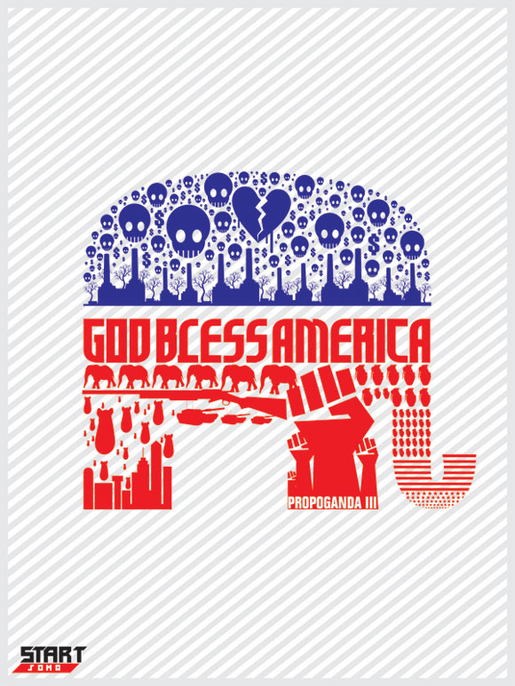
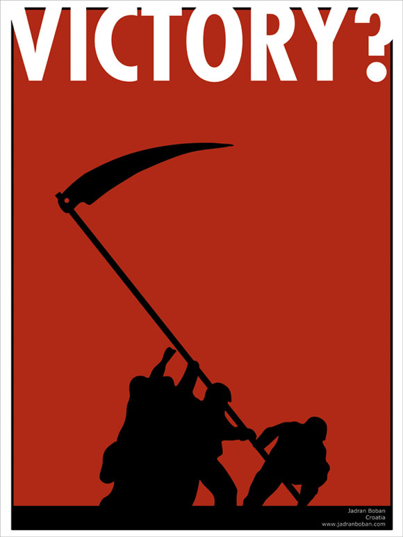
Symbolism:
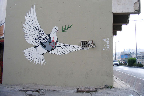
Source: spiegel.de
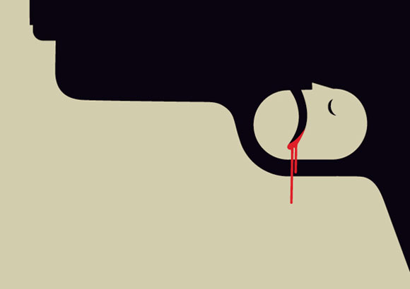
Dual meaning
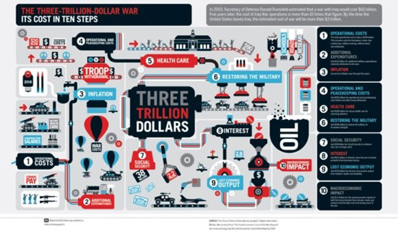
Infographics
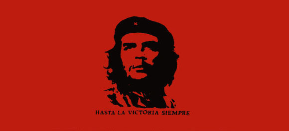
The power of one color
Campaign art always has a purpose. That purpose is to send a message to the voter to convince him or her how to vote and the reason to vote that way. Every stroke of the pen or brush and each letter of every word must be precisely placed to accomplish its purpose, no matter what year it is or who the candidates are.

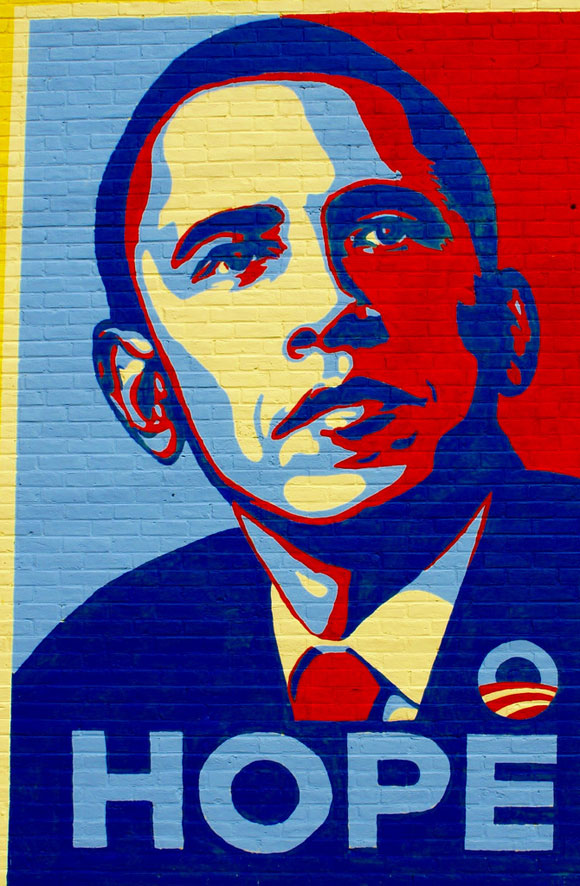
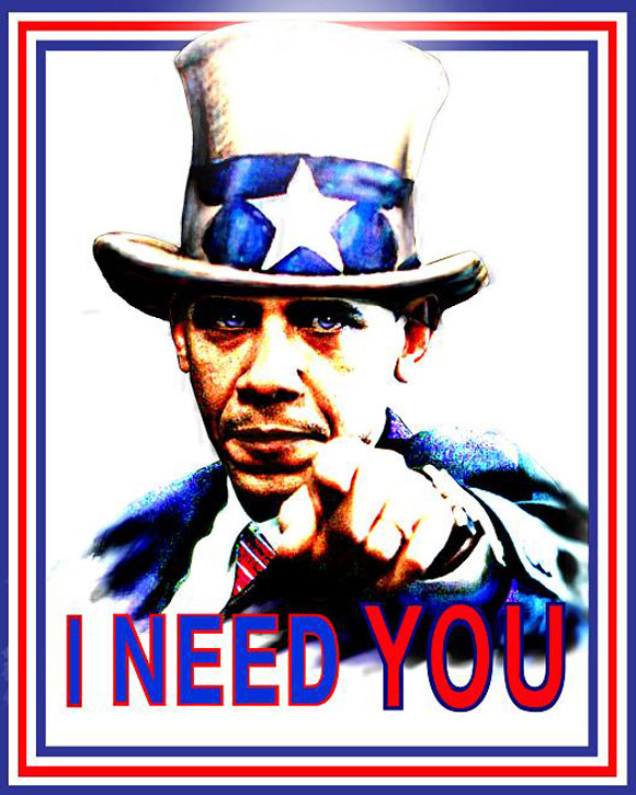


I love this Obama politician campaign art.
Thanks for share such a interesting stuff with us .
i love this blog post.
Wow – brilliant to see such an exciting range of ideas and how different political parties and countries tackle the age old poster! Thanks for sharing
great designs..i like the MIND and your HEART design..thanks for sharing..
Nice examples of political art.