Logo Design Trends for Big Companies
7
Logos are one of the most important components of a brands identity which promotes instant public recognition. Although logos are designed to be instantly recognizable, they don’t always remain the same.
Some modifications are minor; others can result in an almost entirely different logo. In this article, we will look at some logos from well known companies and see how they have changed throughout the history of the company.

Google’s first logo was designed by Sergey Brin using the free graphic design application, GIMP. Later that same year Google added an exclamation similar to that in use by Yahoo! Finally in 1999, Ruth Kedar, a Consultant Art Professor from Stanford created the logo that is still in use to this day.
Canon
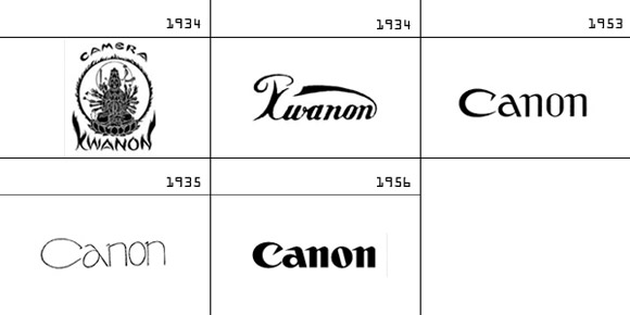
Canon was originally known as Kwanon and the original logo used a unique typeface never before seen in Europe or North America. The logo then underwent a huge change before the rename in 1953. The current logo styling is clearly rooted in this logo and although it has been through more changes since then, it looks very similar.
Pepsi
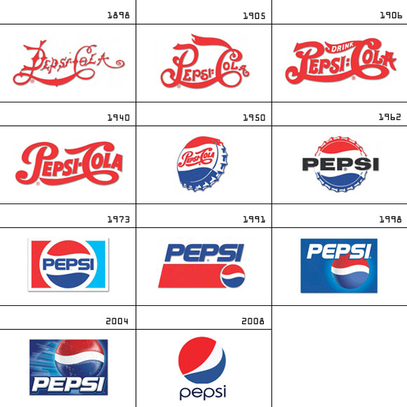
Pepsi have made an unbelievable number of changes to their logo over the years making it the perfect example to end on. The 1905 logo is a little easier on the eyes than the 1898 version. The 1940 logo sports a cleaner look. The 1950s logo introduces the well-known red, white, blue colour scheme which hasn’t changed since.
Pepsi have made many changes to their logo to keep it modern and not all of them have been received well but it’s almost guaranteed they will continue to update the logo to meet future design standards.
Volkswagen
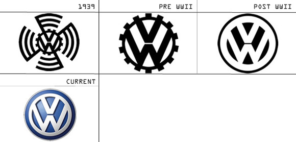
Volkswagen’s history dates back to 1930’s Nazi Germany. Volkswagen translates to ‘people’s car’ which defines what the brand is all about; a car manufacturer that designs cars with affordability in mind whilst not compromising on quality. In the 1939 logo, the design somewhat resembles a swastika. Finally, the current logo follows the pattern of most modern logos by adding a gradient effect etc.
BMW
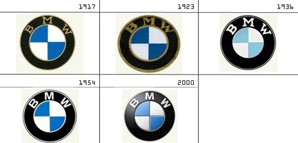
BMW is a leading German car manufacturer which was originally founded as an aircraft company. BMW supplied planes to the German army throughout world war one before having to their change strategy at the end of the war. They moved on to making railway brakes, motorcycles and cars. The core design of the logo itself has remained more or less the same with the current logo using a gradient to give a modern look; the same technique used by the current apple logo.
The next revision uses bolder letters and circle outlines. BMW then loses the gold in exchange for white. The weight of the text is reduced and the size of the circles changed. The next logo uses the same font as the logo in use today. As explained earlier, this is the ’54 logo modernized.
Nike

Nike is a leader in sportswear fashion and has a logo that could be recognized a mile away. Its simplistic design has allowed it to remain modern over the years with very few changes. Caroline Davidson designed Nike’s logo in 1971 for $35. The first change came in 1978 when the text was lifted so that it didn’t overlap the swoosh. The 1978 is probably the best known of the logos. The current logo removes the text leaving only the famous Nike swoosh.
Microsoft

Paul Allen and Bill Gates founded Microsoft (Micro-Soft) in 1975… within the year they lost the hyphen. The 1982 – 1987 logo featured the oddly shaped ‘O’ which was known by employees as the ‘blibbet’.
Microsoft changed its logo in 1987 to a version that didn’t include the ‘blibbet’. This sparked a former employee to campaign to ‘save the blibbet’. Scott Baker created the newer logo with a slash in the O. This became known as the ‘pac-man’ logo. Microsoft is another example of logo’s changing with the times. It’s clear that the 80’s style logo wouldn’t fit in today.
Apple

Apple is an iconic brand with an unmistakable logo but that wasn’t the case in 1976. Apple’s first logo was a picture of Isaac Newton sat under an apple tree. The logo was designed by Ronald Wayne who held a 10% stake in the company which he sold a mere two weeks later. In the same year, Steve Jobs came to the conclusion that the logo was to blame for slow sales and commissioned an agency to design a new logo. The agency designed the striped apple logo which was in use until 1999. Finally the current logo drops the stripes for a monochromatic modern look.
Ford
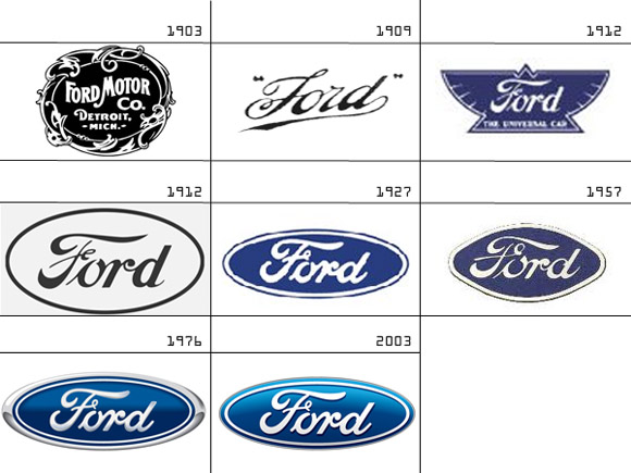
Ford was founded in 1902 under the name Ford & Malcomson, Ltd. In 1903 it was renamed to Ford Motor Company which is shown in the first logo. The 1909 logo has a font resembling the one that is currently in use; both logos shown are simplistic in comparison to the 1912 revamped version. In the same year the logo was replaced with a design incredibly similar to the latest version.
15 years later, Ford changed its logo along with the launch of the ‘Model A’ car. Ford’s current logo is known as the ‘Centennial Blue Oval’. Ford is the perfect example of the evolution of a logo as there are many revisions made over a period of many years demonstrating how logo’s need to change with the times.
The examples above show how company logos transform and adapt with the times and will continue to do so in order to ensure the companies continue to appear modern.




It is interesting to see how logo change, and the history of there design.
Love to know the changes made in logo, and get to know the revolution and innovative.
Logo Design Trends for Big Companies
Like the Pepsi Logo revolution and 2004 was its best shot than ever. The latest one in 2008 is an average approach as i think so.
It is pretty crazy to think that BMW and Google haven’t really changed their logos that much over time, just small updates whereas the other companies have went through drastic changes. Bottom line change is good!
Also very interesting to see the changes of the Nivea logo.
[…] Pepsi, Volkswagen, Canon, aber auch Microsoft, Google oder Apple als die Mammuts im Web-Business. GraphicMania bietet aktuell eine schöne Zusammenfassung von neun solcher Unternehmen und ihrer visuellen […]