DOs and DON’Ts of a Website Background
1Website backgrounds make a big impact on the viewers and enhance the visual appeal of the website. They also give an opportunity for designers to unleash their creativity and come up with unique backgrounds that are not only visually attractive, but also boost the usability of the website in many ways.

There is no limit as to what designers can do for website backgrounds and it can range from pictures to illustrations to photographs and anything else that will blend well with the theme of the website design.
Numerous aspects are involved in the design of website backgrounds and this article aims to provide an overview of the DOs and DON’Ts to help designers come up with the perfect background.
Styles
There are many styles in website background design and it’s up to the designer to pick the one that best suits his or her current requirements. These styles can be broadly categorized into photographs, illustrations and animations. Out of these, photographs and illustrations are widely used, while animated backgrounds are still in the experimental stage due to of limited Internet speed and bandwidth problems.
Photographs and images convey a bold and powerful message to the viewer. It has to be related to the website’s business so that a mere glance can help people to understand the nature of the business. For example, if this is a real-estate company’s website, then a house with a “For Sale” sign says it all. This is the power of images and the designer should do everything to trigger that part of the brain that responds to images and processes them. To achieve this, photographs and hand-drawn illustrations can also be used.

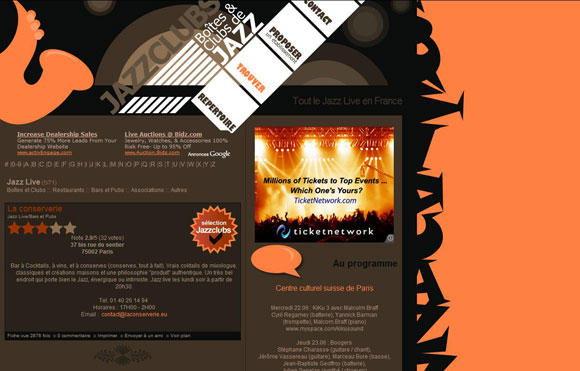
The example shown has a jazz image in the background and a mere look at it makes viewers understand that it is related to jazz music and clubs. Such a visual impact can only be created by photos, images, illustrations or animations.
Position of images
The position of the background image is another aspect that can make a big difference in the look and feel of the web page. It can be centered or tiled to generate the right impact. Some designers even prefer to increase or decrease the scale of the image to highlight their image. While the position of the images depends to a large extent on the website and the designer, the right size and position will help the image to generate the attention it deserves. A skewed image can spoil the look and feel of the entire website, and viewers may think twice before visiting the website again.
Firstly, the designer has to consider the size of the image if it is going to be centered. The background image should cover the entire screen for the most commonly used resolutions. Otherwise, it will look like an image that has been pasted in the website and it will never blend with the rest of the page. One solution to this problem is blending the corner of the images with the background so that it looks natural in all resolutions.
The second aspect that should be avoided is cropping or cutting the image into a desired length because each browser renders it differently. One way to avoid this problem is using CSS background property, since most browsers understand CSS and interpret it well.
If you are using an image as a tile, you have to ensure that the edges of each tile are consistent with the pattern. This will help to render a smooth image with minimal distortion. To create such a seamless background, the designer has to cut the image in such a way that it aligns well with the other pieces to give a blended background.
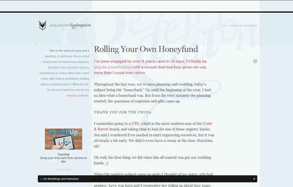
The background below is a classic example of how the images should be sized and blended for the best effect. The different shades of blue are combined together to make it look natural and the blending is so seamless that it only adds to the attractiveness of the web page.

Mistakes to be avoided
Designers make many mistakes while designing a website with background because it can be tricky to design. Firstly, designers should understand the different image formats and which one will be ideal for each kind of image. The three commonly supported formats are GIF, JPEG and PNG. GIF is best for simple graphics, whereas the other two are perfect for static images and photos.
Another common mistake that should be avoided is the size of the image. Designers should try to optimize an image as much as possible so that it does not affect the performance of the website. Large images as website backgrounds can consume a lot of bandwidth which can make the site considerably slower, and so it should be optimized.
The size of the image is also important for achieving the best effect. It’s a bad choice to increase the size of small images because the resolution will go down and it will look miserable on the website. This mistake should be avoided at any cost.
If you are using Flash images, then you have to be extra careful because some browsers require an additional plug-in. While some viewers may already have it, a lot of them may not and in such a case, they will not be able to view the background images.
These are some common mistakes that should be avoided so that the background image has the optimal effect of enhancing the look and feel of the website.
Tips and tricks
Some tips and tricks can help you to fine-tune your background image for better design. The large size of the images can have a big impact on the performance of the website. You can use numerous Internet tools to measure the performance of your web page. Some tools even tell you the size of the image and the ideal size that it should be scaled to. Follow this suggestion and reduce the size of the image file for the best results. You can also simultaneously check the compatibility of different browsers and how your image gets rendered in each of these browsers. Based on this information you will be able to make the necessary changes to your image.
Consider the resolution of the images for different devices. Browsing through mobile phones, tablet PCs and other devices have become pretty common, and your image should render well in each of these devices. You can use a mobile phone emulator to see how the background appears in mobile phones and you can use different CSS styles for proper rendering.
Another trick is creating a background around the image. This is particularly useful if the image is of a smaller size. The background colors can be blended with the image to make it look like a larger image.
These tips and tricks can go a long way in enhancing the background image and avoiding the common mistakes that may come with it.
Conclusion
In short, a website background enhances the look and feel of a website, provided it is used in the right way. It is trickier than most people would imagine and this is what makes it all the more challenging for designers. The above-mentioned aspects and tips can help designers overcome mistakes and make the right choices when it comes to website backgrounds. This element alone can make the website outstanding and unique in the Internet world.


Your background cannot be the main focus. You want people to focus in on the content of what you are trying to create!