Casual Dining Restaurant Web Design: A Tour of the World
0Whether you want to admit it or not, everyone loves going to the local chain restaurant for a burger, Bloomin’ Onion and a beer. There is no shame in admitting that you would rather have a platter of fried fare sitting in front of you, all ordered off of a menu full of pictures, colors, and sometimes an occasional Comic Sans font, than a pretentious plate of escargot or goat cheese menagerie. The state fair mentality is alive and well within the hearts of all of us and we have the casual restaurant chains to thank for keeping the deep-fried flame lit within our heart(burns.)
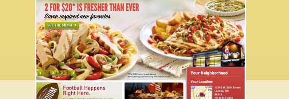
While trendy lounges and fine dining establishments offer atmospheres that cater to what people in New York, London and Barcelona think is cool, the vast majority of us can find solace in the pleasant atmosphere of a TGI Fridays or Applebee’s located right down the street. Sure, the food might not be on par with whatever Bobby Flay or Iron Chef Morimoto might have in store for our culinary palettes, but it sure does hit a soft spot in the collective subconscious of society.
The biggest thing that chain restaurants have going for them is the uncanny ability to spend money on marketing. You can’t turn on a television without seeing Tyler Florence, or drive with the radio on without hearing the latest Guy Fieri spot for the biggest chain restaurant. These places do not only have a firm market share of where we visit on ventures out to eat, but they also dictate the way we view restaurant marketing.
These restaurants have all been influenced by unique destinations and culinary minds throughout the United States and the world. Here is a world tour of how the most popular chain restaurants in America are trying to win over our hearts and minds through slick interactive web design:
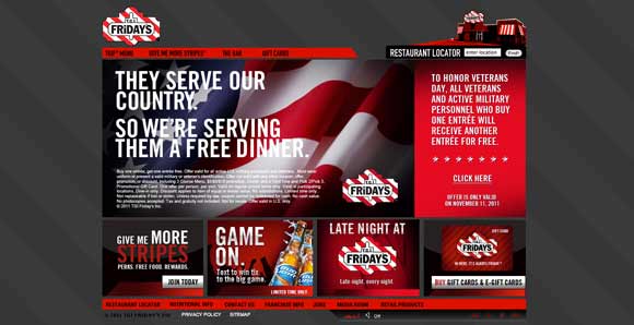
Our journey begins in Manhattan at the TGI Friday’s in Times Square. When directed to the TGI Friday website you will find a simple design which contradicts the noise found in most of the physical locations. A logo appears on the upper left hand corner and a simple red strip underneath it with navigation links in black. The body of the website features a black silhouette of a tailgate party on a slightly darker red background in order to signify the restaurant’s party-time atmosphere.
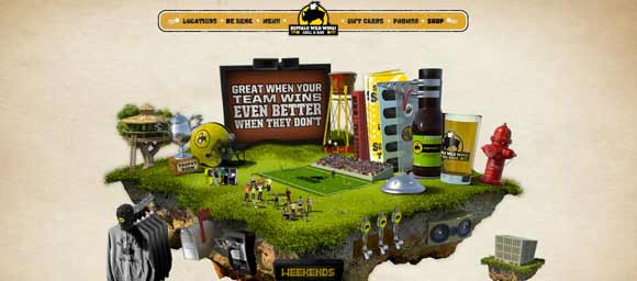
Taking the football game to a whole new dimension, Buffalo Wild Wings gives an interactive sports fan what he craves. By using a Flash animation, the website conveys a sense of activity and intensiveness that can be associated with most sports. A giant piece of floating turf sits in the middle of the screen with a football field, giant sauce tower, beer glasses and other features that defy the laws of subtlety. The cold weather of Buffalo is supplanted by the wild atmosphere of the website.
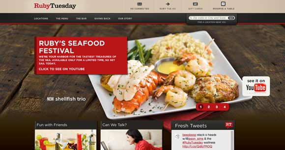
As we inch deeper into the heartland, we make a stop in Tennessee to visit Ruby Tuesday. Based off the name of a Rolling Stones song, this restaurant lies in between two of the blues and rock ’n’ roll capitol and the home of country music. Unfortunately, the website doesn’t offer as much excitement as expected. The website offers a calm, somewhat classy introduction to the standard salad, seafood and steak fare which tries to differentiate the chain from its competitors.
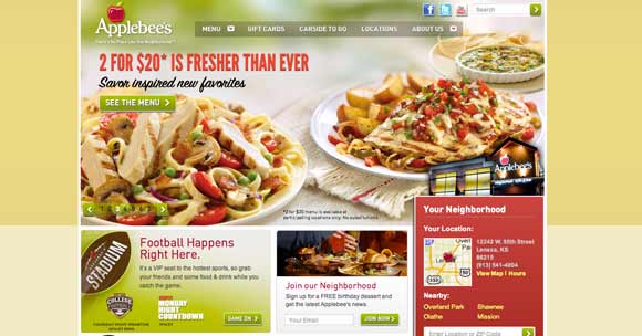
The Applebee’s chain, which caters to the Midwestern demographic, turns up the patriotism by opening their website with a tribute to the troops. A red white and blue stitch pattern adorns the background, while a call to send messages to our soldiers overseas is laid out in a strong Impact style font.
Applebee’s has recently taken the same approach as Ruby Tuesday has with its classy design by introducing a more elegant logo. Instead of the festive font that once adorned their restaurants, they have reduced the boldness and lightened up the serifs.
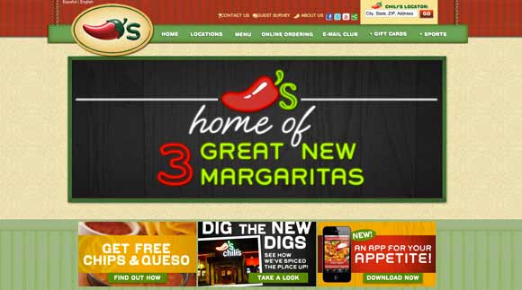
The Chili’s website is adorned with the classic red, white and green of the Mexican flag in order to emphasize their Tex-Mex specialties. The navigation banner hangs like a menu board at a cantina at a Mexican resort and the font is bold, bubbly and gold when you roll over it with your cursor. The images include icy margaritas and cool pico de galo spread over a plate of tacos which gives a fresh impression of the restaurant.
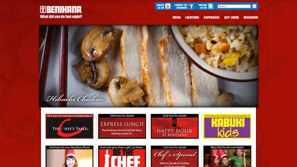
If we take a trip across the Pacific and land in Japan, we are taken to Benihana, which specializes in Teppanyaki cooking. The website is as simple as the ingredients served at the restaurant. There is a basic white logo on the top left, a red background with lightly shaded floral features and a photo slide in the body which displays freshly cooked steak, chicken and prepared sushi. The font featured on the website is a bold Japanese style lettering.
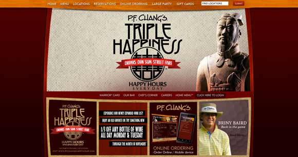
Traveling three-thousand miles to the west, we find ourselves in the majestic grandeur of the Chinese dynasty. A bold wood panel adorns the top of the site with an elegant white lettered font for navigation links. The body is placed in a curved frame with wood paneling decorating the borders. The slide show features a statue of a Chinese Emperor over a dirty white background with a faded black halftone which advertises drinks, dim sum and street fare.
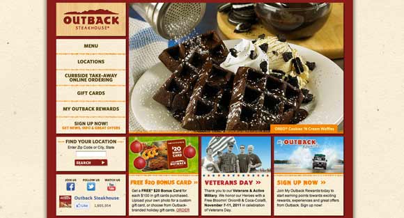
The last stop of our journey is the Outback of Australia, where eating kangaroo meat isn’t too far of a stretch for most. Fortunately, Outback Steakhouse specializes mostly in gigantic steaks and fresh seafood. The website is very basic and focuses on the quality of the food and the style of preparation. This is the only chain restaurant which featured a side navigation instead of a banner styled header.
Keeping things colorful, exciting and casual is what these restaurants rely on to keep customers returning. Offering slick interactive ways to view menus, see food, and get a sense of the general atmosphere in each location is the best strategy to take when designing a website for any restaurant or bar. Just remember to keep your site easily navigable and place the most important information up front.


