Fun Helvetica Posters
4Design, especially traditional print, has a certain code when it comes to fonts. There are some that are used in moderation (such as Times New Roman), others that are only used if you want to be made fun of (like Comic Sans), and some that are overused (like Arial).
But there is also a font that is considered the typeface of choice for many projects that want some flare without being too flashy. That lettering is Helvetica, which remains one of the most popular fonts used by designers today, especially for print jobs like posters.
Each one of these uses both Helvetica and typography humor to make great posters celebrating the font.
100% Helvetica, 0% Arial
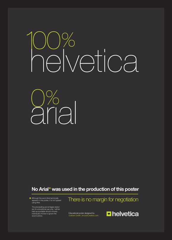
„There is no margin for negotiation” is the slogan for this 100 percent Helvetica poster, which claims no Arial was used in the making. That is true; it is all Helvetica goodness. Though it does point out that the name of the font appears in the poster, which could count as inclusion into the design, even if the typeface wasn’t actually used. That will have to be up to the viewer, I suppose.
All I Got
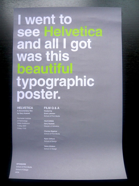
You won’t get a lousy T-shirt here. But you will get this „beautiful typographic poster”, according to the piece itself. The simplicity of this one is really appealing, right down to the faded and bland colors that somehow manage to just make the font pop more on the paper.
I Am Helvetica
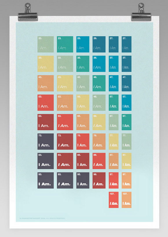
The metaphysical and the typographical meet for a single poster in this interesting creation by Change the Thought. It features a set of boxes that are numbered and say „I Am” in various colors. Each one is set in Helvetica font, so the message seems to be „I Am Helvetica.” Weird, but pretty cool.
Print, Design and Industry
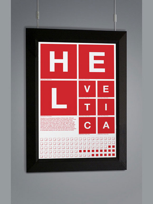
Aaron Pou decided to go really literal with this poster that shows off the font in huge block letters making up itself in a unique design. There is a lot of interest from people in this poster, so if you know if it is on sale, please let us know in the comments.
Helvetica Is Art
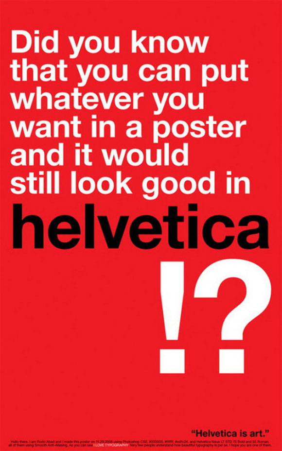
This one is pretty funny. It has the slogan, „Did you know that you can put whatever you want in a poster and it would still look good in Helvetica? Helvetica is art.” They proved that, because it is literally just white text in the font on a red background, with the fine print in black at the bottom, and it looks amazing.
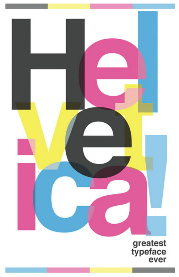
Every time I see this poster I am reminded of the comic book seller in The Simpsons, and it is his voice in my head when I read „Greatest typeface ever”. I can’t help but wonder if that was the designer’s intention when they wrote it – unless they don’t have my sense of juvenile humor.
Thank F*ck for Helvetica
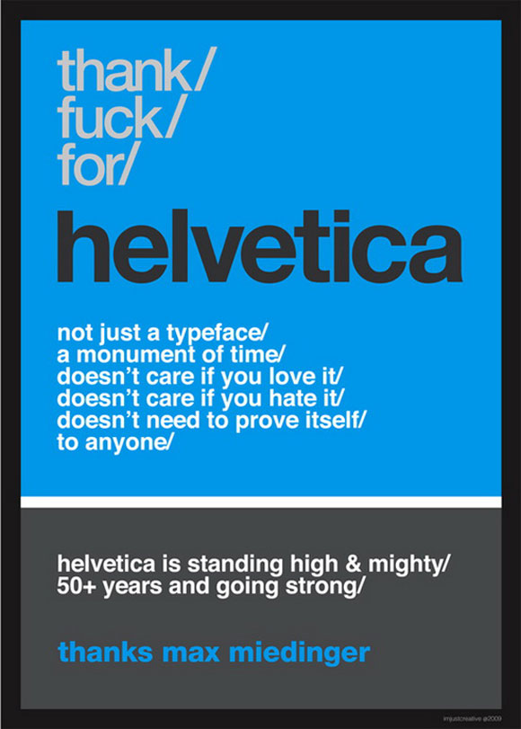
Crude, to the point and accurate. The poster points out that Helvetica doesn’t care what anyone thinks of it – it is still too cool for your opinion. It also mentions a thank you to the creator, Max Miedinger, who came up with Helvetica more than five decades ago.
Arial/Helvetica Fight
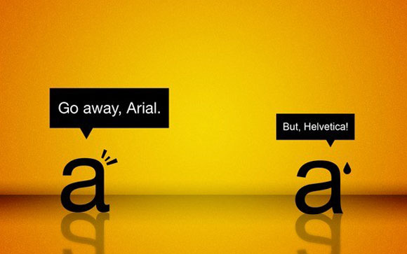
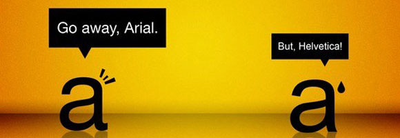
It looks like Helvetica has had enough of Arial’s attitude. The two are shown as simple, lowercase a’s, with Helvetica walking away and telling the other font to go away. The background on this is gorgeous and gives it all a humorously dramatic feel that melds well with the concept.
Helvetica Abuse
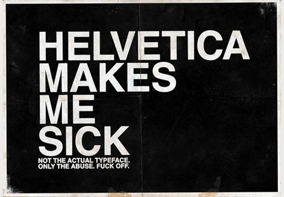
Some people aren’t impressed with the common use of Helvetica in posters and said so in this „abuse” poster, where they say it makes them sick, while using the same typeface. Irony or just a lack of thinking ahead? Hmm…
Robotica
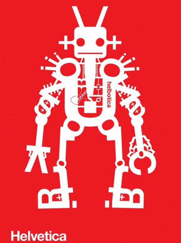
This one isn’t funny, just really cool. It shows a retro robot made entirely out of Helvetica font. It was very well made and interesting, and it can be funny to pick out the different letters through the image. What are some of your favorites? Let us know in the comments!



Helvetica! The number one go to font for artists with no real imagination! 😀 But seriously this typeface is definitely over used and overshadows a lot of other great fonts!
But on to the posters! They are great and helvetica has most definitely been developed in to an art form. My favourite is probably the Aaron Pou design very different and reminds me of the opticians not that, thats good!
I see no reason to stick to one font, but still: these posters were great.
The most beautiful font ever created!
Great blog! Cons dear Sonia, I read and watch all the blog and it’s an oasis (for designers) on the internet.
Funny!