Eight UI Design Patterns You Should Consider
0As a design professional, you are already aware that UI design patterns are essentially the solution to common user interface-problems.

In this article we will be covering eight UI designs patterns you should consider using.
Related posts:
- Significant Skills Every Web Designer Should Know
- How Designers should Read Clients
- A Guide to Select a Font Family for Any Project
- Designing Websites for a Better Mobile User Experience
- Tips for Designing iPhone Apps and Web Pages
- Approach Tips to Design and Market Your Mobile App
1. Lazy Registration
This feature’s function is to allow users to try out the site before signing up. The design of this application process engages the account registration pattern and is more suitable for certain situations. These are:
- When users are allowed to check out your website and sample its products and services before signing-up.
- When it is necessary for you to get users familiar with your system before they sign up. This is commonly used on shopping sites such as Amazon, where users can view the products available on the site without being a registered user. Registration is totally optional and is based on the user’s satisfaction with your services.
Some sites have found a clever way of bypassing the sign-up form altogether by slowly asking users for data along the path of discovery. Before the user knows it, they are a member of the site without having even filled out a form. Using this UI design pattern not only eliminates the old registration form, but it also increases user engagement and trust.
2. Progressive Disclosure
This interaction design technique is often used to reduce the number of advanced or rarely used features appearing on the primary screen. In a nutshell, this technique is used to de-clutter the user interface and reveal controls only as they are needed. Users are allowed to show or hide features at will, enabling them to perform a complex or multi-step process on a single page. Consider these tips:
- Avoid using a “wizard” and keep the entire interface on one page. Present the control buttons for each option in a step-by-step display.
- Users will be walked through complex UI tasks step by step. A user conducting a bank transaction online is first presented with minimal buttons transactions such as Withdrawal Cash, Making a Deposit, See Balances, and Transfer Money. After clicking on the action they want, they are presented with options relating to the selected action. For example, if the user wants to withdraw cash, then on the same page he/she would be presented with options for selecting checking or savings account. Check How to Build a Better Design Experience.
3. Forgiving Format
Search functions gives users multiple options, and this can contribute to the complexity of that interface. The forgiving format pattern eliminates this complexity by allowing the user to enter data in various formats (zip code, street name etc.) and then systems the will parse the data.
Indicate the formats the system supports by giving the user hints on how to conduct their search. This can be done by listing all the available formats or by providing a link to your help page. This UI pattern simplifies the user interface significantly, but the back-end developer may have to do a lot of work to accomplish this. Give minimal options, as parsing becomes more difficult when there are too many options. Check Making Sense of Clients’ Inputs.
4. Clear Primary Actions
Some web forms present users with several options, that makes it a bit challenging for them to make the distinction between the primary and the secondary action. Simple Web forms with definite actions such as “Submit”, “Save” or “Send” indicate the final (or primary) action to the user. Primary actions are used to complete the form while the secondary action usually does not lead to the forms completion. Canceling a form could be the secondary action.
For forms with several options, you can indicate to the user the primary or secondary action, by highlighting the primary options with bright colors and the secondary in a dull color. You can also style the primary option buttons and show the secondary options as links.
5. Bread crumbs
The bread crumbs pattern is formed by the path created through the front page of the site leading to the current location of the user. This is done in the website’s page hierarchy. These crumbs are somewhat like a secondary navigation system which helps the user better understand the website. Each breadcrumb trail has a label that is linked to its page or hierarchy position. These crumbs can appear as text links (separate them with the > sign) or graphics. They don’t require much space and can be placed at the top of the page.
6. Account Registration
This pattern can solve three problems.
- Only registered users can access certain content.
- Personal data need to be re-entered before the user gains access.
- There is a need for users to access personalized content while on the system.
The account registration pattern addresses these problems by allowing users to register and store their personal data on the system, so it can be reused in the future. This allows users to receive personalized offers, (as in the case of Amazon) and to perform their tasks more efficiently.
7. Required Field Marker
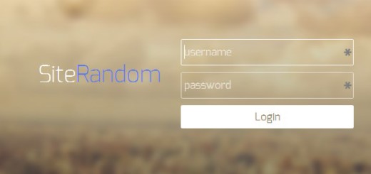
Making the interface of Web forms more obvious is best done by marking the required field. These markers will alert the user to information that they will be required to provide. This will indicate to users that they do not have to fill out the entire form. Simpler is better when it comes to web forms and user experience. Remove optional fields and leave only those that users will need to supply. Check Tools for Web Design and Evaluation.
8. Steps Left
Widely used when users will have to fill in data in multiple steps. This pattern functions as follows:
- Guides users,
- Explains to the user the scope of the process by stating the steps needed to complete it,
- Highlights the users’ current step so that they can easily see their position.
The steps are usually shown horizontally in descending order and connected by arrows. They are usually marked with large numbers and users given concise descriptions of what to do. Consistency is marked by an indicator showing users where they are at. The steps left pattern is usually combined with the wizard pattern for multi-step processes such as registration for a shopping cart.
Related posts:
- Significant Skills Every Web Designer Should Know
- How Designers should Read Clients
- A Guide to Select a Font Family for Any Project
- Designing Websites for a Better Mobile User Experience
- Tips for Designing iPhone Apps and Web Pages
- Approach Tips to Design and Market Your Mobile App


