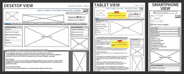
Analyzing Responsive Design – Things to Know for a Right Website
0A lot has been said and read about Responsive Web Design (RWD) and that will remain continue for the importance of it. As more and more mobile users are shifting to smartphone and gadgets like iPod, iPad, tablets, Kindle, etc and have increased the usage of Internet through these, the need for responsive websites is more evident than ever. Also, the time people spend on desktop has reduced in comparison to the time they are on other devices. This is why companies more or less always in the customer-consciousness have to embrace this technology swiftly rather than sticking to desktop-only version.
Here, we will learn about the aspects of this technology that allows it to be so widespread in usage, expectation and appreciation.
How exactly RWD functions?
The understanding that websites with responsive design technology expand and contract depending upon the size of the gadget in which the window is opened gives way to the curiosity as to how it actually does take place. The answer is simply in the design using of image, grids and CSS Media queries and their clever layout. Web designers and experts righty compare this technology with artificial intelligence given to website in order to fit all the screen sizes and compatible to most of the popular platforms. Here are some features of any website that ought to be made right by employing RWD.
Navigation
A website with confusing navigation can make users feel lost for the destination they seek inside the website. Once hit by this feeling they might ever again visit the site for not getting info they seek. In desktop version, the space is ample to get to see everything but this is not the case in mobile as all the space has to be effectively utilized, especially with intelligent employment of dropdown buttons.
Screen Size
According the requirements of websites, companies make use of various features of tools to allow user a better experience in their smaller screens. For example, a popular coffee-retail brand has chosen to keep initial breakpoint at 769 px, assumedly for the portrait orientation of devices like tablet. On the other hand there are other companies who prefer to accommodate smallest of screen size and resolution and adding more CSS codes to get more breakpoints.
Screen Breakpoint V/s Navigation
More often than not, one format of navigation for all screen sizes is not the standard choice. For better accessibility across multiple platforms and screen sizes, the best practice is to keep different navigation options with different breakpoints and however small or big the screen might be. Used thoughtfully it, keep the user indulged and occupied with the brand for good.
Target Audience
How much a group of people known as ‘target audience’ are important in a marketing and selling process for whom the product/service is meant? Probably everything because as could be guessed by the act of a well-known company that shuns away most of the original aspects of its desktop-only website version when moving in smaller screen gadgets just because research has revealed that its users open the website in their mobiles to get a quick brief info about it and not the whole thing.
Aesthetic Elements
At many times, websites are recognized and inspired from the brand image people have in mind. Desktop version ought to be flawless as anyone could guess why but should compromises to be made on design appeal? The answer is- most of the times it depends, but it is better to maintain the balance in switching the gadgets. After all, the aesthetics have its appeal and a brand conveyer inn its own small way.
Position of the Content
Keeping the content in centre and in front has noticeable benefits as the users do not like to scroll from left to right and at last close the website in frustration just because they have to go from one place to other to set eyes on the stuff written. The best example could be seen the way Contents Magazine does the trick using responsive images. Responsive Design for your business website can take an inspiration from this near perfect employment of the available technology.
Besides the above points, there could be other things that could be added in discussion on responsive web designing but the basics stay in their place, that is crafting of the websites has to be user-centric, simple, navigation-friendly and hassle-free. And to maintain the high standards, the challenge is always staring in face of the brands in wake of pressing competition.


