Dos and Don’ts of Website Design
4
Website design is a competitive as well as a lucrative field due to many reasons. It is competitive because of the numerous website designers present around the world. Internet has changed the way businesses operate and it is no longer confined to local companies or designers. Any person who has the talent and skill can get a website design project, irrespective of his or her geographical location. This has opened up the world and has intensified competition.
Before continuing reading this post did you already join our Twitter and subscribe to our RSS feed? If not, rush and join us now to receive updates of new posts and free resources.
On the other hand, it is also lucrative because Internet is a powerful medium through which a message can reach millions of people. Most companies are looking to tap this medium and the first step towards that is an attractive website. So, there are lots of opportunities for anyone who has the know-how. In order to get more business, one should keep in mind certain do’s and dont’s while designing websites. These points will make a website attractive without being a turn-off for the viewers.
Dos
The below-mentioned aspects are vital to enhance the look and functionality of a website and it is important every designer follows them.
Maintain Consistency
The website should have the same design through all its pages. It is unprofessional to use different fonts or colors on different pages. It is confusing for the reader and gives a negative impression about the company. Every page should have the same color, font, font-size and layout. You can however change the images, content and the way it is laid out. For example, the contact us page will mostly have a form which is way different from the about us page which will contain text about the company and maybe some images. However, both the pages should contain the same font, font-size, font-color, background, header and footer.
Viewable Resolution
The pages should have a normal resolution and it should be compatible with all browsers. The normal resolution is 1024 * 768 and the designer should stick to this number. This is important to ensure that everyone is able to view the pages the same way. When a designer has a resolution of higher than 1280 * 1024 his computer, he tend to design a website that matches that resolution.
Image by shutterstock
But, this can be a problem for someone who has a computer with less resolution to view them. They may have to scroll through the page to get the complete picture and this can frustrate some users. So, its a good idea to stick to 1024 * 768 resolution for all pages.
Site Map
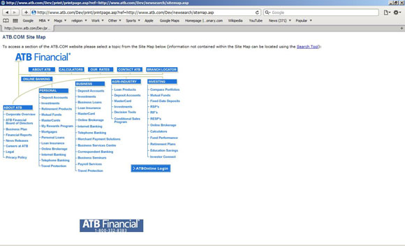
A site map is a useful tool on any website because it gives the readers a good idea of what is contained in the pages and more importantly the exact location of the information. It is just a web page that contains text links to the content in other web pages of the site. This helps the site to better organize the information and it can be a great boon for users. Most of them will use a site map if there is one.

Safe Colors and fonts
There are certain colors and fonts that are called safe because they can be viewed by anyone with a basic computer and a browser. While designing websites, its important you keep in mind these users and not the ones with the latest software. So, you have to use simple colors and standard fonts in your website so that it can be seen by everyone. The simpler, the better it is to suit the needs of all kinds of viewers.
Focus on the purpose
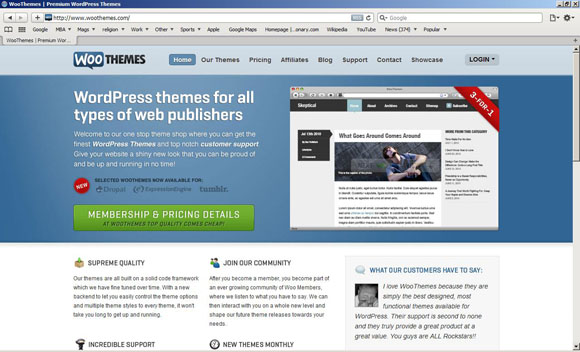
The website should convey a clear message to the user about the business or the product and the best way to do is to focus on the core business. Design the layout and choose colors and fonts that are in tune with the business. For example, if you are designing a doctor’s website, keep the layout simple and open while for a rock band, you can use bold colors. Also, concentrate on the message that is being conveyed. The below image shows the site of WOO themes and the focus is clearly on wordpress plugins. It is obvious at the first glance and it conveys a crisp and clear message to the user.

Simple content and layout
The content should be the mainstay of your website. Use words that are easy to read and understand without being complex. It should be appealing and readable to any user with any level of knowledge in English. When you keep it simple, the chances for it to be universally popular is high.
Other than the content, the layout should also be simple. When you use too many boxes with too many colors, it tends to get confusing and can make the page look cluttered. So, use a simple layout that is appealing and powerful.
Optimize loading time
The amount of time it takes for your page to load should be less. This is because your website is going to be viewed by people in all parts of the world and many of them may have a slower Internet connection, If you have too many heavy objects in your page, then it can take considerable time to load. Some people may not have the patience to wait ten or even fifteen minutes for a page to load and this can reduce the viewership.
These are some of the do’s that you should consider while designing a website.
Don’ts
Besides the do’s, there are some aspects that should never be present in your website and some of them are mentioned below:
No page counters
Page counters are a boring feature that does not add any value to the page. Readers are not interested in knowing how many people have visited your website before. It can also mess with your design and so it is a good idea to avoid it completely.
No Flashing text
Flashing text can take the attention of people away from the content and it is plainly irritating for most users to have neon signs on the page. They are probably used only in casinos and bars and not in websites any more. So, if you want to turn your viewer’s attention to something important, make sure you come up with some innovative ways to do it.
Image by shutterstock
No forced downloads
While designing a website, make sure your user does not need anything more to view your website. Avoid the use of any feature that requires any special browser plug-in. With CSS and HTML, you can make everything possible today and so use these technologies to the optimum extent. Also, make sure you never ask your user to download a file or an image or anything else, unless they want to.
No Background Music
Background music is a bad idea for most sites, unless you have a music-oriented website like MTV or Channel V. Some designers tend to think that music can set the mood for the information. Unfortunately, nothing is farther from the truth because of two reasons. The first reason is music files are large and typically take a longer time to load and the second is that it can sometimes cause unnecessary noise that can be irritating to the ears. If at all you want to have music, make it an optional feature that the user can turn on or off, depending on his or her preferences. You can also create a link to a MP3 file or You tube video.
No Pop-ups
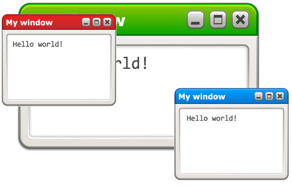
Pop-ups are a complete turn-off for most people. It takes users away from the core content of the main page and it is a good design to exclude them. Come up with creative ways to say all that you want to your user right on the main page and avoid pop-up windows completely.

Image by shutterstock
No keyword stuffing
Keyword stuffing is a bad design idea because more often than not it backfires. It not only makes the content badly written and difficult to read, but it can also make the search engine ignore the page. The main idea of keywords is to help the search engine identify your page when a user searches for the related words. When you have too many keywords in your content, the search engine can consider it a spam and so the purpose fails. Instead, have a density of no more than 1.5% in your page and this can make it appealing to read as well as search engine friendly.
No Unnecessary Ads
Though ads can contribute to the revenue to some extent, too many ads can be an eye-sore. The page should not contain more ads than content because people will not even bother to look at such pages. So, you will have no viewership and whole idea of a website is lost.
Conclusion
In short, the above-mentioned points can go a long way in making your website attractive and also appealing to viewers. This simply means more revenue for the company and more business for you. So, make use of them today to build a lucrative career.


Web safe colors were called so because they were the colors that were common between Mac and Windows when Mac and Windows only displayed 256 colors. If someone has a computer old enough to need web safe colors, it’s highly unlikely they have a modern browser anyway. If you really want to cater to that audience, you should also avoid CSS layout and the like.
In other words, there’s no reason to stick to web safe colors.
I would like to add a point , websafe Font or use @font-face 🙂
I like it – good article, good information, Enjoyed your post greatly! Great write up! Need more like it! Wish to hear more like this! Your article was very interesting. Thank You.
Thanks alot!!