Enhancing the Usability of Your Website
0Usability is the approach that makes it possible for end-users to easily use a website. This approach is based on the established principles of web design and development, and also the natural intuition of human beings to do things in a particular way. It is primarily about removing any kind of ambiguity from the content or navigation of websites and providing the required information in a clear format to the end-users.

It is an important feature that every website should have to attract large crowds. People will visit the website and use it only if they find it easy to navigate and understand, and this is why designers should do everything possible to make it appealing and highly usable to the end-users. The tips mentioned below will help designers to make small, yet vital changes to their websites to enhance their usability.
Approach and Mindset
The designer should keep the user in mind throughout the design process. The website is a window to the organization it represents, and so a well-designed website that ranks high on usability will give a positive impression about the company. Users should feel smart and not stupid on the website and the best way to make every user feel smart is to keep it simple. When a site is simple, unambiguous and easy to use, visitors tend to stick around for a longer time.
The first step towards designing a usable website is understanding the end-users and their technological expertise. After that, it is important to make a list of the goals of the website from the users’ perspective. When these two are ascertained, the designer can begin creating the website. It’s a good idea to spend considerable time and resources on usability testing to ensure that it meets the goals and knowledge-level of different kinds of users.
Content and Readability
The content on the website should be easily readable for the end-users. The text to background contrast is important for easy readability. While colorful backgrounds can enhance the beauty of the site, they are likely to rank low on usability because the text will blend with the background. If you are designing sites with little, or no content, then it’s definitely a good design choice. However, if a website has a lot of text, then its best to stick to the traditional layout of black text on white background.
The font-size and the spacing should be adequate. While large fonts can occupy too much space, small fonts will make it difficult to read the text, which will only lead to frustration for the end-user. So it is best to choose font-sizes that range between 10 to 16 points, as these will be ideal for reading. Opt for well-known and readable fonts like Georgia, Arial or Times New Roman. Also, limit the use of flash and animation because it can be disturbing and can take the viewer away from the core content.
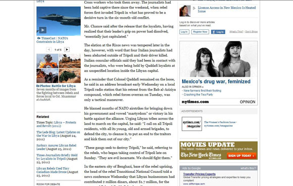
In this example from nytimes.com, the content is adequately spaced and the font-size is just right for reading. Also, the traditional black and white combination works well and makes it a joy to read through the contents of this website.
Site Maps
The site map is a page that acts as the master page of the entire website. It lists all the different web pages on the site and links that can take the users to the right pages. This is essential for enhancing usability, because it makes it possible for users to find the web page they are looking for in a website. To make it useful for the end-users, it’s important that site maps should be updated all the time. There should be no broken links on the site map as it would reflect badly on the company. Users feel empowered when they can find what they want to, and this helps them linger on the website for an extended period of time.
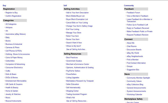
Ebay’s site map, which is shown below, is a perfect example of what a site map should look like. It has links to all the information and web pages present on Ebay’s site and this is a one-stop place for users who are looking for anything on the site.
Name and Purpose of the Company
The website represents the company itself and users should be able to identify the name of the company and its nature of business within seconds after visiting a website. This means that the design should contain the logo and the by-line prominently. The by-line should describe the company’s operations in a few words, so as to give the users a basic idea of what the website is all about. Similarly, the About Us and Contact Us pages should be well-structured and should present true facts about the company. This will boost the confidence of visitors and will provide a sense of credibility for the company. Likewise, visitors should be able to get in touch with a representative of the company in some form, so the Contact Us page should contain the name, phone number, address and email ID of the company. Alternately, visitors should be able to send a message to any representative who will be able to respond to it at the earliest. All these aspects enhance the usability of the website, since the user gets to know the gist of the company within five seconds, and it also helps the company to build a good image in the eyes of the end-users.
In this example below, users can understand what TEK systems is up to within five seconds. The by-line beside the logo and the bold images on the home page show users that it is an IT staffing company. Such a clear message is required to capture the interest of the relevant users.

Navigation
Navigation is another essential factor of usability. While creativity is important, it should not get to the point where it’s difficult for the user to move from one page to another. Navigation menus and links should be easily identifiable in the web pages and more importantly, users should be able to get to other pages right away. The navigation labels should be clear, short and concise. For example, “About Us” is better than “Click here to learn more about our company.” The latter is not only long, but also unwanted. Also, the labels should be unambiguous. For example, when a label says “Investor Relations”, the link cannot go to the Contact Us page. It should rather take the visitor to the About Us page, or anywhere else relevant to the label.
Another aspect of navigation is keeping it small. When there are eight or more navigation links and a host of other information, users will find it difficult to navigate through this mess. So, keep navigation simple and short for enhanced usability.
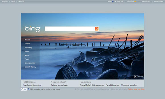
The navigation menu of Bing has eight links on the left and the labels are clear and simple.
Reduce the Usage of CAPTCHAs and Scripts
CAPTCHAs and scripts greatly reduce the usability of a website and they can be a major deterrent for users. Though CAPTCHAs are essential to identify humans from automated software, it can be a nuisance when users are asked to type in numbers or letters several times during their visit at a site. User intervention should be kept to an absolute minimum in the website and CAPTCHAs should be limited to a maximum of one per website.
Scripts are another unwanted nuisance from the users’ perspective. They do not want to know the background operations of their requests or any javascript functionality, and having them displayed from time to time can be frustrating for the end-users. The excessive use of scripts is also likely to slow down the site.
Conclusion
Usability is an important feature of every website as it enables the users to read the content and process the information presented in the site without any form of ambiguity. It is the responsibility of designers to increase the usability of the sites and make them more usable and appealing. The above-mentioned suggestions can help to enhance the usability of websites and provide the right image about the company in the eyes of the visitors.

