How to Create a Comic-Book Style Image of Yourself
4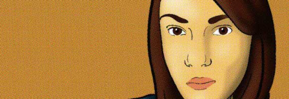
In this new tutorial, we will see how to create a comic-book style image for yourself based on a personal portrait photograph. This tutorial will cover how to create this effect from scratch in Illustrator and Photoshop for intermediate level users. It is preferable to have a graphic tablet to follow this tutorial first steps.
Related posts:
- Quick Tip: How to Create a Seamless Pattern in Photoshop
- How to Create Islamic Style Poster in Photoshop
- How to Customize Skyscraper Background in Photoshop
- How to Create a Photo Manipulation Poster in Photoshop
- Amazing Photo Manipulation Tutorials
- How to Create HDR Photos in Photoshop CS5
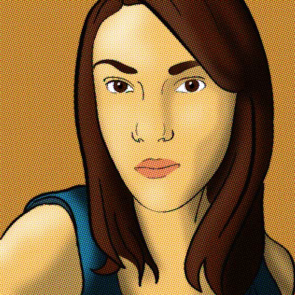
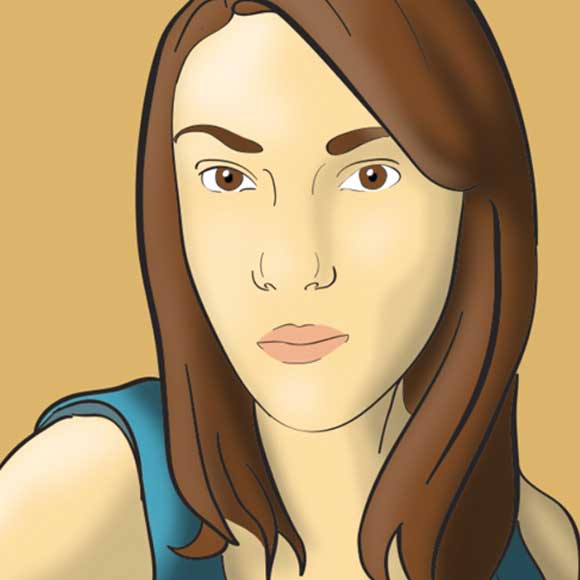
The final result should look like the below image:
Step 1:
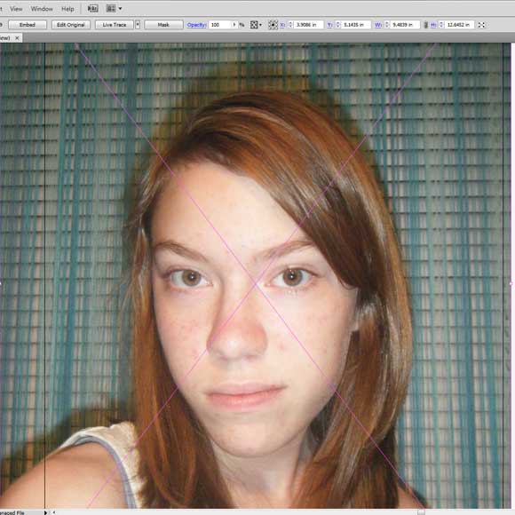
First, you need to look for a good photo of yourself or a friend. Open a new illustrator document then paste the photo on its own layer.
Step 2:
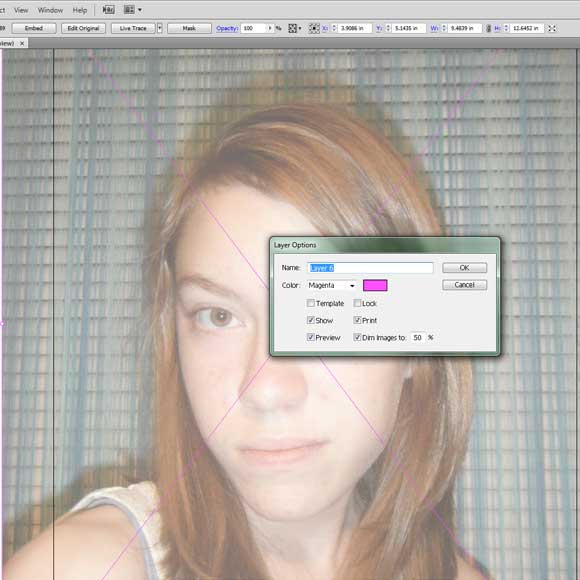
Double click on the layer that the image is in and diminish it a little bit. You can decide on how much is right for you.
Step3:
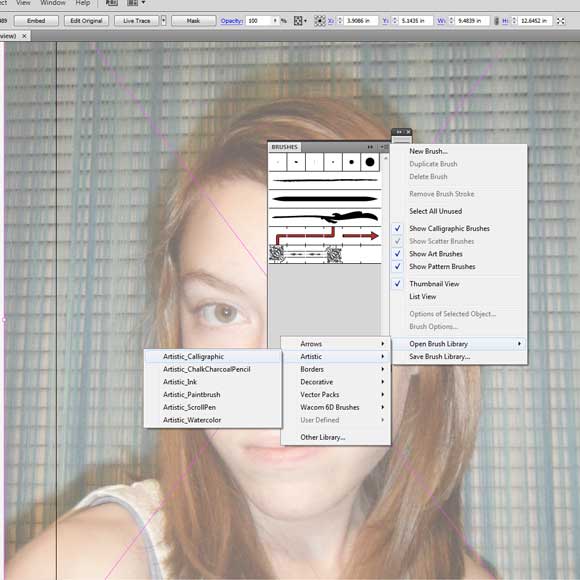
Now, we need to open the brushes. Open the brush tool box and click on the top right icon. Open the drop down bar and go to “open brush library”, “artistic” and “artistic_caligraphic”
Step 4:
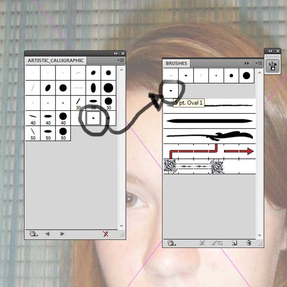
A new box will open and we’ll pick the 5pt oval. Double click on it and it will move to the brush box. Then, you can close the artistic_caligraphic box.
Step 5:
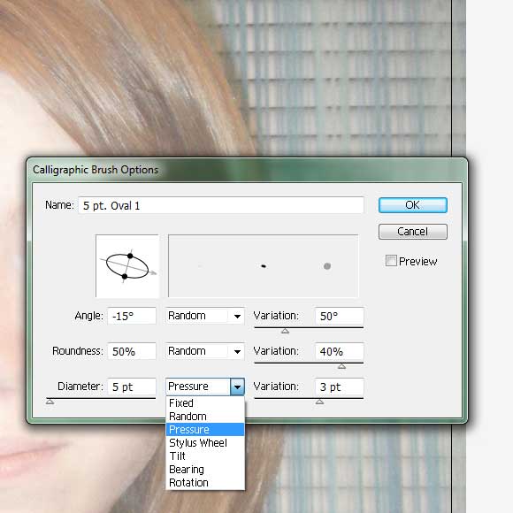
Next, double click on the brush and adjust the diameter control to give pressure and add a good amount of variation.
Step 6:
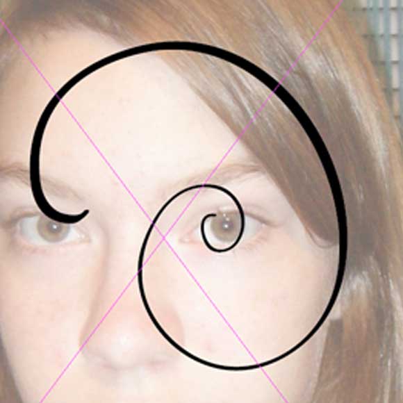
Add a new layer and test your brush out. Your brush should look like that when used with the graphics tablet. It won’t work without that.
Step 7:
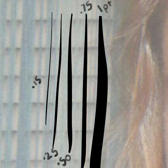
Throughout this image you will want to adjust the stroke width, the examples are shown. We will probably never use the 1pt but most definitely, the .5pt and the .25pt.
Step 8:
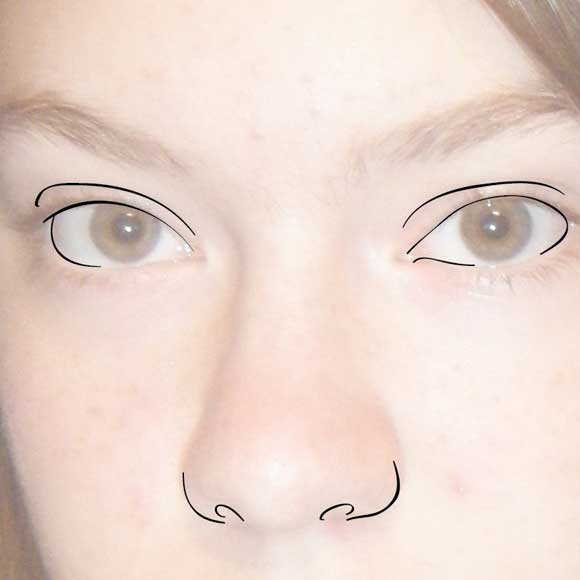
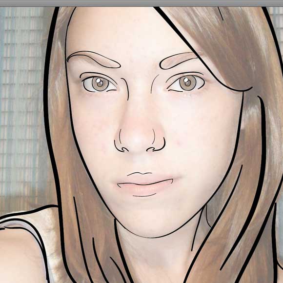
This is where drawing skills come in handy. You don’t want to completely trace every line, just the dark areas. It won’t look natural or very good if you do completely trace everything. You want to leave a suggestion of shape and not over power the view with lots of lines. Be gentle.
Step 9:
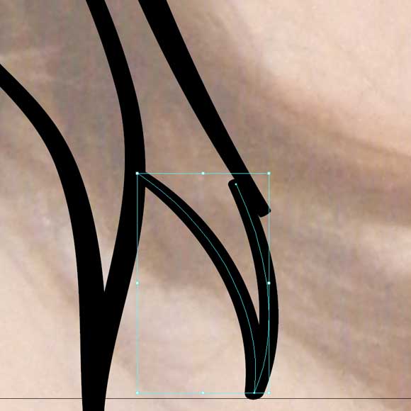
When you make errors where the lines match up, you will want to hit the selection tool “V” and move it.
Step 10:
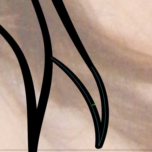
Here is another problem, the lines don’t match up. Again, use the selection “V” to select it and then you want to hit the direction selection tool “A” and grab a hold of the anchors. Here, it will act like a line you drew with the pen tool. Just move it and everything will be alright.
Step 12:
Alright, we are almost done. See how the lines in the hair are wider and then thinner on the face. Good to remember. Okay, you want to select everything except the original image. You can select everything with “Cmd/Ctrl+A” or with the selection tool. Then copy it.
Step 13:
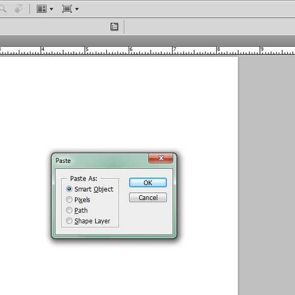
Open up a new Photoshop document. Hit paste and then hit “vector smart object” to place it.
Step 14:
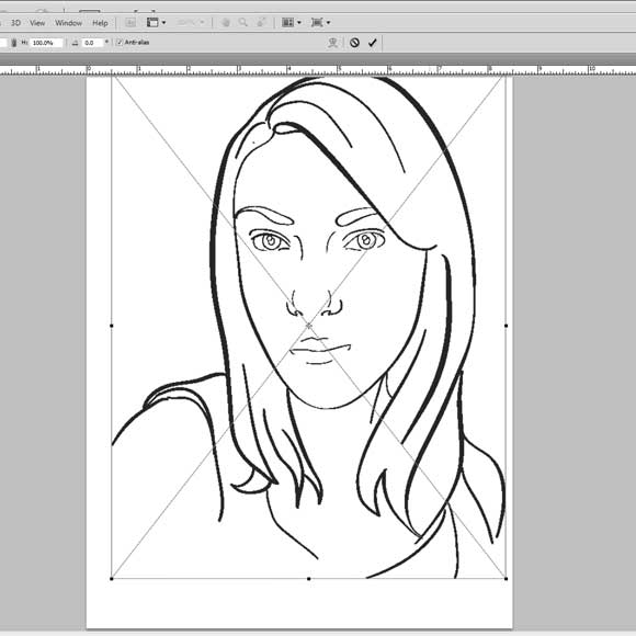
Move it around and then double click on it when you are finished.
Step 15:
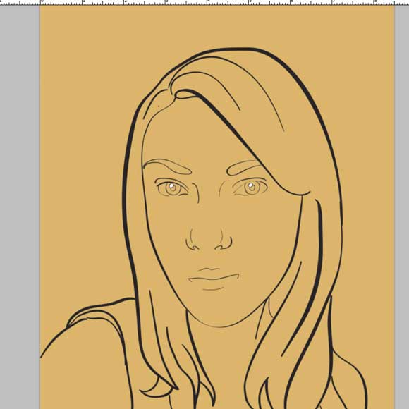
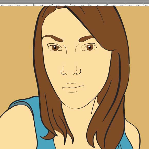
You want to make sure that the image is on the top layer and all the other layers are below it. So the lines will be all over the image. For the first color, I picked a dusty old yellow for a base because old comic book pages have yellowed over time.
Step 16:
On separate layers, fill in the color. This will be easy if all the lines are connected.
Step 17:
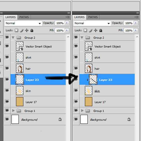
To color the different colors effectively, you want to use a clipping mask. So, add a new layer above the layer that has the color. Double click on it and a menu will appear then hit clipping mask. And it should look like the 2nd half of the image shown.
Step 18:
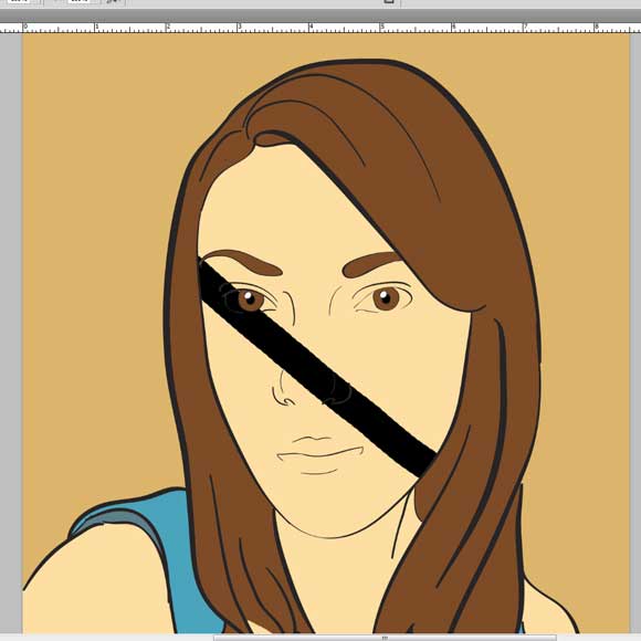
In a clipping mask work like in this image, the contents of the layer that has the clipping mask is the only one filled in when mess. Also it is not destructive.
Step 19:
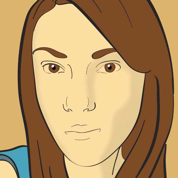
Follow the shine of the eyes in which direction to put the shadow. Make each shade a little bit darker than the original and then do some gaussian blur, but not too much.
Step 20:
Add shadow and highlights. As much as you think you need.
Step 21:
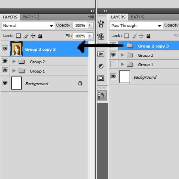
Put everything you did in its own group and then duplicate it. Then, double click on it for the menu and merge the group into a single layer.
Step 22:
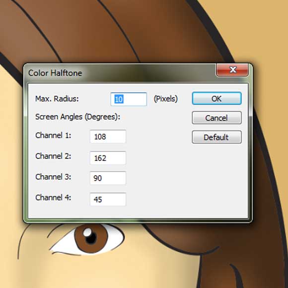
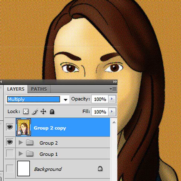
On that new layer, go to the menu bar on the top of the screen and hit go to “Filter” > “pixilate” > “color halftone.” Then punch in 10 pixels for a maximum radius. Then, hit “okay.” Watch what happens!
Step 23:
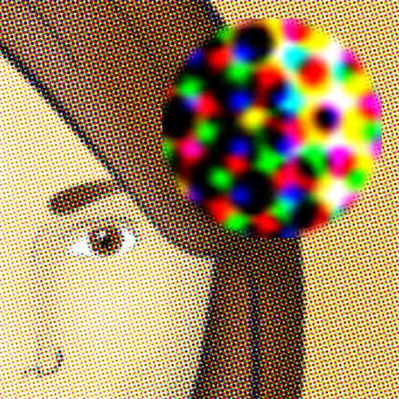
Ta-Da! It got all speckled. There is a close up of what is happening. Each dot is either Red Yellow or Blue and each dot is closer or farther apart from each colored dot to make specific color.
Step 24:
Alright, now take that speckled layer and change the layer effect to multiply. It will affect the image below it and not have it so pronounced speckled. And that’s it!
Hope you find this tutorial helpful. To see a full size view of the image, go to this link.


I feel powerfully about it and love learning more on this subject. If probable, as you gain proficiency, would you mind updating your blog with additional information? It is very helpful for anyone.
wow that’s a fantastic work! well done
It is really fantastic tutorial.thanks
Awesome work. Thanks for sharing