How to Design a Logo of Your Initials
1
One of the first things someone learns to do is sign their name. It’s their signature, their personality; their logo. When a business starts up, it learns to sign its name too — of course, it’s in the form of a logo or a ligature. The word “ligature” literally means “to tie” something together, which is what business logos usually do.
They “tie” the letters together to try to make them into a smooth and memorable design that is catchy and artistic. If you want to make your own logo or ligature, all you need is your initials and your imagination.
Step 1: Inspiration
The first step is to get inspired. Look at other ligatures on popular clothing lines, well-known toys or other brand name items to find one you like. Once you find one that catches your eye, examine it carefully. What is it you like about this ligature? Is it the colors or the combination of the names? Is it the angular design? Whatever it is, start doodling out ideas. Imitate the other ligatures by using your own initials and practicing on your computer.
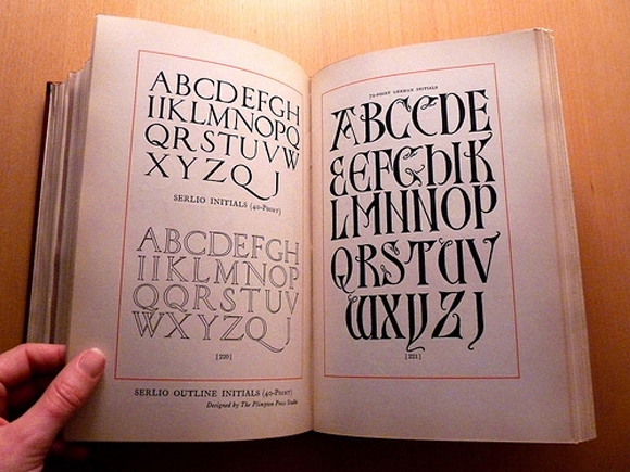
Step 2: Picking a font
A font is a style of text and fonts can make all the difference in your ligature. Pick out something that speaks to you but also looks professional. Fonts like Arial and Times New Roman are very common and easy to combine. Arial is smooth and classy while Times New Roman is clean and easy to read. Comic Sans is notorious as being unprofessional, so you might want to avoid using it unless your company is actually selling comic books.
Step 3: Types of strokes
Shared strokes: Shared strokes are when two letters are combined into one. Any two letters that have a flat side can be combined. Letters like K, B, D, F, R and L are all flat sided and work great in shared strokes designs. One popular way to design shared strokes is to use two colors to help distinguish the letters.
Similar strokes: Letters that have similar strokes, like “-T-” and “-R-” can be combined despite the difference in the top curve of the letters. A good way to help you visualize strokes is to turn your initials into outlines. Outlines can show what you’ll need to modify and can give you ideas about what will and won’t work.
Angle vertical strokes: If the letters in your initials aren’t shared or similar in strokes, they can still be combined with a little adjustment. For example: say your initials are “N” and “V.” They have a similar curve but it’s not easy to combine them without losing your V in the N. Try tilting the V or the N until they match up and then combine them.
Once you decide on the design for your ligature, the last step is ease. Use a graphics program on your computer to refine the lines and add your colors — and save it in multiple sizes so you can use it on everything you make and sell! The best option is to make it in a vector format, which can be re-sized infinitely.
To get you inspired, here are 10 really creative initials logos:
“P”: PlexiRecords:

“S”: Shadowbox

“C”: Catalogue

“W”: Whitelace
“R”: Rhombi

“U”: Uppercut

“EH”: Elle Hive
“Q”: Qool Pictures

“KS”: Kite String Studio

“F”: Fold it
Make sure to join our Twitter and subscribed to our RSS feed? If not, join us now to receive updates of new posts and free resources.



Youth on a mission