Integration of Interior Design and the Web Design
1Interior design and web design have a lot more in common than you think. They are based on common principles and approaches and the fundamental building block of these two professions is imagination. Both these works of art are expressions of the designer’s personality and creativity with certain tangible goals in mind.
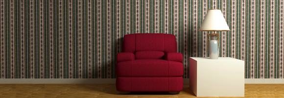
So, it is natural that one form of design can be extended into another. In fact, web designers can stand to gain a lot more by understanding interior design and vice-versa. This article will examine some aspects that web designers can use from interior designing.
Related posts:
- Are Web Designers Required to Know How to Code?
- Useful Online Graphic Design Resources to Improve Your Skills
- How to Avoid Losing Time for Freelance Designers
- Protecting Artwork Copyrights, Think again!!
Aesthetics
Aesthetics is the beauty and attractiveness of a room or a web page. Interior designers take into account many factors while imagining the aesthetics of a building. Some of the aspects that are considered include the personal preferences of the owner, the purpose of the room or building, the dimensions of the place, current trends, available technology and a sense of beauty. With these in mind, the interior designer comes up with a design that is pleasing to the eye and at the same time satisfactory to the owner and the residents of the place who are likely to spend a good amount of time here.
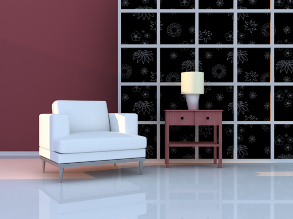
Image by shutterstock
Similarly, web designers should also have some of these considerations in mind while designing a web site. The purpose of the web page is an important attribute that determines the design to a large extent. For example, a website that sells a line of product will have a different design when compared to a website that is primarily involved in providing news. So, this purpose has a huge impact on the design of a website. The current trends and the available technology also determine the aesthetics of a web page. Animation, graphic, CSS and HTML are some of the technologies that are used in designing a web page and the designer’s level of expertise in each of these will determine its usage on the page. A sense of beauty and imagination also depends on the skills of the designer and this is what makes each page unique. Finally, the dimensions of the place and the preferences of the owner are not applicable here because the web page is intended for millions of visitors who can have differing likes and dislikes and the dimensions are usually common to all web pages.
Theme
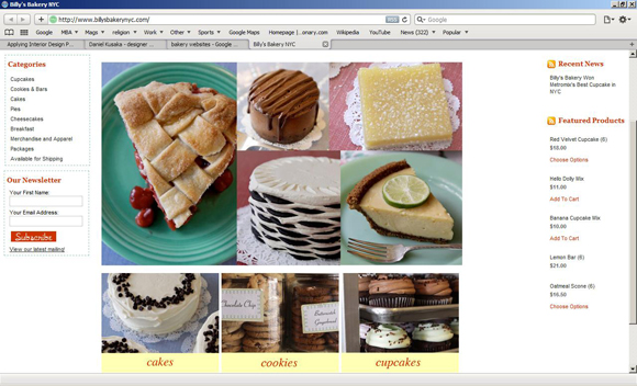
There is a theme for each room in the house and this should be the central focal point of design for an interior designer. For example, the kids’ room can have an animal theme whereas an adult bedroom can have an oriental or Greek theme. Accordingly, the layout of the furniture, lighting, color of the walls and everything should change to incorporate with the theme. The primary idea of having a theme associated with a room is that the owner or resident can connect with the place mentally and emotionally. The same is applicable for a web site too. It should reflect the theme of the company as well as the product or service that it is offering to its visitors. For example, a company involved in selling environment-friendly products should have an earthy theme whereas a kid’s site should be more colorful and vibrant.
The example below is a website of a bakery company and the theme is centered on what is sold here.
Dimensions
The dimensions of different objects in a room have a bearing on its look and feel. For example, a large object between two small objects can make it look out of place and ugly in a large room. Each furniture should complement the other items inside a room and above everything, their size should be appropriate for the size of the room. If an interior designer places three large pieces of furniture inside a small room, then there is no place to walk and the purpose of the room is lost.
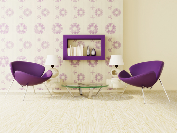
Image by shutterstock
Likewise, a web designer should also consider the dimensions of different objects in a web page. It does not make sense to have a large font besides an insignificant portion of the website because you want the visitor to focus on the important parts of the page. When a person sees the page it should not make the visitor confused. Everything has a place in a web page and each element should complement the other elements. Therefore, the web designers should choose the appropriate dimensions.
Harmony
Harmony is a vital aspect of design because it is something that strikes a cord with the viewer subconsciously. When a person enters a room, the objects should be harmonious with each other. A central piece of furniture should be complemented with good lighting or plants. Also, when there is a large piece of furniture on one side of the room, the other side should also have something substantial to create a balance between the two sides of the room. Harmony and balance are abstract aspects that are perceived subconsciously by the human brain and this determines the level of comfort one feels in a room.
Like interior design, harmony is also important for a web page. It is important to create a harmony between colors, texture and design in a page because it will help visitors to linger on the page and they are also likely to visit it again.
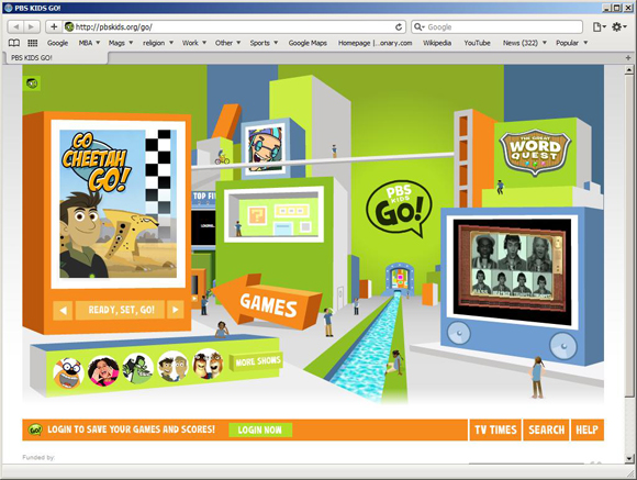
In this example, the PBS kids’ website has a complete harmony with color, images and text.
Color
Colors are ingrained in human minds and intuitively, we associate them with different things. This is what influences designers to choose a particular color or a combination of colors in any design. Interior designers make a distinction between warm and cool colors that are believed to have a certain kind of impact on the human mind. For example, bright red color depicts vibrancy whereas gray depicts dullness. Also, in interior design, the amount of light that a room receives naturally or artificially has a bearing on the room’s color.
In web design too, colors play an important role in making a web page look attractive. The right choice of colors and its spatial impact on the layout determines how good a page looks. In general, a heavy layout and mild colors go well. When a heavy layout and a bright color are chosen, it can sometimes throw the visitor off guard because of its gaudiness. Therefore, web designers should choose colors that complement the theme, layout and the overall purpose of the page to garner the visitor’s attention.
The website of Wildlife Conservation Society shown below has earthy colors that make it easy for the human mind to relate to environment.

Highlight
Every room has a central focal point and this should be the highlight of the room. In the case of a bedroom, it is the bed and in a living room; it is usually the fireplace or the couch. The other furniture in the room should be placed in such a way that when someone enters the room, they can immediately sense the focal point. For interior designers, it is the central point around which they design the room. The same rule can be applicable to web design as well. The website should have a central idea or object that reflects the purpose of the page. A visitor should be able to identify the purpose of the web page or the business of the company by a mere look at the site design. Web designers can capture this aspect by having a relevant large image or a theme or text to attract the visitor’s attention.
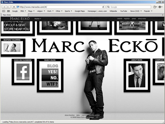
In the example below, the highlight is on the words Marc Ecko and his picture because it occupies a large portion of the viewing frame.
Grids and Geometry
Grids and Geometrical shapes add a subtle effect to the room. It strikes a particular vibe and helps create a mood that is relevant to the room. These grids are powerful tools that can create a huge impact on the owner or resident. Similarly, in web design too, grids and geometric shapes give additional touch required to make a web page attractive. These geometric shapes also help to balance a page and give a certain structure to it.
Conclusion
In short, interior design and web design share common aspects that can have a profound influence on the room and web site respectively. There is a lot that one group of professionals can learn from the other in terms of the application of these aspects.



An interesting post. I think many design disciplines have crossovers and we can all learn from each others genres.