Introduction to Infographic Design
1Information Graphics or infographics in short, is a visual representation of any kind of data or information. It is a powerful means of representing data because it reaches the audience better. The adage ‘A picture is worth a thousand words’ is perfectly applicable here.

Complex information can be presented in a simple design that is easy to understand and infer. This can be particularly useful in many fields like maps and technical information. It acts as a bridge between scientists and common people and makes the transfer of information simple and effective.
Related posts:
- Creative Infographics to Visualize Information
- Useful and Creative Examples of Infographics
- How to Design for Your Target Audience
Brief history
Though infographics is all around us today, it developed as a visual language and gained significance as a branch of communication only in the later part of the 20th century. It began to capture the minds of scientists and designers after the 1972 Munich Olympics in which pictograms and signs became popular.
Description
The aim of infographics is to present complex information in a simplified manner that will make it easy for people of all skill levels to understand what is being conveyed. It works towards reducing communication barriers and language differences between people belonging to different countries. It is universal in every aspect and this is the reason designers ate increasingly looking to adopt this concept to express their ideas.

Image by shutterstock
Some common infographics representations include signs, drawings, charts, maps, tables, lists, pie charts, bar diagrams, histograms, flowchart, cartoons, pictures and organizational charts. Each of these elements can be used to represent a wide range of data across different contexts. Any of these representations can be used by itself or in combination with others to help users get a visual feel of the data that is presented. This aids better understanding and comprehension. However, it is not easy to design an infographics and it requires extensive imagination and hard work because you are trying to convey a lot of information through a picture. Therefore, it should reach the audience well and this means, as a designer, you have to put in a lot of time and effort.
Designing an Infographics
There are many elements of infographics and these should be incorporated into every image to ensure that it is meaningful. The fundamental building block is authentic data or information that the graphic should represent. The second element is the connectors. Each and every part of the image including the boxes, lines, text and symbols that you use should be well-connected. There should be a coherence between your symbols. This is a vital part of the image and this gives the user a whole picture and a clear message. Fragmented parts can impede their comprehension of the information and should be avoided at all costs.
The third aspect is the designer’s imagination. A given data can be represented in hundreds of ways and it is up to the designer to come up with a picture that is complete, attractive and easy to understand. While designing an infographics, the designer should understand some accepted symbols that the human mind has been trained to interpret. For example, a rabbit represents speed while a turtle represents slow movement. Similarly, white is for peace while red is for war. When these accepted symbols are used in the way they should, it enhances the reader’s understanding of the image.
Once you understand these aspects, it is time to bring out your creativity. Some broad steps that will help you are:
- Decide the layout – Every infographics requires a well-connected layout. Have a few options and select the one that you think will depict the available information best.
- Color – Pick the right colors. As mentioned earlier, some colors have an inherent meaning and so do not try to experiment too much with it.
- Typography – The image should contain minimal text that is required to convey the meaning. For the remaining part, the picture should speak for itself. So, it is ideal to choose not more than three different fonts.
- Innovative – use your imagination well and steer away from the typical charts and bar diagrams. People have seen these numerous times and it does not interest them anymore. Come up with a unique design that is eye-catching in every way.
Examples
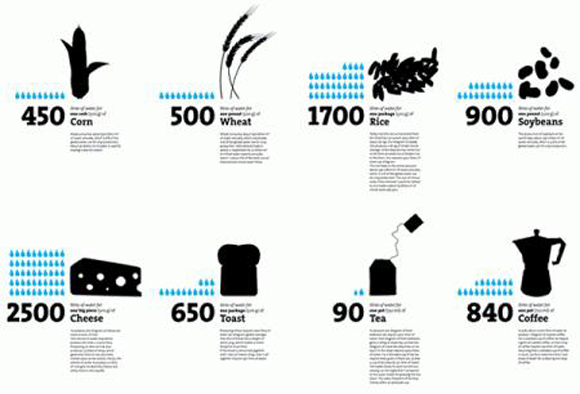
The first example is a water footprint. It shows the amount of water that is consumed by different plants. One look at the picture can give any reader a fair idea of which products consume more water than others. This is a complex data that will require pages of text to explain the effects of producing certain water-intense crops like rice. An infographics can convey the same with just one well-thought picture.
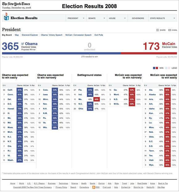
The second example shows the results of the 2008 US elections as published by New York Times. A quick look will show the number of seats won by Democrats and the ones won by the Republicans. This infographics is a good example of how established colors are used to depict information. In the US, blue stands for Democrats while red stands for Republicans and when the same colors are used, it makes it easy for readers to relate to the information.
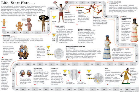
This example is about how a woman is born and the different stages she undergoes in her life before her death. This is a great example of how a lot of data can be represented through one picture.

This picture about workout speaks for itself. It shows the different postures and how a particular exercise should be done. This visual representation brings a lot of clarity about the different postures and it may even be difficult to express the same through words.
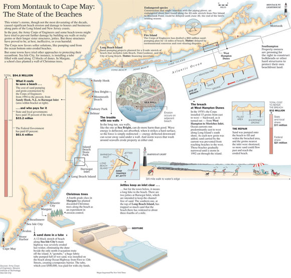
This is another great example of infographics. It contains complex information that is divided into different segments for easy understandability. One prominent aspect in this picture is the way each segment is connected to form a whole picture that gives the exact data to the reader.
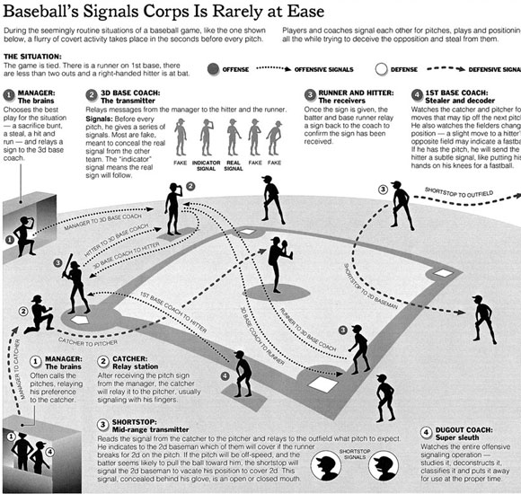
This infographics teaches a novice about the rules of baseball. It is well-depicted and is largely self-explanatory.
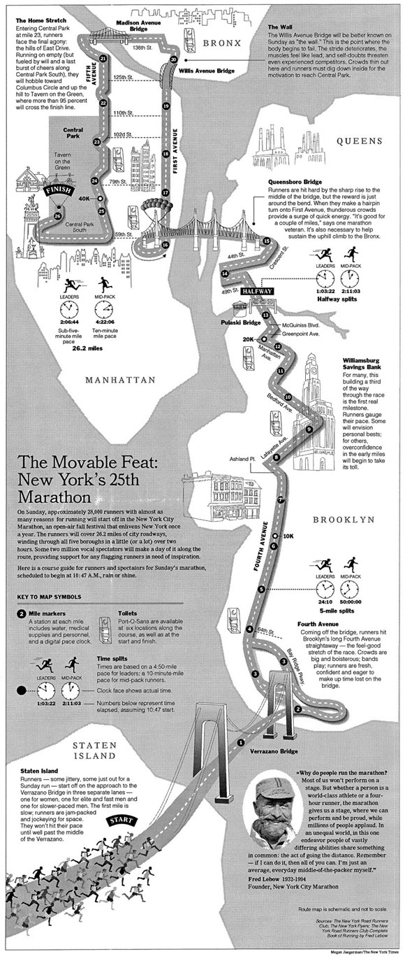
This example is a classic representation of a map. It depicts the route of the New York marathon including the mile markers and toilets available. This can be of immense help to runners as well as others who are involved in this event.
Future for infographics
There is an amazing future for infographics. More and more people do not have the time to read a long article and understand all that it has to say. They just prefer to see one image that contains a snapshot of the entire information and as a designer, you can make it possible for them. With your imagination and creativity, you should be able to represent any kind of information as an image. Most print and online businesses are looking for someone like you and there will be no dearth of opportunities in the near future for infographics.
Conclusion
In short, infographics is the way in which complex data is represented through a picture. There are endless ways to represent information and it depends to a large extent on the designer’s skills and imagination. A few basic rules mentioned above should be followed to ensure that the information reaches the audience without any distortion. More and more businesses are realizing the importance of infographics in this time-strapped world and any person specializing in this field can expect to have a great career.
If you like this article, make sure to check these useful topics:
How to Design a Logo of Your Initials
The Revolution of Green Design
Political Campaign Art: Trends and Examples


Great way to present info, text and graphics