Principles of Designing “About Us” Pages
1The “About Us” page is one of the most important pages in a website and unfortunately, it is also the most ignored one. Many designers and developers lay a lot of emphasis on the functionality of the site without understanding the importance of the “about us” page.

In this article, we will explore why this page can make a big difference to your business and how it can be designed well to attract the viewers.
Importance of About Us page
The “About Us” page serves a lot of purpose in a website. Primarily, it gives a face to the business and it is an opportunity for the visitor to know more about the company, its history and the owners who currently own and operate it. In fact, any new customer who is looking to buy a product or service will look at this page to evaluate the reliability and credibility of the company and so, this page alone is very important to determine if you are gaining or losing a valuable customer. Another reason for having this page is to make this website peerless.
The “about us” page is probably the most unique aspect of a website and ensures that the site is not lost among the thousands of websites and companies that occupy the web world today. These are some of the reasons for giving this page its due share of worth and importance.
Design Aspects
Like every web page, the “about us” page also has some mandatory design aspects. When these aspects are used in the right proportion it is bound to make the site attractive to any visitor. Below are some of the aspects that can enhance the look of your about us page.
Uniqueness
The “about us” page should be unique in numerous ways and it should strike a note to the visitors. In many cases, the visitors will remember the entire site based on the about us page because they can relate to the name of the company, its history or operations more quickly than a stereotype design that encompasses all the pages. This is the reason why the “about us” page should be unique. As a designer, you can combine different design elements, colors and textures to come up with a unique design.
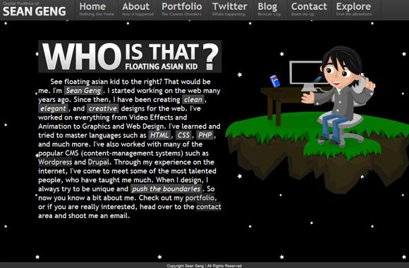
The example below is a classic example of creating a unique “about us” page. This design has a “floating” element to it and it creates a lasting impression in the minds of the visitors.
Relevance
The images, colors and the text in the page should be relevant to the business. This is absolutely important because of the connections that people make with the company through the “about us” page. You can talk about the company’s performance or business or just about anything that you feel is relevant to the operations of the company. It should help the visitor to get the right impression of the company and they should be able to easily understand what they can gain from it.
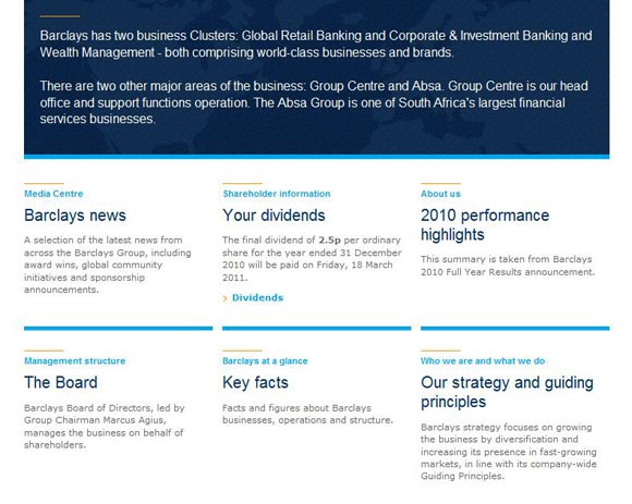
In this example, the “about us” page has detailed information on the performance of the company during the previous year, its dividends, strategies, nature of business, board of members and other information that are relevant to the user to assess and gauge the credibility of the company in a better way.
Photos and Images
Photos and images create an instant vibe with the visitor and it also leaves a lasting impression. It is a good idea to have an image of the owner or the location of the company or something that is relevant to the company’s mission or business. Human minds have the power to grasp images and relate them easily with the product or the business and this is why the about us page should have an image. It also helps to create a sense of trustworthiness of the company because when we subconsciously see the picture of the owner or the office of the company, it makes us feel secure and we will have little hesitation to become a valued customer of the company.
In the example below, the about us page of this company contains the photos of the people who play a key role in the company and there is also an image of the company’s office. This gives a big sense of credibility and the visitor will be thoroughly convinced that it is not a spam company and they can definitely have a professional relationship with it.

Simplicity
A cornerstone of any design is simplicity. The “about us” page should be simple and yet attractive. An overly gaudy page filled with numerous design elements may create a sense of imbalance and the users can tend to get bored or irritated. There should be a central focus on the page and this is achieved by using one or two elements at the most like text and images. This should be a powerful means to send the right message about the company to the user. When too many elements are used together, they may not blend well and as a result, it can grab the attention of the user from the focal point of the page. So, keep the page simple with minimal design elements.
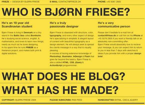
This example is simple and yet striking. It has a yellow background and the attention is captured purely by the use of different font sizes and words.
Content
The content plays a key role in the “about us” page. It should not be a boring and run-off-the-mill content, but rather it should be informative and engaging. This is an opportunity for the company to show its human face to the visitors. Typically, the page should talk a little about how the company was started and its background to give the readers a fair idea of its beginnings. Again, this should not be too long and boring. It should talk more about what the company can do for its customers and what are its missions. The emphasis should be on the information that the visitor will find useful and it should bring out the company’s personality. The content should revolve around why the customer should do business with this company. These suggestions will go a long way in making the content readable and yet convincing. It can also talk about the awards won by the company to further boost its credibility in the eyes of its potential customers.
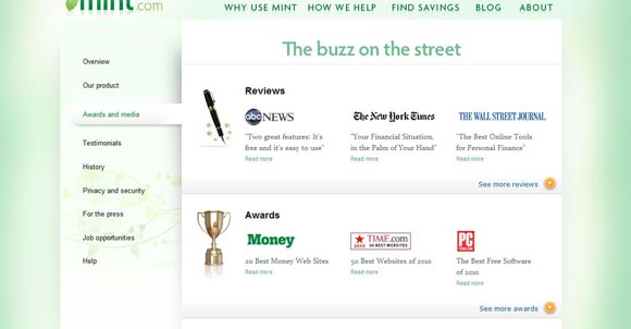
In the example below, the about us section comprises of many pages and each talks about a specific aspect. It is a good idea to make it elaborate so that it is easy to read and viewers can only click on the portions that they want to see. This website also has awards listed as part of its “about us” section.
Conclusion
In short, the “about us” page gives a face to the business and it helps the visitors and potential clients to understand the mission and operations of the company. It is not a page that can be developed within a few hours by throwing some words into it. It is rather a page that requires careful wording and design because of the huge impact it has on the readers. Therefore, every designer should understand its importance and incorporate the above design suggestions to make this page alive and enticing to customers.



very helpful….
Thanks