Tips to Avoid Creating Redundant Designs
1Routine can be creativity’s biggest enemy.
Schedules are great for staying on task and habits are a wonderful way for our brains to save time and work more efficiently. However, when it comes to making distinctive designs repetition can be a dangerous way to slip into making projects that come across as mundane. Routines and creativity are typically not a good blend since the outcome often involves drowning possible ideas. And so I’ve composed a list of some excellent ways to escape the mundane and venture into the world of the unexpected.
1. Rules Aren’t Rules!
For any person working as an artist this is extremely important. Yes, rules are great for helping you stay away from those horrible fonts and colors that never look good. However, rules can often be restrictive and prevent new ideas from being realized. Rules should be treated as flimsy guidelines more than anything when you’re attempting to make an artistic statement.
As designers we want to grab someone’s attention and make an impact on them that they will remember. Therefore, it’s important to think of as many potential possibilities regardless of what “the rules” say. Being unexpected is an effective way to grab that initial attention of your audience. So in short, take rules lightly and put creativity first then take a second look and see if there are any rough edges to smooth over.

2. Try to recreate some of your favorite designs
One of the best ways to learn (especially in graphic design) is through copying. It’s important to note that I’m not talking about ripping someone off, but rather learning by recreating. There are so many great designs out there with plenty of amazing styles and often times solely looking at them won’t ingrain the design elements in your head. So if you have some spare time, take one of your favorite designs and use the same style to make a similar project. This process works very well for learning new techniques and adjusting the way you approach new projects.
The recent Google redesign is one great style to try this exercise with. You can see in Google’s icons how the graphic designers made beautiful symbols with simple shapes and shadows without soft edges or fading. Another great design quality to note in the redesign of Google is the colors they chose, specifically the level of saturation. This lack of vibrancy gave the designs an entirely new feel so why not see if you can replicate that and then maybe use similar ideas in the future.
Give it a try and that way you will have a larger pool of ideas at your disposal if a job or personal project comes up that can utilize these styles. When replicating a style, think about why a designer might have chosen to put things where they did. This way you’ll gain an understanding of their process so that you can use similar lines of thoughts in your own work.

3. #Throwback Thursday
Another great idea for staying creative and keeping up with the crazy world of design involves looking back at designs from the past. Trends tend to resurface over time and some great designs use the techniques and elements from older work in order to draw more interest to a new idea. One example of this is the “retro style” which always seems to poke its head back into the world of design. We saw this strongly in the American muscle car industry where makers such as Ford Mustang and Chevrolet Camaro threw back to the older models and ended up being quite successful.
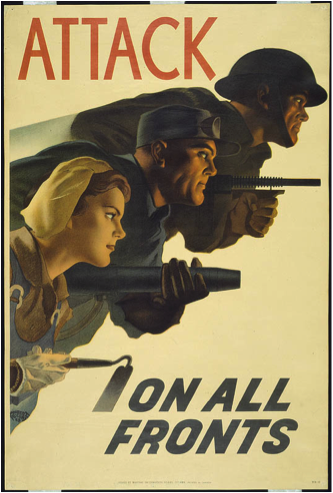
One great thing to do when looking for inspiration is to take a look at some early 1900’s posters and dissect what makes them interesting. You will instantly notice the difference between modern styles and the ones from sixty plus years ago. Many of these differences can be used in your own pieces to separate your work from a design that looks similar to everything else. For example try incorporating the shading styles seen in these old World War II posters into your own designs and see the difference it could make.

Not only does this generally improve the designs we make, but it can be a super helpful tool since creating feelings of nostalgia is an extremely effective marketing strategy. And just to prove that this is worth your time, take a look at one of the most famous and iconic logos ever created. The Coca Cola logo was made in the 1880’s and to this day still retains the same style as it did back then.

4. More or Less Interesting.
A great tip I read from Sam Mendes the director of Sky Fall which personally helps me to avoid stifling creativity and progress is that things aren’t right or wrong in art, but rather more or less interesting. It is important when creating a design to avoid sabotaging yourself because you feel a graphic is “bad.” Since our jobs as creators is to catch people’s attention in order to drive a point across (whether that point is, “Buy this” or simply, “Here’s what I think”) it’s important to focus on interest instead of simply, “Is this good or bad?” at least when you’re building your concept.
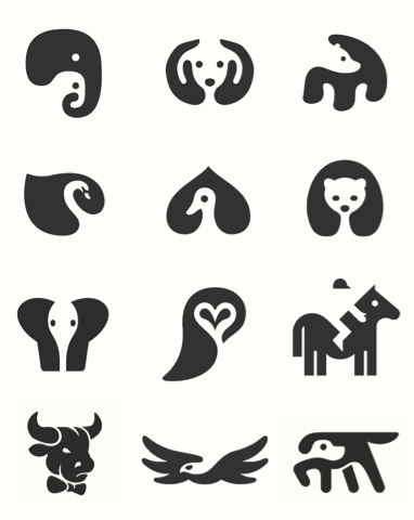
One great example of creating something interesting is the extremely popular minimalistic negative space animal icons. These icons display something as simple as a few animals, but the way negative space and simple geometry is applied makes a pleasant and intriguing design. In short, make changes to things and experiment with ideas that come third or fourth since the first couple of ideas will often be what is expected. The importance of avoiding drowning your creativity with negativity is the main point here, work instead on making variations of your idea and decide what looks more interesting.

More tips from Sam Mendes here: http://www.vanityfair.com/online/daily/2014/03/sam-mendes-rules-for-directors
One tip which should be pretty obvious to any designer, but can often times be forgotten is to take a look around you. Observing surrounding environments is one of the best ways to find inspiration. Look out a window and take a picture and you may find yourself with a great new scheme of colors. Take a look at some of the objects around you and pay attention to the shapes and curves of things because they may just give you a great idea to help get through that awful stuck feeling we can all experience.
The things we create are always inspired by the things we hear and see. Therefore, seeing and hearing more ideas (especially new ideas) will undoubtedly improve creative work.
Even things that are not visual can inspire our visual works. Music is a great way to inspire new ideas and moods. A different type of music could help you think in a completely different way. When trying these exercises attempt to do them away from the computer. Instead, get away from your house itself, because the chance of something irregular happening away from your home is much greater. The stranger something is the more interesting it will most likely be.
A beneficial variation of this idea is to look into other skills that you don’t typically work with. If you work only in graphic design then take a look into some behind the scenes of sound design. If you do most of your work on the computer, attempt to make something completely out of tangible objects to experiment and get new perspectives.
6. Feedback.
For people working in creative fields getting feedback exists as a crucial aspect to improving work or even style in general. First of all, feedback lets us receive critiques and the opinions of people who we may be advertising to someday and so their thoughts on a project can be very helpful. However, often times the critique side is not the important part. Sometimes we just need a, “Good job” to escape a rut. But the only way to earn a compliment like that would be to share work. Today sharing work is extraordinarily easy especially with sites such as Behance or even Facebook and Twitter. Sharing a project or an idea and getting a comment or two about it can make an unbelievable difference especially when you’re stuck.
So give it a try and put a few files together to put up on Behance’s great Work In Progress library and then tweet about it.

When you’re trying to brainstorm and come up with a new idea it can be difficult to think differently and get some diverse ideas flowing. I find myself falling into the trap of making overly redundant graphics all the time. It can be extremely frustrating to get away from this. Even though having a style is great it’s also important to have varied design approaches in order to attract more attention. Hopefully, trying something out from this list can help you avoid repeating your usual works and instead continue to surprise yourself and others with great new concepts.
What do you think? What works best for you?


Great article, some of the tips get straight to the point, while others seem to be far more broad. I’ve always had this idea of simplicity in design, something of everything — but, never too much of something. FLAT design is definitely gaining momentum, but I think it’s worth waiting until it becomes more ‘bubbly’.