Tips for Creating a Magazine Layout in InDesign
5Adobe InDesign is the most popular application in the world for creating book or magazine layouts.
The program is flexible and full of options, yet intuitive. After you get used to it, you will find out it is very easy to use. It differs from the other Adobe applications from some points of view. I know a lot of quick ways to work in Photoshop and Illustrator, but first when I have used InDesign I have realized that I need to learn the shortcuts again, because they are different.
I am not an InDesign expert myself, but I have a strong knowledge of the program and I can make a list of things you would like to know before starting to work with it. Not because you can’t use it properly, but because it will spare you a lot of time.
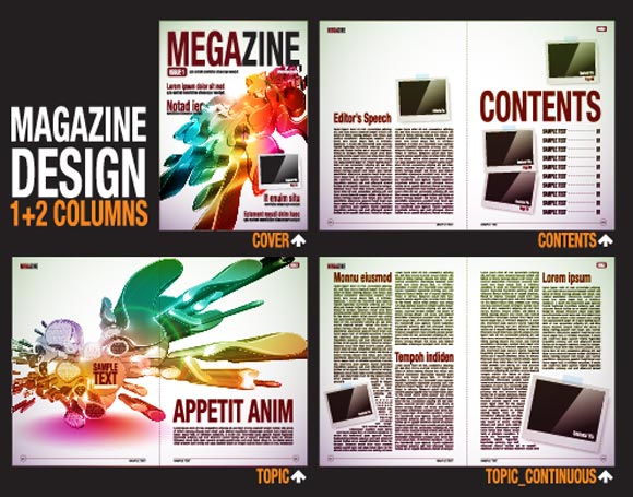
Image by shutterstock
Master Pages
If you design a single-page layout, you can handle it with Photoshop. However, if you have a multiple-page publication you need to design, Master Pages help a lot when you want to automatically insert certain elements in all the pages. Let’s say you want the page number to be showed on the right bottom of every page, or some graphic elements to be present all over the place. Grids and guides are also easy to set and use in your Master Pages panel.
To set those pre-defined elements you have to access the Pages palette and double-click on “A-Master”. Every element added on the Master Page will be present all over your document. You can create more than one Master Page. To apply any of it to a certain page in your document, you just have to drag it onto the Pages panel in the palette. Any page can be turned into a Master Page, so do not worry if you have forgotten about setting it in advance.
Margin and Bleeds
The margin and bleeds are mainly important to keep in mind when you design a layout for print. If you have the design on your computer only, it will look fine, but printing it is a total different task. Do not forget to set your margin and bleeds in the beginning, not during your work. Those two settings can alter any text or graphic element you already have on the page, so work wisely and set the margin and bleeds before putting content in.
Image by shutterstock
You may not know how to adjust the settings, but the printers usually give those measurements. Otherwise, 1/8 inch or 3 mm should be enough.
Frames
Everything in InDesign happens inside frames. It’s like everything in web design happens inside boxes. Images and text have to be placed within frames to work. The text frame is not very difficult to use. After you create it, you can type some text in yourself or import it from other file. You can import text by going to the File menu and choosing Place.
Now, if there is something I enjoy in InDesign it is the placeholder text. Sometimes, when you create a design you do not have the content yet. If that’s the case, just create the text box, right click inside it and choose Fill with Placeholder Text. InDesign has a wide collection of random Lorem Ipsum text and will fill the box with it, so you can see how text looks.
The image frames work the same. You can fill the box with a color or certain a picture from your computer. Users can also import images by dragging them onto the document. This will automatically create an image frame for you.
Proper Images
If you plan on printing the magazine, make sure your pictures are large enough. InDesign can import many formats, but can’t do wonders when printing if your pictures are not high quality. The images need to have a resolution of 300 pixels per inch (PPI) and to be saved in CMYK.

Image by shutterstock
CMYK is the language a printer understands. RGB are colors for computer screen, so if you plan on printing a picture which is in RGB, the output will be different, even if you have the best printer in the world. They just do not get RGB. Change the graphic element to CMYK and you can see on your screen (with small differences) the actual output.
The images you import do not have to be at more than 100% of their size. We recommend sticking with EPS and TIFF, two formats intended for prints.
Import PSD files
Being able to import PSD files from Photoshop is huge. Transparent files do not have to be exported in Photoshop and imported in InDesign; you can just import them automatically. If you import a PSD file, you will even be able to adjust it in the application, because you can turn layers on and off without even having Photoshop.
However, imported PSDs use a lot of memory and you might encounter some issues when you want to export the layout as a PDF file. Use this option wisely, just for the cases you really need. Otherwise, just flatten the images as TIFF or EPS and use them this way.
Color
The same adjustments should be used for colors, not only for pictures. When you turn your black text into blue, make sure the blue is a CMYK color. The basic colors in the Swatches palette (press F6 to see it) are all in CMYK, so you can use them and be sure they are going to be printed exactly like that. You can also import swatches previously created in Illustrator or Photoshop, but keep in mind their type.
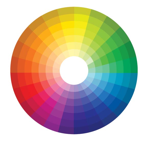
Image by shutterstock
Pick the right black
It may sound weird, because black is black however you look for it. Well, in CMYK black is made up from four colors (40, 40, 30, 100), and this rich black is really useful when having to print large areas with this color. It is very useful for outdoor posters and flyers. Huge billboards are printed with a CMYK black.
However, keep in mind that pure black should be used when working with text. If you work with pure 100% Key (K) color, you will avoid trapping problems. The rich black used for large areas should never be used for body text or thin lines.
Check the preview
Instead of hiding the guides all the time to see a better preview of the layout, you can just hit the W key to toggle between the document view and the working view. You should use this often, because guides tend to distract the attention from the big picture. If you hit the W key you will be able to see a preview of the whole page and allow your eyes not to be distracted by guidelines.
Those are some tips for the first time you use InDesign. If you are a proficient user, I do not expect you not to know those basic things, but as a novice, some of them might not only spare you a lot of time but also stress.
Now, it’s your turn. Do you have some InDesign tips you would like to share with the community? What do you like most about this application and how long did it take you to get used to the many small things you need to know?



Great techniques…. good one…
It was really excellent post! Thanks a lot for sharing..
Incredible article and resources you have provided. I would be more than happy to share this with my followers! Keep up the great blog!
im working at CTP (computer to plate) department and for K artwork im using 40,20,20,100
You forgot one important thing. Fonts. Could you point me a few relevant fonts that I can use for an online magazine?