Tips for Creating Effective Single Page Websites
1Single page websites are becoming more and more popular for many reasons. Firstly, it takes less time to create them and a smaller space to host.
So, this means more profit and less effort both for the designer and the company. Another advantage is that users can be presented crisp and clear information and there is no need to include a bunch of pages to convey one message. It also makes it easy when it comes to online advertising, because it costs less. All these factors make single page websites an attractive option for many companies and entrepreneurs.
From the designers’ point of view, this can be a great platform to showcase their talent and skills. While creating larger websites with many pages is more common, these single page websites test the creativity of the designers and help them give their best every time. The tips below can go a long way in helping any designer to fine-tune existing single page websites, or create new single page websites and make them appealing to viewers.
Understand the purpose
Understanding the purpose of the web page is the first step towards building one. The web page should be firmly based on the purpose, and any user who sees the page should be able to ascertain with relative ease the nature of the product, or service offered through the web page. However, this does not mean that the site has to be dull and boring. As a designer, you can bring on all your skills to create a page that truly serves its purpose, and at the same time is eye-catching for the users.

In this example, the single page is about the designer called Vadim. His portfolio, as well as his contact details, are available on the same page, and users can access it by scrolling or by clicking the links. The designer is clear about his purpose, which is to popularize his profession, and he exhibits it effectively.
Keep the focus on the topic
The single page websites that you plan to build should be focused. As a designer, you should strive to keep to the point and not stray away from what your website is intended for. For example, if you are a designer looking to advertise your work, then use the web page to display your best content. Talking about your hobbies and your passion is unreasonable and takes you away from the focus of the website. Also, you have little space to say the important things, so, make sure you use the space well to convey exactly what you want the users to know.
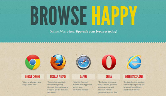
The example below is a single page website that offers the latest versions of different browsers for download. The heading followed by the one-line content clearly explains what this website is all about and what users can get out of it. It focuses on the download part and does not go into the comparisons or features, which would take the focus away from the download.
Create an appealing layout
The layout is probably one of the most important aspects of a single page website. This can be more challenging than you may think, because you have to convey your message as well as capture the interest of the user – all with just one page. Most single page websites have a hierarchical layout and users can scroll down to see more. As a designer, your aim is to inform the user of the purpose of the web page, and so you have to use a layout that will be most effective. People tend to see larger fonts better than smaller fonts, so using this to your advantage is a good idea. Highlight the areas that you want your users to see and reduce the font of the less important parts. Bold text and the right mix of colors can give a boost to your layout. You can also combine different design elements to make the page more engaging.
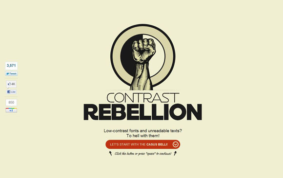
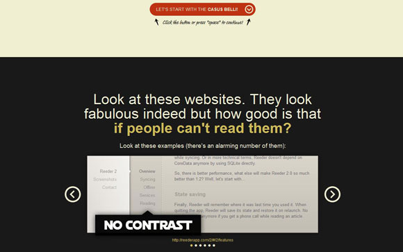
The example below has an appealing and yet simple layout. As the user scrolls down, the layout changes and at the same time, it keeps the users engaged.
Avoid clutter
It is tempting to present all the information you have in a single page. However, it will not only decrease the look and feel of the website, but will also make it cluttered and confusing for users. When you present a lot of information using different objects, such as text and videos, the user does not know what to do. When this happens, the purpose of the entire site is lost and all your effort goes to waste. To prevent this from happening, keep your content simple and crisp. The user should know the purpose at a glance and they should never have to search for any information. If there is a need to present a lot of data or statistics, then it is best to go for a multi-page website.
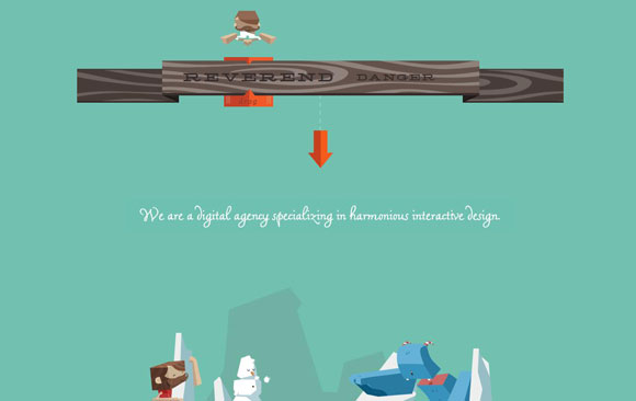
In this example, the message is easily understandable and there is no unwanted clutter.
Keep the navigation clear
Navigation is often an overlooked aspect when it comes to single page websites. On the surface it may seem unwanted, but navigation continues to play an important role in one-page websites too. As a designer, you should be wary of sending your users to an external website and it should only be done when there is no other way out. Also, you should inform the user before sending them to an external website. A good example would be YouTube videos that are displayed on the page. When the user clicks on the video, he or she is automatically redirected to the YouTube site without warning. This can be irritating for a lot of users and more importantly, it distracts the users and takes them away from your website. So, stay on top of your navigation too while designing a single page website.
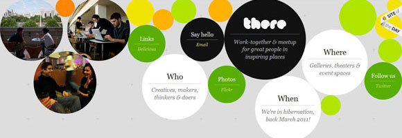
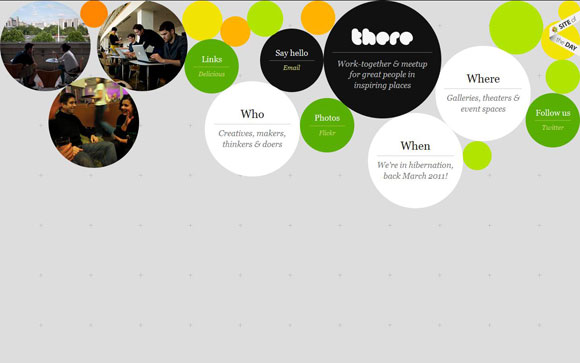
The site below is a great example for good navigation. The links to external sites are distinguished by the green circles and they say so on the labels. This will warn the users if they are being redirected and they can decide if they want to navigate or not. It is always best to leave the decision to the user, because they feel empowered when they can decide about navigation.
Be creative
Single page websites are the best tool to bring out your creativity and talent. There is so much you can do to make the site simple and attractive. In fact, this is one of the most challenging projects you will ever take up as a designer. Use this opportunity to show the world what you are capable of, and never hesitate to experiment and try something new. Use pictures, different colors and even photographs to come up with a unique design. Novelty and uniqueness can make you stand out in this crowded world of websites.
In this example, the “jump now” navigation is apt and gives a unique flavor to the design. You can also try to have one or more such exceptional elements on your website.

Use coding whenever needed
You may need some amount of coding on your web page, especially if it has to perform a specific functionality like processing a payment. You can do the coding yourself, or take the help of others to get it done for you. AJAX and JavaScript are the two most commonly used coding languages on these pages.
In the example below, the single page website has a fair amount of coding that gives it the desired effect. So, you can also use coding wherever needed to improve the overall quality of your website.


In short, single page websites are a cool way of presenting information to the users and at the same time, it is also challenging for the designer. The above-mentioned tips can help you design single page websites that are user friendly and appealing and this, in turn, can give a huge boost to your designing career.



Thanks for the info. I, personally, like single page websites, but definitely don’t suggest using them for SEO purpose…