Travel Store Websites: Design Blunders & Best Practices
0Some famous travelers, such as the Baker family of the Man Vs. Debt blog, have traversed New Zealand with little more than what they can fit in a backpack. Fortunately for owners of e-commerce travel store websites, most people don’t like “roughing it” like the Baker family.
Whether you rent condominiums on exotic beaches or sell high-quality leather luggage, you need a website that’s as picture-perfect as the destinations your customers visit. For that reason, your e-commerce site should be easy to navigate, easy to complete a purchase on and easy for you to maintain. We can’t talk in terms of maintenance, because it depends on merchant’s skills and experience and also on the type of software they use. But we can discuss the general travel store design & functionality as visitors.
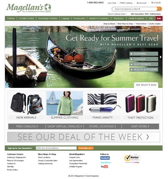
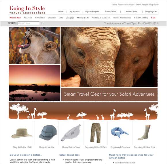
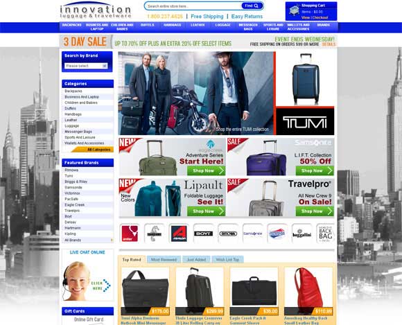
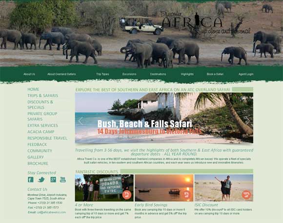
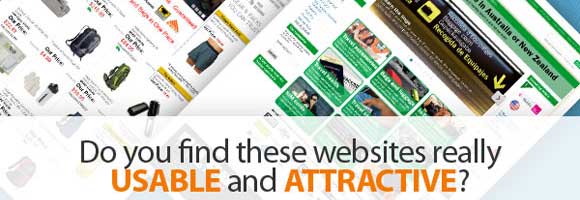
After browsing hundreds of travel store websites, we have noticed that a greater part of them leave much to be desired. They feature small unattractive images and photos; sometimes these images are of poor quality and make websites look even more tasteless. The layouts of such websites are overloaded with tons of information and links, flashy fonts and design elements, and it’s hardly possible to make heads or tails of what they present or try to sell on. Below is the visual proof of what we are talking about:
But our purpose is not to criticize the travel store websites. On the contrary, we would like to present the travel store web design in its fullest and provide you with the useful recommendations on how to improve your website by pointing out the main criteria and showing you some beautiful examples of online travel stores and travel agencies websites.
Photography & General Atmosphere
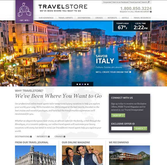
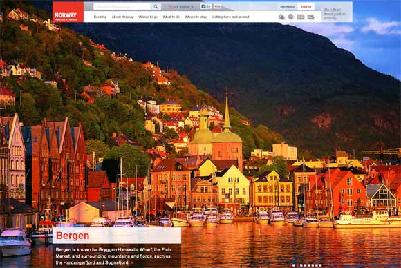
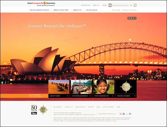
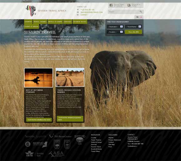
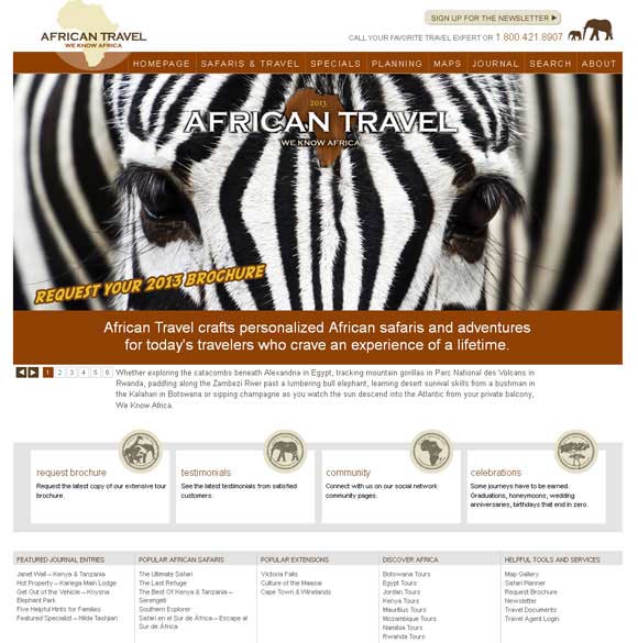
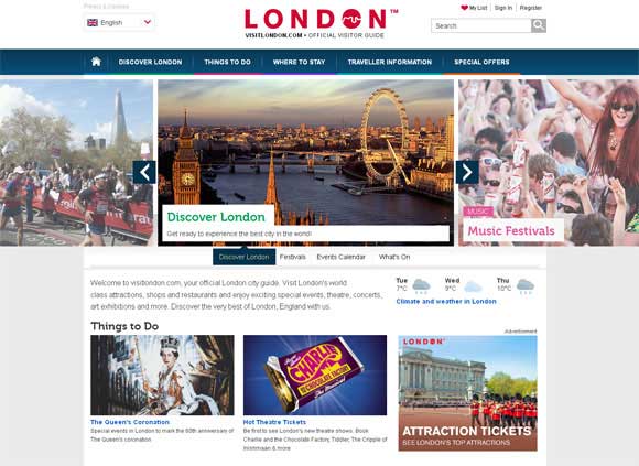
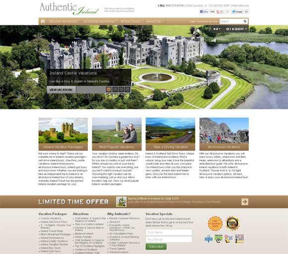
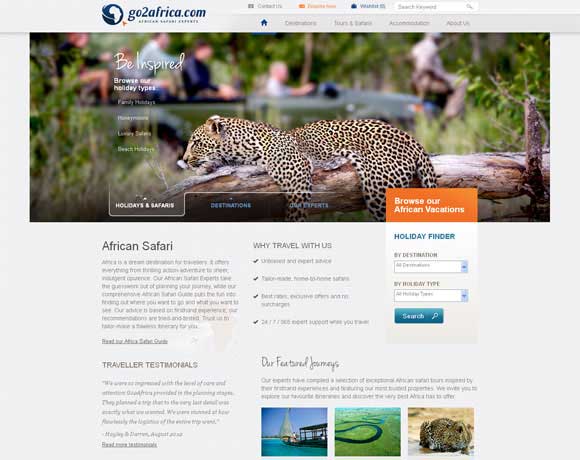
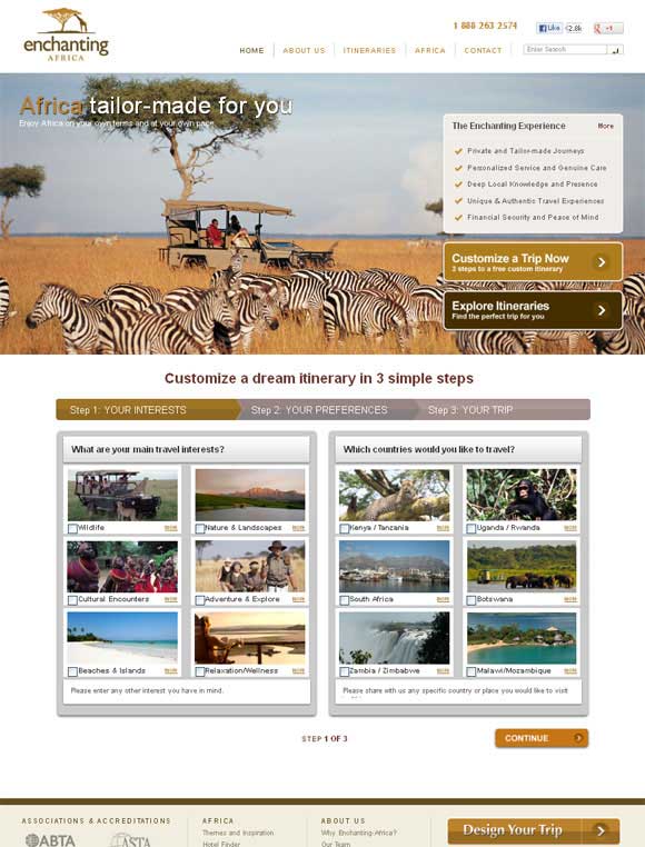
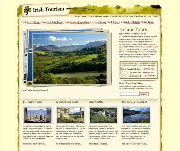
Photography is the best way if you want to sell on the product. And you can’t take the cheap way out here, as poor hotel interior pictures or poor landscape photography can do even more harm. Picturesque photography can help visitors or customers get a feel for the places the travel agency provides, and they will feel more confident in their decision to go there. Here are a few websites that did particularly well:
Color and Texture
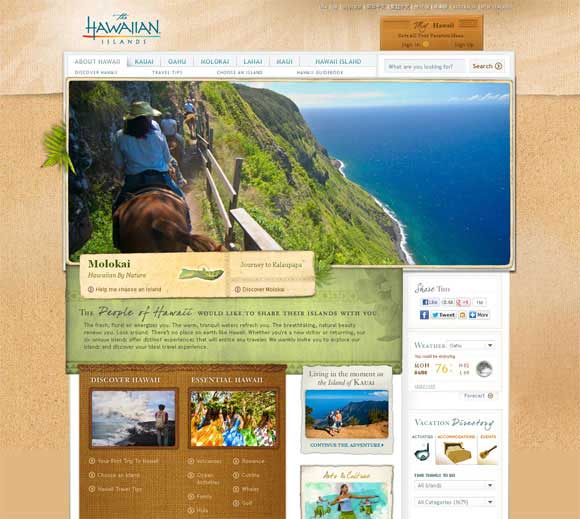
Using pleasant bright colors is a good practice for travel websites, as color enhances the fascination and helps set the mood. For example, orange and yellow are associated with the tropics, joy and sunshine. They produce a warming effect and arouse cheerfulness. Green has always been considered as the color of nature; it symbolizes harmony and freshness, whereas blue, the color of the sky and sea, is strongly associated with calmness.
Texture as well as color is also a very powerful design tool. And the site GoHawaii.com (below) is a good example of it. The home page of the website is full of different textures.
Categories
Quite often this part of the site offers a terrible user experience. Think through your categories carefully and don’t confuse your visitors with tricky navigation by creating dozens of categories and subcategories with only few products in them.
Contact & Ordering Information
Remember that no matter how attractive and cool your website design is, first off it should be usable and user-friendly. With any site design, you should always carefully consider the goals of the average user. For a travel store, we can guarantee that your customers will be looking for a few specific pieces of information:
- What’s the contact info?
- Can I make an order or reservation online?
- What’s the price?
- What is the place like? (Graphics or video)
Try to make this basic information highly visible and never make your visitors hunt for it. If you are looking for a good example, check the website below:
Examples of Attractive Travel Store Websites
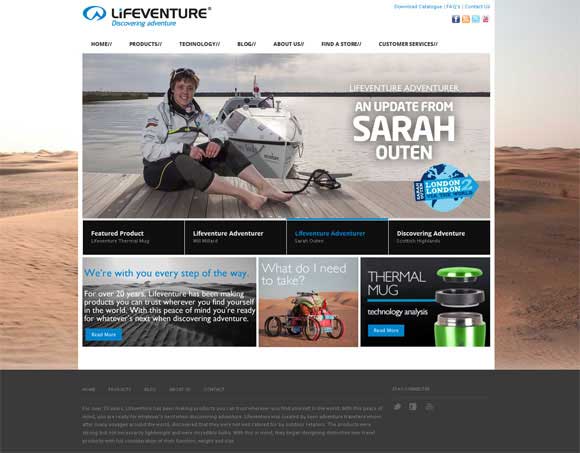
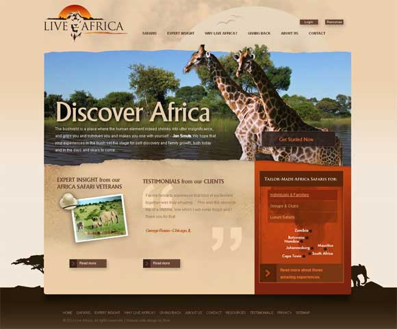
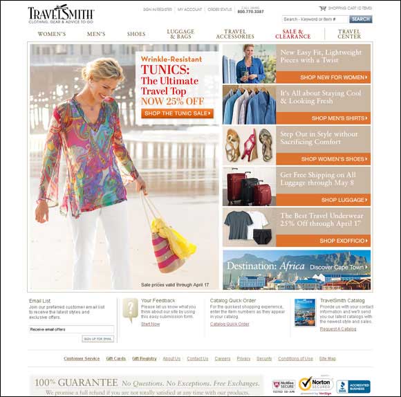
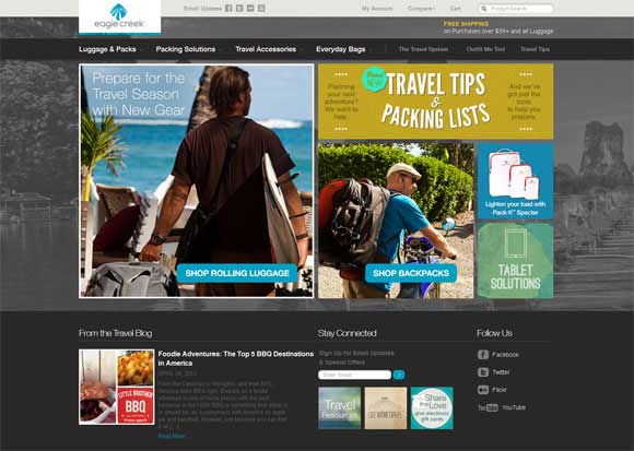
Below you will find some more examples of travel store websites that are worth looking at. They feature high resolution photography, attract visitors’ attention with pleasant color palettes and provide user-friendly navigation.
What do you expect from the travel store websites? What are your main requirements? Share your thoughts in the comments below.

