All About Typography in Web Design
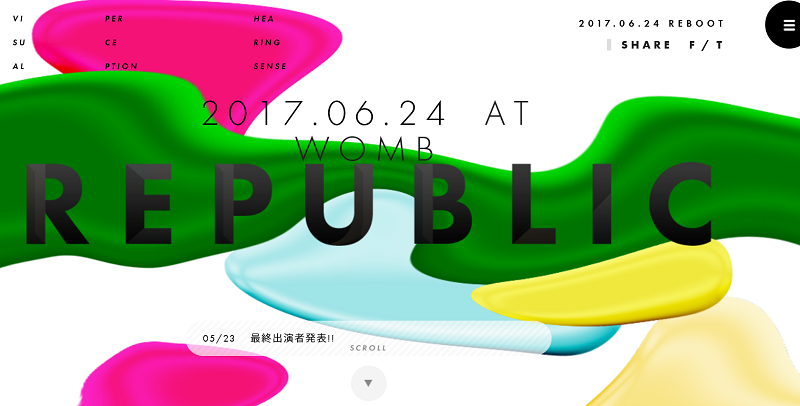
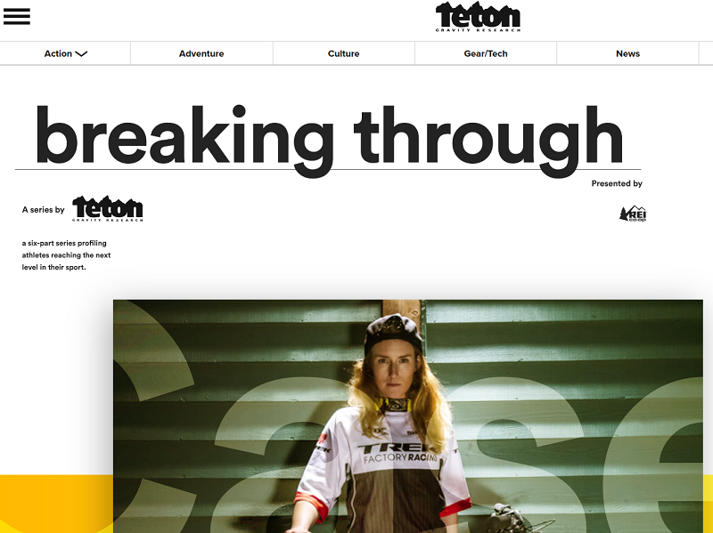
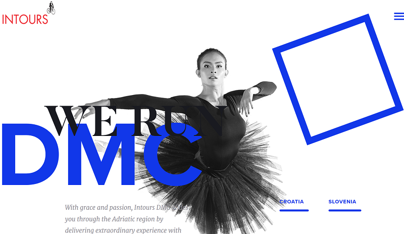
0A well-known fact in the world of web designing states that when users visit your website, along with colors, images, and layout, typography too plays a vital role in enticing them. Some UX experts call typography the voice of a website as it is the main thing that actually talks and communicated with your visitor.
And since communication is key, it’s crucial to establish a connection between the user and the website so that the user can accomplish the goal for which he visited the website.
Since we have established the importance of typography in web design, there is a lot a web designer should know about before selecting fonts for their web design. Therefore, in the article below, we will discuss some basic rules involved in mastering typography and some useful tips to help you design a website where the text is readable and legible.
1. Go Through the Text Once
It is pivotal that you, as a web designer, read the entire text thoroughly. You may think, now that is simply a waste of time. But simply copy pasting the text out of a text file does not absolve you of your textual duties. By reading the text yourself, you can get an idea of how best to integrate it in the website and to make the design and the text cohesive.
2. Use a Minimum Number of Fonts
Using too many styles and sizes of the type is a recipe for disaster. Just like the design, it is best to keep the number of fonts to use in the website to a minimum.
When you use many different types of fonts, they all grab for attention and then the text itself loses its meaning and the user is left focused on fonts only. While one font is usually sufficient for a nicely designed website, two is also a good number. And if you absolutely have to, three is the hard limit. And make sure every font you use complements every other in terms of character width.
3. Loose the Dummy Text ASAP
Specific tweaking in the website cannot be done with dummy text. Unless your text is actually just Lorem Ipsum, drop the dummy text as soon as possible and use the real text. Ask your client to provide you with the text early on in the process. Trust us, it will make your work so much easier.
4. Steer Clear from ALL CAPS
All caps is workable as long as you are using it in headers or logos but using it in the readable text is not a wise thing to do. Capital letters is like forcing the user to read the text and we all know that defies the purpose of a website being easy on the eyes.
5. Establish a Clear Hierarchy
When a user visits the website, he should immediately know where to start reading. Every website needs a well-established hierarchy, which can be achieved through good typography. Hierarchy involves employing clear indicators of where to start reading and how to proceed further.
6. Spacing Between Lines
Spacing between lines is very important. The spacing should be just enough to improve good readability. As a general rule, a line height of more than 30% than the character height is just perfect. Any less than that and you have the user vying for focus and any more than that, you have lost the user’s attention.
7. Use the Right Type Colors
Absolute care should be taken when using type colors which should be corresponding to the background color. The basic rule to remember in this regard is that the color of the text should be drastically different from the color of the background. While black over white is a universal perfect combo, some other combos like dark blue over pink can work just as well. Just know that reverse text (pink over dark blue, for example) is a bit tricky to pull off and cause some trouble.
8. Avoid Using Red or Green in Your Text
In today’s age, color blindness is a pretty common condition, especially the red and green color blindness. Therefore, it is always wise and considerate to avoid using the colors red and green to highlight important information. There are so many other colors you can play with and if at all, use other cues for highlighted information along with the usage of red and green.
To conclude the matter…
Good typography makes it easier to read text on the website while poor typography makes the users turn away from your website. Typography plays a huge role in optimizing your website user interface. Arranging the type is an art and any web designer who masters this art has mastered web designing.


