Understanding Swiss Style Graphic Design
2The Swiss Style of Graphic Design, as its name itself implies was developed in Switzerland during the 1950’s and became popular worldwide because of its precision, clarity, readability and typography.

It is also known as the International Typographic Style. It became a new revolution in the world of graphic design and was instantly adopted by artists all over the world.
History and Background
This style originated in Russia, Germany and the Netherlands during the 1920’s and it spread to Switzerland after the World War II. The world-class Swiss designers improvised this design and came out with a new wave of graphic language. This was evident in not only the posters, but also was prevalent in designing train tickets, travel pamphlets, drug labels and even bank notes. This style, otherwise known as, “Neue Grafik” encompassed a formal discipline and had a profound impact on the world of graphic design for the next three decades. It continues to inspire graphic designers even today.
Swiss Style Design Elements and the Web
Early Swiss style artists used this form of design to capture the attention of users for posters and brochures. In the process, they had created the basic forms of user interface and it is only logical that Swiss design is extended to the web. The central element of Swiss style design is uniformity. All design elements adhere to geometric shapes and grid lines. This has been interspersed with text, patterns, colors and photographs to create abstract and unusual images. Some of the Swiss style elements that can be used to design a web page to look attractive are grids, white spaces, a defined structure and sans-serif fonts.
Grid lines
Grid lines form the foundation for Swiss style design and they present a sense of uniformity to the viewers. It serves as a framework for designers to organize their information and make it more presentable to the viewers. When grids are used, it gives a defined structure to the page and makes it easy to group related information. It also gives an overall balance to the entire design and makes it appealing as well as user-friendly.
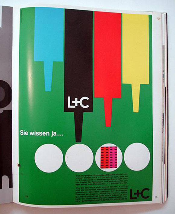
The example below will show how the designer has used grid lines to design the page. It gives a uniform look and makes it easy to read and understand.
White spaces
White spaces are essential for any design because it helps the mind perceive different groups of information. The right amount of white spaces at the right places can create a first good impression and this can motivate any visitor to read through the web page and linger on it for a longer period of time. So, white spaces are vital for a good design and the Swiss style design lays a lot of emphasis on it. This style advocates the use of extensive white spaces between texts to differentiate them and to give a boost to the overall quality of the design. It also suggests the use of white spaces between images to enhance the look of the page.
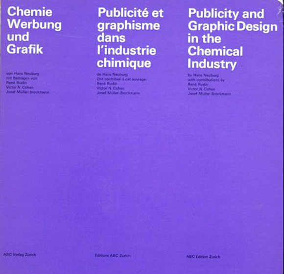
This example depicts the importance of white spaces and makes it possible for users to have lesser design elements and more white space to attract visitors to the website.
Structured Design
The cornerstone of Swiss style is structured design. Websites that follow this style should use a high amount of definition lists and other HTML structure elements. There are a wide variety of uses for these elements and most design styles tend to avoid using a good part of these elements. However, these elements are vital for Swiss style and the more you incorporate, the better will be the outcome.
Minimalistic
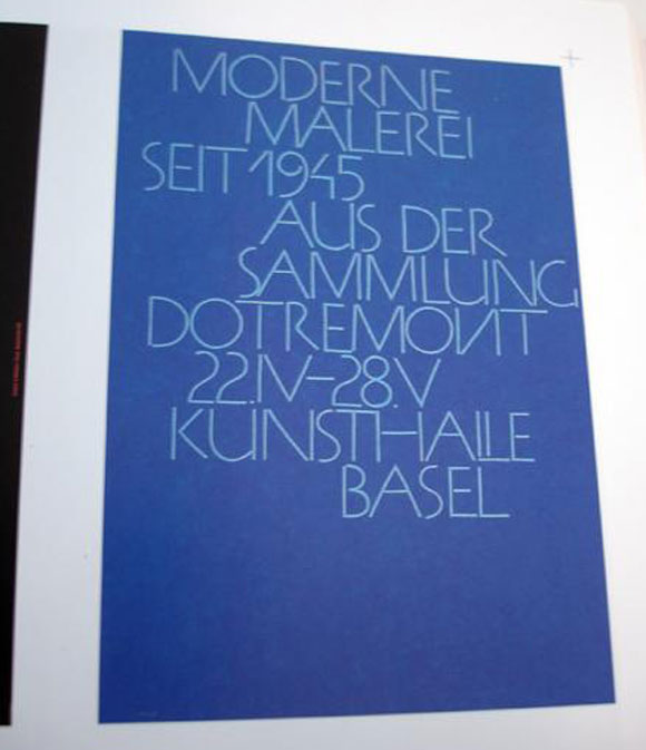
The Swiss artists are well-known for their minimalistic and elementary approach to design and this design naturally follows that trend. This design is all about simplicity expressed in the most attractive manner. Designs based on the Swiss style use the least number of elements required to create the best designs.
Fonts
Fonts are the most defining aspect of Swiss style. The developers of this style believed that an attractive image can be created using precise words, the best typeface and the designs will be an ample proof that they will hit the bull’s eye!
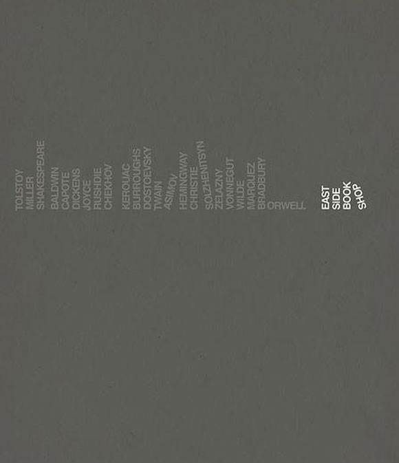
Most Swiss artists prefer to use the sans-serif typefaces to give a sense of clarity and universality to the design. Different font sizes and typefaces were used in a single design to bring more depth and to act as a true avenue of expression. Also, differing font sizes were used to group different kinds of information and it added more readability to the design.
Images
Images and photos are surprise elements of the Swiss design. The Swiss artists felt that photos are better ways to portray an idea than illustrations and drawings. It also opened up numerous possibilities for the designers to incorporate unique photos into their design. This improved the aesthetics of the design and brought in a unique versatility to it.
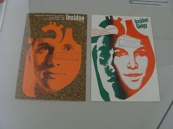
The image below shows how photos can be blended into designs to make it more attractive to the users. Different design tools can be added to the photos to give it more depth and resonance among viewers.
Examples
The first example depicts a minimalist design that is attractive because of the use of differing typefaces. The colored band adds a lot of the depth and makes it a central aspect of the design.
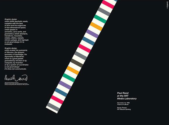
This image is a classic example of the use of grids and structure to make a design readable and attractive to the viewers.
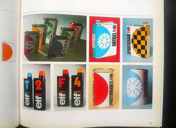
This example shows how font colors and typefaces can be used to distinguish different groups of text so that the viewers can simply peruse the page to get a fair idea of the information.
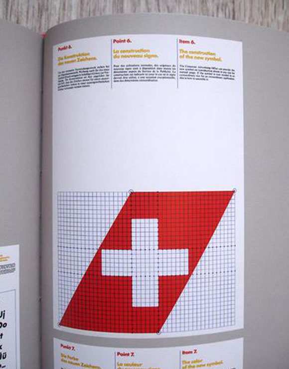
In short, Swiss style design has some unique elements that can make your design outstanding and attractive instead of a run-off-the-mill design. As a designer, you will be surprised to see the impact that it can have on your design. So, feel free to use these design elements to create attractive designs that can leave your audience spell bound.


Nice. Thx!
Great article! Thanks!