Understanding the Website Design Trends
7
Web design is an integral part of every website because it is the first thing that any visitor notices when they visit a website. It creates the first impression about the business pr the website and this is the reason most people try to keep their websites attractive. There are many aspects to web design like color, buttons, logos, browser compatibility, layout, text and so on. Each of these aspects are vital and require equal amount of attention.
Before continuing reading this post did you already join our Twitter and subscribe to our RSS feed? If not, rush and join us now to receive updates of new posts and free resources.
Website design has undergone big changes in the last few years, thanks to advancements in technology. As we move into the next decade of this century, let us look into some of the trends that are likely to take the world of Internet by storm in the next few years.
Headers
This is the one of the most significant trends in web design today. Small headers with multiple click options are a thing of the past. Many designers have started making large headers that take up more than half the page. This makes the website attractive and makes a permanent impression on the visitor. This trend is so powerful that visitors tend to remember the website, just for its huge header! It also gives an opportunity for the designer to bring out his creativity.
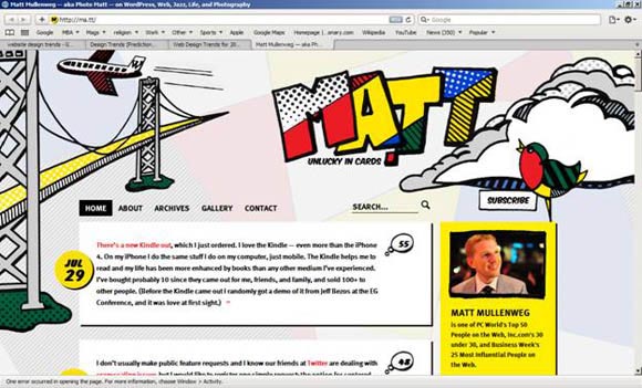
In this website, for example, the header has taken a substantial part of the page. It is creative and attractive in many ways. To see the rest of the page, the user has to scroll. The best part of this page is the user can go through the information without having to click.
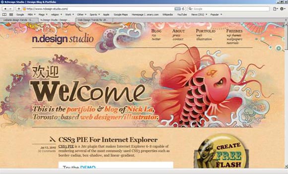
The above website is another example of the impression created by an oversized header. It is not only catchy, but also leaves a lasting impression on the visitor. This trend gives a lot of scope for the designers to exhibit their creativity and mark their stamp in every website. These are the reasons many web designers are resorting to this style and this trend is likely to continue through the whole of this decade.
Fonts
During the last decade, standard sans-serif fonts like Arial and Verdana were widely used. This was due to rendering factors of Windows XP and the browsers. But now, browser technology has improved greatly and it can support all kinds of fonts. So, web designers are looking to explore how different fonts can be used to make a web page attractive to visitors. Serif fonts like Georgia and Palatino are expected to rule for the next few years.
The examples shown below depict how serif fonts have become popular. This gives a lot more variety to designers and it provides ample scope for creativity and experiment.
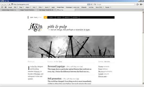
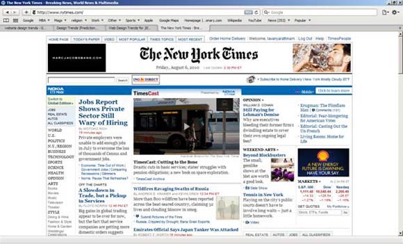
Fonts can make a site to stand out from other similar sites and an excellent example of this uniqueness is New York Times. There is nothing boring and mundane about the fonts used in this web page and it clearly shows how the available fonts can be used for optimal results. In fact, the font is probably the first thing that comes to many people because it simply stands out in the crowded world of fonts.
Illustrations
Another popular trend is the increased use of illustrations on the page. The saying – “A picture speaks a thousand words”, is the crux of this trend. They are more visual and attractive than plain text. The illustrations have to be clean and clear to impress the visitor. Sketches and hand drawn images are also a good idea because they highlight the designer’s creativity and make the web page unique. It can make a website a lot more personalized. This uniqueness is important because Internet is all set to explode in this decade with more and more third-world countries getting connected to the web. The number of blogs is also expected to rise exponentially and the only way to make a web page unique is by having your own stamp and signature.
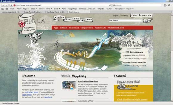
This web page is an excellent example of the impact created by hand sketches. The illustrations are not perfect by any breadth of imagination and no visitor expects it to be perfect either. It is the designer’s work of art and it is his or her uniqueness and creativity and this is what is appreciated by the visitor. So, going forward, this decade will see lots more such hand sketches or illustrations because it reflects what the designer can do.
Minimalistic Websites
The idea of simplicity has come back, but with a twist. A web page can be simple and yet attractive. This can be achieved by the use of bold colors, layout and fonts. Minimalism does not necessary mean black lettering on white spaces. It can be spruced up with a splash of color or even a revolutionary layout. It provides an opportunity to bring in some fresh colors and ideas to make the web page pleasing to the eye.
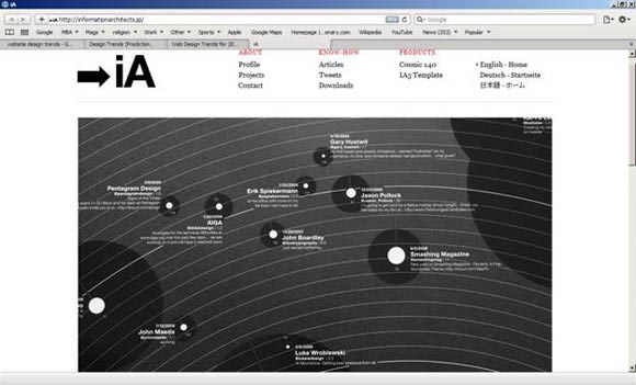
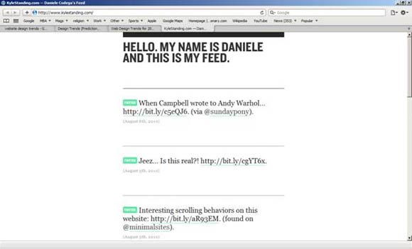
When you see the above web page, what strikes the most is its simplicity and its minimal design. This minimalistic design is infused with the right choice of fonts and a splash of color and this is what makes it attractive. These minimalistic pages go to show that a page infused with a lot of white space need not have to be a drab on the eye. Simple changes can make it great. This kind of web page is more difficult to design than what it looks. It is quite a challenge to make a page catchy with minimal changes.
Modal boxes
Modal boxes are going to stay for a long time. This because of the numerous social networking sites like Facebook, Digg, Twitter and so on. As and when a user likes a post, he or she can share it with the rest of their contacts. To do so, they should be able to log into their account right from the website where the article is posted and this is done through modal boxes. They are a smoother and an improved version of the traditional pop-up windows. Though pop-up windows proved to be a frustrating design, these modal boxes are not only utility-based, but also attractive.
Also, some businesses choose to incorporate live chat in their website so that a representative can answer the questions of the user. This is also accomplished through modal boxes. Web designers have to come up with cool designs to blend the modal boxes with the overall design of the web page and at the same time, the usability aspect of these modal boxes should also be considered.
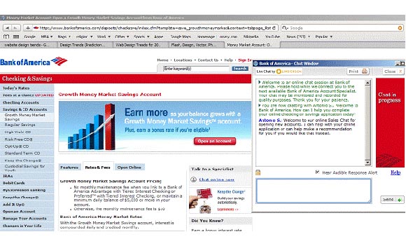
In this web page, Bank of America has incorporated online chat as one of the features on its website. When a visitor clicks on the online chat option, it opens a new modal window that is sleek and is a much better version of the ordinary pop-up windows.
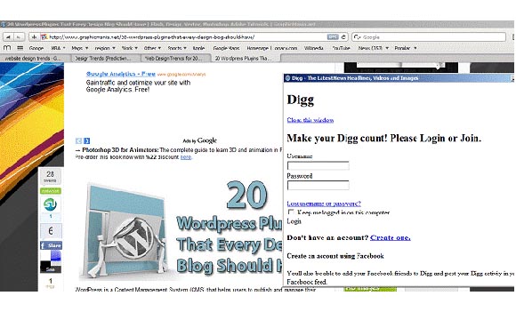
In this example, a modal box helps a visitor to log into their social media profile right from the website. This makes it easier to share interesting articles and news with other people.
In short, modal boxes have a huge utility aspect and this is the reason designers should pay a lot of attention in creating modal boxes that blend well with the existing design of the parent page without compromising on its utility factor.
CSS3 and HTML5
CSS3 and HTML5 are the next generation techniques in website design and development. There are a whole lot more things that one can do with these technologies and most of the popular browsers have the capacity to support these technologies. This combination is perfect for web design and the future is going to see more and more websites based on these two technologies.
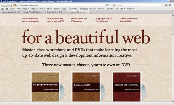
This web page goes to show how much one can do with CSS3 and HTML5. These two technologies are a deadly combination that gives unlimited power in the hands of designers. The myriad of shapes and background images add a whole new level of depth to any web page.
Magazine Layout
Many people are looking to get real-time information and news from the Internet because it is more updated than the print version. Other than news sites, many other informative sites are looking to adopt this design because it makes it easy to read concise news and if interested, the reader can go to the full length of the article. This trend is expected to be the future for blogs.
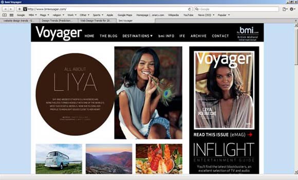
This web page is a good example of a magazine layout. It offers glimpses of new posts and based on the visitor’s interest, he or she can explore the articles in depth. The home page is more of “table of contents” page and it is typical of any magazine. As more and more readers are moving to the Web from the print edition, this trend is likely to get a boost during this decade.
Introduction Boxes
It has become popular in the last couple of years to have an introduction box about the owner of the website. This is a way of introducing oneself to the visitor. It is a simple and yet effective way of telling the world a little about the owner of a blog or website. Web designers are experimenting with the placement of these introduction boxes in different parts of the page. New and innovative messages are also being used instead of the regular “Hello, I am so and so.” Lot more innovation is expected in this segment in this coming decade.
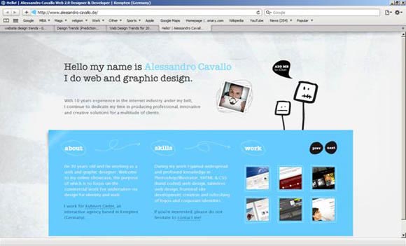
In this example, the owner of the web page tells the world a little about himself and his work. This adds a personal touch to the design and makes it absolutely unique!
Single Page Layout
Single page layouts make it easier to cut out unnecessary and boring information. People are in a hurry and many of them take only a quick glance at the page before moving on to the next. With the explosion of blogs and information, every visitor just wants some quick information. One page layouts are the solution to this need. These pages are more like business cards that gives a gist of what the owner is involved in and the contact details including the social media profile. This trend is more applicable for personal profiles rather than businesses.
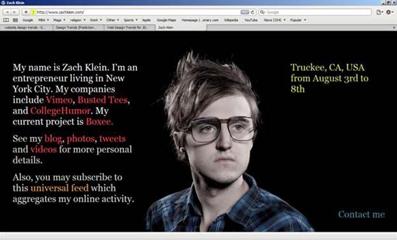
This is a one-page website that gives the crux of the information to visitors. It does not bore them with unwanted details. This is likely to be the best way to capture the attention of people who have very little time to read through the extensive content of the website.
Conclusion
In short, the next decade is going to see some revolutionary changes in web design to suit the changing needs of users and businesses. Web designers should keep these trends in mind while designing future web sites to remain unique and competitive.


This time website designing services are must for all types of business as all want to create their own business policies. I think, by the given post one will be benefited much and able to amplify his work stream. Thank you for this valuable post.
Great blog i like to read this blog daily it has all the useful stuff, i would like to subscribe it so can you please tell me when your blog gets updated.
Thanks alot, you can subscribe it through the RSS icon on the top right in the sidebar 😉
Good analyze every points clearly and meaningfully are given. Thanks
Pictures of buildings very interesting. Explanation was Good,I waiting for the new pictures add in this blog in future.
Upon designing a website it should be both from the owner or client and the designer itself.
Came across the post while I was searching for design trends during 2011 and I see that HTML5 was almost launched during 2011, which did not go as expected. But did had a great start for a lunch.
I had been making a report on design trends during every year and i am surprised to see the developments happened during 2011, which was extraordinary.
Thanks for the post.