Web and mobile design consistency
1In the last decade the world of design has seen immense changes. From new software to fresh trends, graphic design has been revolutionized over and over again in all manner of ways. One of the biggest catalysts for these changes has come from the popularity of smart phones and the innovations in mobile platforms in general. These days most of us have a smart phone which requires its own unique designs and layouts in order to perform specifically in the mobile world.
These mobile devices have introduced and inspired many new changes and when broken down, most of these changes are because of workarounds for issues that mobile designers faced since web and print designs are entirely different. One of the biggest of these issues is the fact that selection on a touch screen phone is far less precise. On computers we use the mouse which allows for a good amount of accuracy, but on a small touch screen we aren’t allowed this amount of control. This caused many designers to work with larger buttons in order to make navigation easier. This is just one example, but mobile platforms have forced designs to grow in many different ways in order to work around the difficulties and some of these changes have become very popular even when they aren’t necessary.

Now why are these obvious changes caused by smart phones important? Well for one mobile design has widened the market for graphic designers and it helps to know tricks to make beautiful well functioning designs. The other reason is because some of these fresh designs have generated a solid amount of appreciation and many mobile design concepts have splashed over into other areas of design as trends.
Trends play a huge role in the world of design and clients are often looking for people who can deliver good work that contains similar aspects of other popular works. With that being said, knowing what is popular and what may be coming into the scene next can be very helpful for getting more work. At the moment it seems one of the biggest graphic trends is still the flat designs. However, recently there have been a few brand redesigns and website tweaks that point towards some great new mobile inspired looks.
Netflix
The change in the Netflix logo is one small example where the design was revamped from the classic look into a darker design with a lot more contrast. I personally enjoy the new design mainly because it looks sleeker and fits into the app far better. The overall design on Netflix is incredibly fluid between all platforms and shows a great model of how websites and apps can share style and look to bring the brand together as a whole. Having matching designs not only makes a more pleasing look, but it also allows better transitions between app and website making a better overall experience.

Even before this slight redesign, Netflix provided us with a great look that appears to be very app inspired. Across all platforms selecting movies on Netflix is a great experience which features large buttons in the form of movie covers. These give us a great mobile experience and even retain the same look on web, but the design allows more information to be displayed when hovering over a movie title.
Fandango
Another brand that made some changes specifically to pull website and app together better was Fandango. A few months ago Fandango’s app and website didn’t connect very well in terms of look so they came out with a new appearance for both the app and website to make the two look more like a pair. The redesign encompassed a new logo which works far better for the app and generally looks cleaner. The colors of the brand were also adjusted so that the app and site had the same overall scheme making their look far more complete. The new logo and overall design was a great change and gave the app an overall look that matched the website better especially though colors. The fandango website also contains a lot of the great large buttons and other trends made popular in apps. Overall, the design looks great, but also pulls the app’s look into the websites look far more effectively.
Paypal
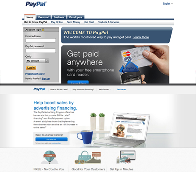
Lastly, Paypal had a considerably heavy redesign in which their entire look was revamped into a much more user friendly and mobile matching appearance. The Paypal website prior to the redesign looked very old with small word links instead of buttons. Many of the functions on the website were also quite small which made navigation somewhat unpleasant.

One thing you will quickly notice about the new Paypal website is how large it is. Traditionally many websites stuck to using only the middle portion of a screen to display information. However, now that many of us are using widescreen monitors newer designs fill the entire screen. Paypal’s design seems to derive much of this from mobile styles considering their design features extremely easy to read large words and icons in a “scroll down for more information” layout. In other words, the new look doesn’t attempt to encompass all information on screen at once or hide it throughout a web of links. Instead lots of information is spread across one page leaving all designs with more room to breathe.
Overall, the new design contains a great new simple logo and friendly looking large buttons which again pull the look toward their app far more than the previous design. These large buttons make navigation much more pleasing, but also provide a more modern design. Not only do the buttons replace the old links in a better looking way, but many of them also serve other functions. By giving buttons different colors and symbols they can provide more information in less space which is something that mobile design has definitely pushed many graphic artists to hone.
Facebook and Vimeo
Two good examples of websites that have already had great looks synonymous from app to website are Facebook and Vimeo. However, the two go about their designs in extremely different ways. Facebook’s clean graphics transition extremely well from their website to the mobile app especially in the case of functions and color distribution. However, the website features many small buttons whereas many new designs have followed the trend of apps and started implanting larger buttons (which are also far easier to find). One thing the Facebook design does very well is giving users many options on both the app and website. Even though finding things with Facebook’s designs can be tough at times the user interface still allows for all the options you could ever want even in the application.
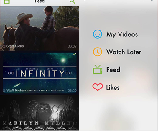
On the other hand, Vimeo keeps its experience very similar from web to app, but makes the app far simpler which also hinders the amount of options and tools in the application. While both companies have great designs and layouts, each takes on the task of designing for mobile differently. When doing any sort of design it is always important to keep these options in mind and choose what works best for the specific functions.

Bringing together apps and websites provides a strong overall look for brands and it can be overlooked very easily especially when the sites and apps are designed by different people.
Conclusion
Of course it should be mentioned that uniqueness is an extremely important trait and that simply following trends will not make anyone a great designer. However, trends do play an important role in design and should always be considered.
What these changes show us is that the mobile design styles have been spilling into other formats in great quantities. Larger buttons and user friendly, app-like styles have a large appeal and therefore may be a good tool to have when designing. As always, it is important to pay attention to the evolution of design and use observations such as these to improve our design vocabularies.


Great article. Very interesting