15 unique color combinations that make your work stand out
0
Working in a professional environment requires a lot more than you think. You have to understand the requirements of your work and how to keep up with the market you are working in. There is also plenty of competition in every field which is way it is important that you make your work standout. Making your work standout is not always about spending more hours at desk. Most of the times you have to think out of the box and work on your creativity level. If you are a photographer, graphics designer or a painter, you will understand how important colors are. A good color combination can make and break the overall look of your work.
Following are 15 unique color combinations that will let your work seek for itself.
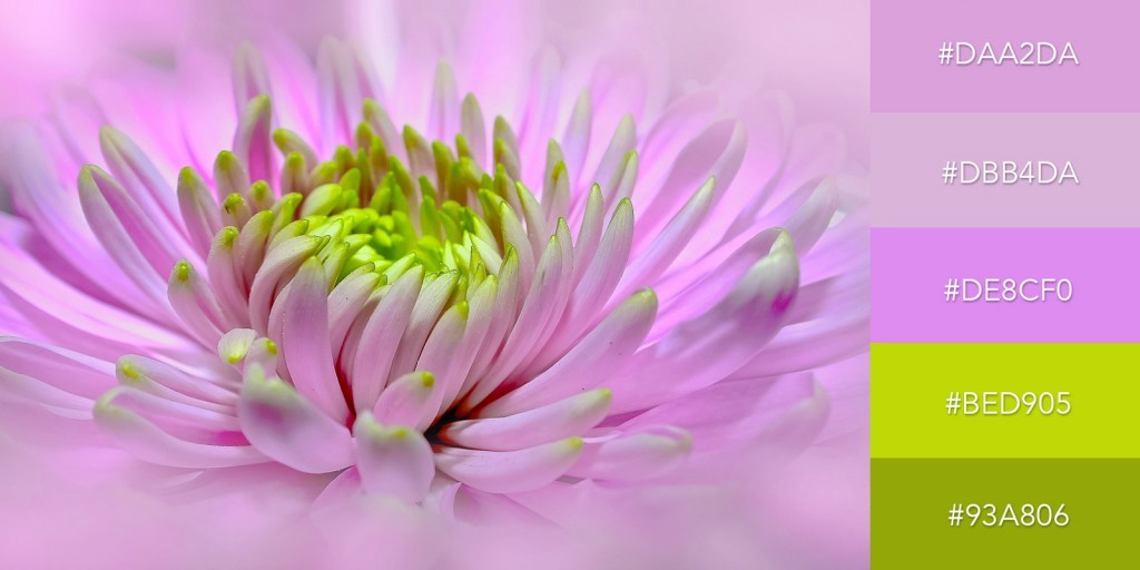
Combine two families of color:
There is always something amazing about combing to two different families of colors and making something amazing for the viewers.
http://blog.visme.co/color-combinations/
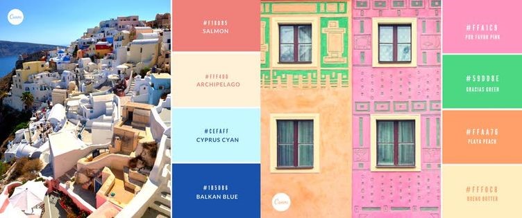
Play with colors:
People usually think that adding more than three colors can make everything look odd. However, the truth is that if you work on the right placement of your colors, you can add a good amount of them to your work.
https://www.canva.com/learn/color-theory/
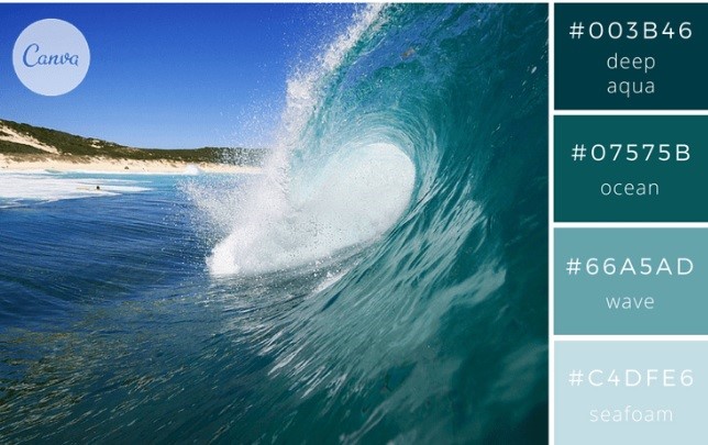
Let the nature do it’s work:
Some of the best color combinations that you can ever find are in nature. If you are trying to capture something under the sun, it is always wise to go with the nature’s color selection and avoid adding anything to it.
https://www.canva.com/learn/100-color-combinations/
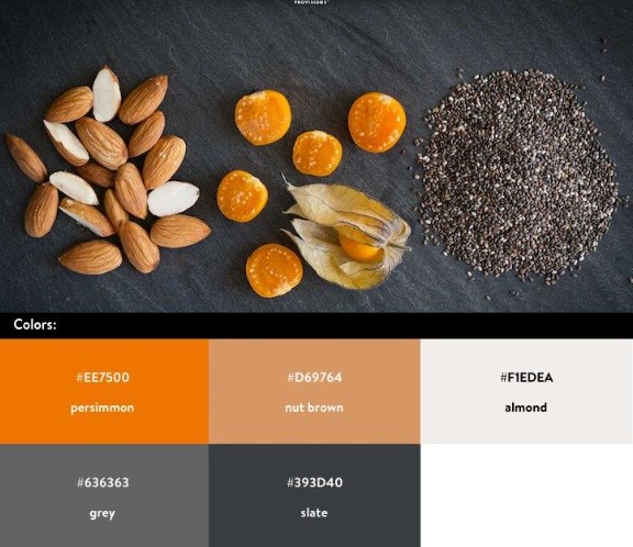
Make the color pop:
Sometimes to make your work standout all you have to do is add little pop of color.
https://www.shopify.com/partners/blog/93130630-10-beautiful-ecommerce-website-color-schemes
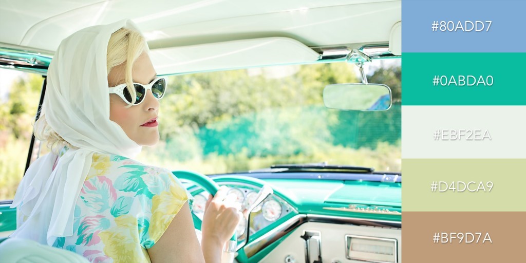
Pastel colors always work:
If you are out of ideas then it is always best to go with the pastel colors. They always work together and gives a breath taking look.
http://blog.visme.co/color-combinations/
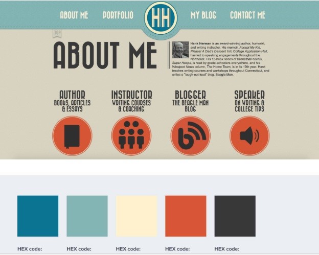
Keep base neutral:
One of the cleverest ways of making every color work in your favor is to go with the neutral colored base. For designs with neutral base, everything will pop in the right ways.
https://piktochart.com/blog/website-color-schemes/
Be playful:
There is nothing wrong to be playful and to go with the vibrant colors. All you need to do is learn little bit color theory to make sure all the colors you are using looks perfect together.

https://www.canva.com/learn/color-theory/
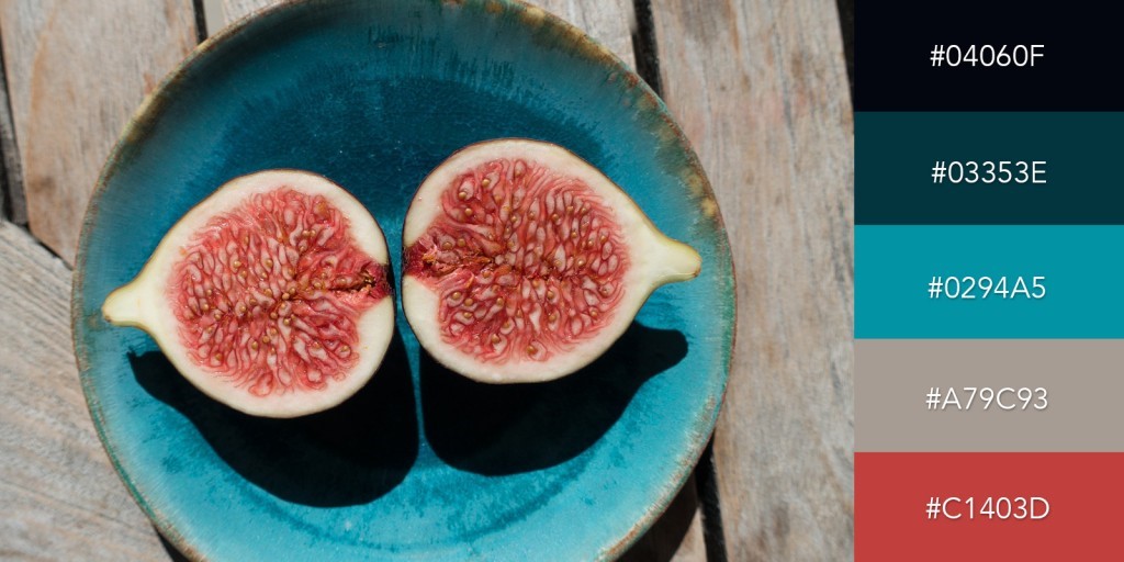
Choose the odd one:
For people who like to keep things simple but still wants to add a little bit something to their design should try adding an odd color to their picture.
http://blog.visme.co/color-combinations/
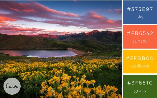
Wait for right time:
Sometimes the best color combinations that you are ever going to find will be provided by the nature. All you will have to do is wait for the right time.
https://www.canva.com/learn/100-color-combinations/
Go for all cool tones:
For people who love to add colors but are not fan of the color shouting out, going with the cool toned colors is the best thing to do.

http://blog.visme.co/website-color-schemes/
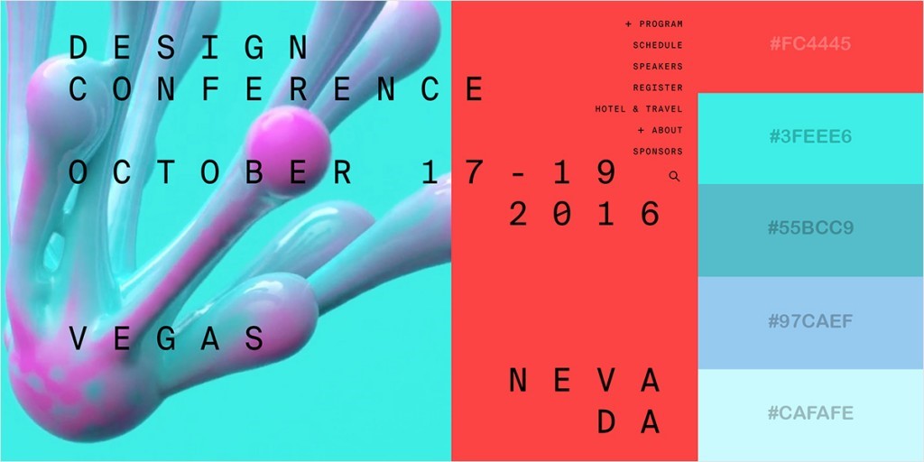
Keep one color loud:
To make your design unique and simple, try to play with different colors. One of the easiest things that you can do is use all colors from one family and adding only one color from another family.
http://blog.visme.co/website-color-schemes/
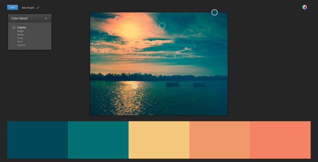
Warm tones are key to success:
There is so much that can be done with the warm tone especially if you want to give a subtle yet unique look. All you need to do is work on the color placement.
https://mavsocial.com/instagram-color-palette/
Black makes every color pop:
When in doubt what base color to go with, choose black! Yes, any color used in combination to black, pops out in the best possible way.

http://blog.visme.co/website-color-schemes/
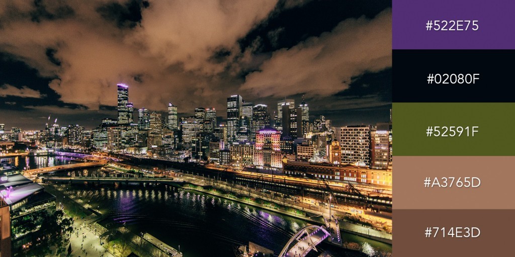
Wait till lights out:
If you are trying to capture the skyline of a country or city then wait till natural lights go out and artificial lights are all the rage.
http://blog.visme.co/color-combinations/
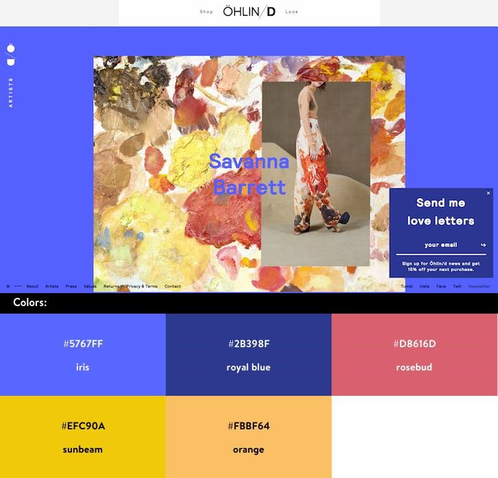
Choose best possible odd color:
There are some odd colors in every color family that never work expect when you put all these odd colors together in one design.
https://www.shopify.com/partners/blog/93130630-10-beautiful-ecommerce-website-color-schemes

