20 Examples of Subtle, Creative and Unexpected Product Packaging
1When creating a product, manufacturers know that every detail matters. The entire experience of a product can be improved, or worsened, by every minor detail – including the packaging that it arrives in.
Compare Apple with their competitors, for example. They might sell similar products, but Apple puts a real focus on the fit and finish of the packaging that they arrive in too – and as a result have built up a reputation as a company that cares deeply about every single aspect of their products.
But you don’t have to be a company the size of Apple to put some thought and care into how your product is presented.
Some companies spend a huge amount of effort on making sure the item is packaged beautifully, and there are some real advantages to doing so.
A product that’s packaged creatively or in an unexpected way can stand out on store shelves, and may be more likely to be purchased. Sometimes the packaging is so nice that people may not want to part with it, and it merits purchase all by itself.
I’ve brought together a post that collects some of my favourite examples of packaging designs that are quirky, unexpected and creative and yet are all tasteful and beautifully crafted too. I hope you find the collection interesting, and if you know of any other examples that would fit well, I’d love to hear about them in the comments.
If you’re interested in more examples, also see this post!
In the examples below, be sure to also visit the source pages to get the best feel for how the designs work.
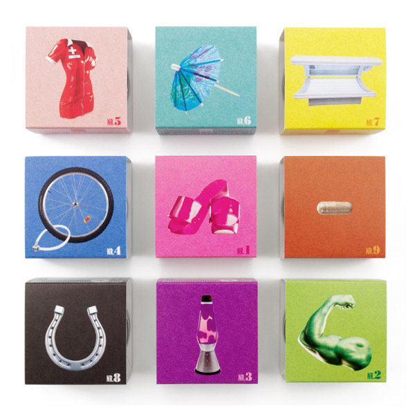
Source: http://lovelypackage.com/tea-bar/
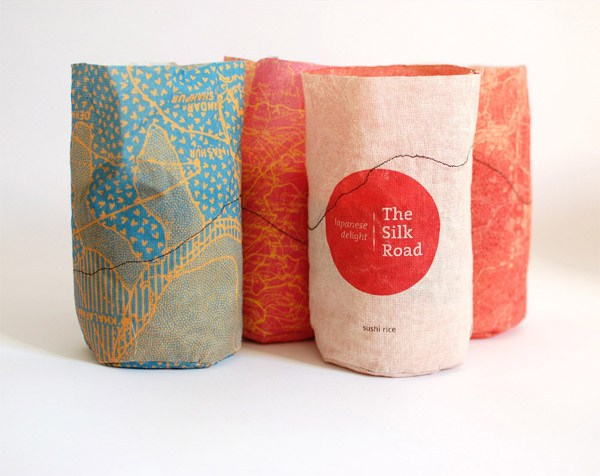
Source: http://lovelypackage.com/student-work-yonatan-sheinker/
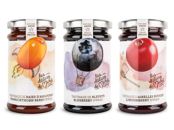
Source: http://www.behance.net/gallery/Dlices-de-Michele-Brand-Identity-Packagings/9979453
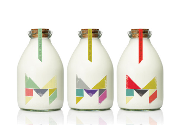
Source: http://www.behance.net/gallery/Little-Fingers/6268193
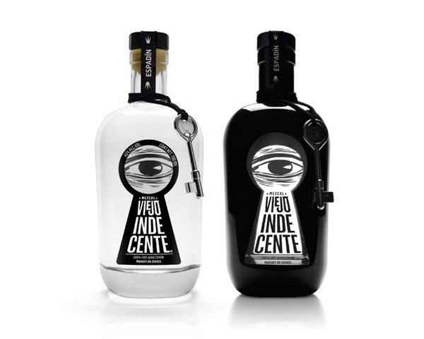
Source: http://lovelypackage.com/viejo-indecente/
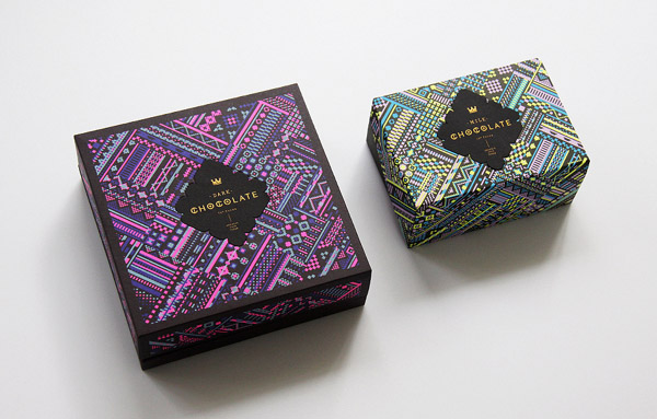
Source: http://www.behance.net/gallery/Astrobrights-Packaging/9333731
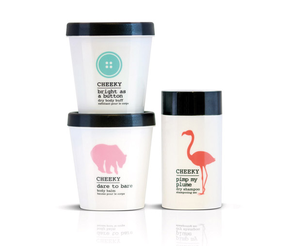
Source: http://lovelypackage.com/cheeky/
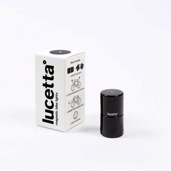
Source: http://lovelypackage.com/lucetta/
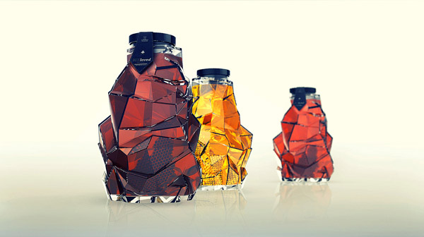
Source: http://www.behance.net/gallery/BEEloved-honey/7297839
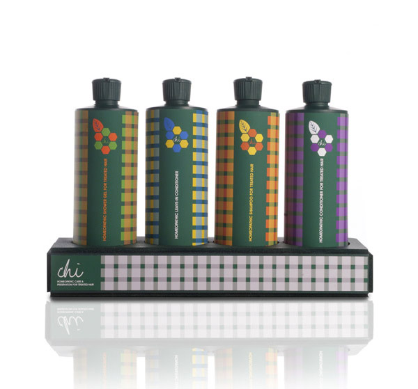
Source: http://lovelypackage.com/chi/
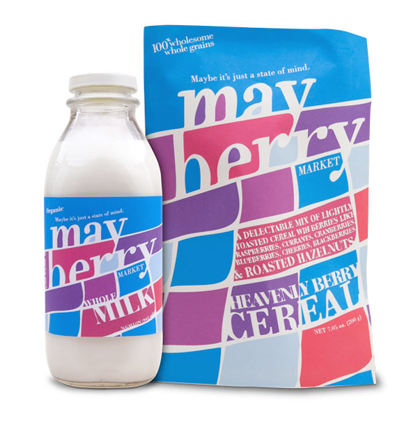
Source: http://lovelypackage.com/student-work-victor-saleh/
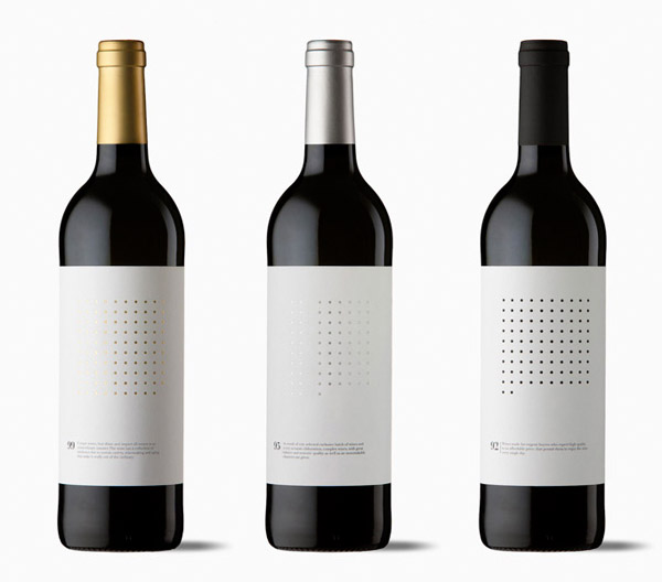
Source: http://lovelypackage.com/dotted-grid-ninety/
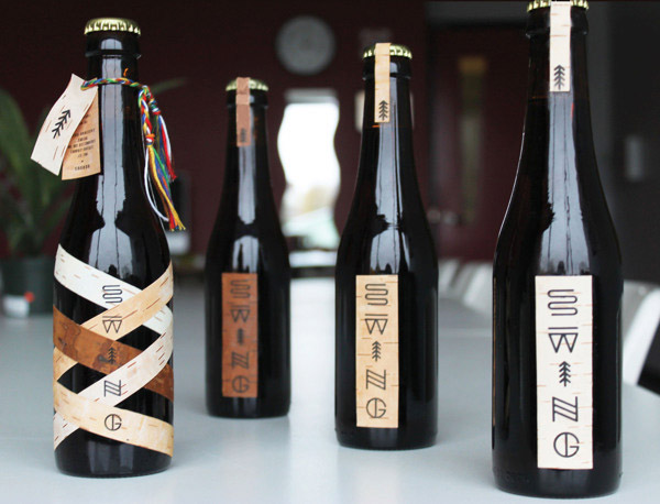
Source: http://www.behance.net/gallery/Packaging-Swing-microbrewery/5858349
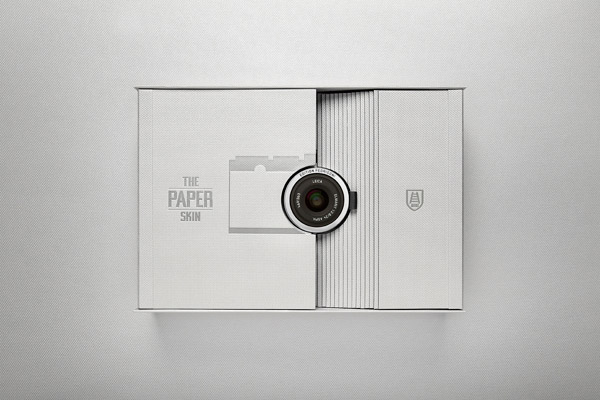
Source: http://www.behance.net/gallery/The-Paper-Skin-Leica-X2-Edition-Fedrigoni/14409103
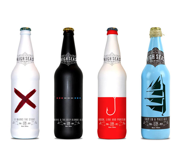
Source: http://lovelypackage.com/student-work-brennan-gleason/
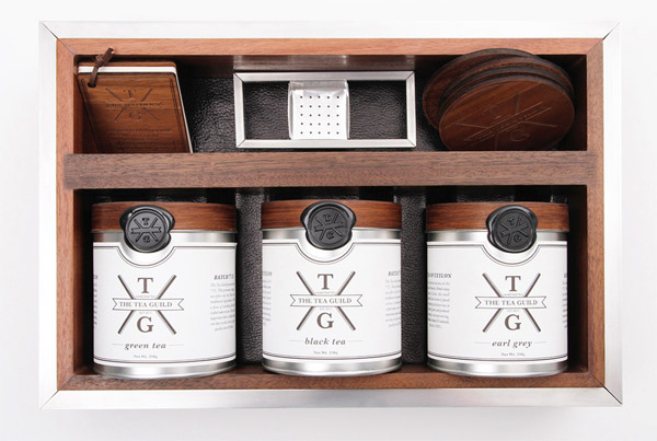
Source: http://www.behance.net/gallery/The-Tea-Guild/12350601
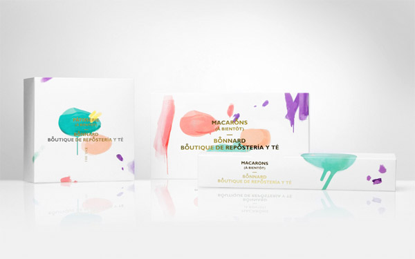
Source: http://lovelypackage.com/bonnard/
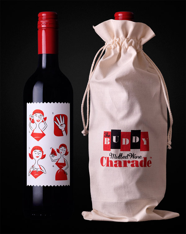
Source: http://lovelypackage.com/the-buddy-mulled-wine-charade/
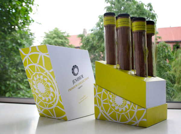
Source: http://www.behance.net/gallery/JEMBER-CIGARS-packaging/5863453
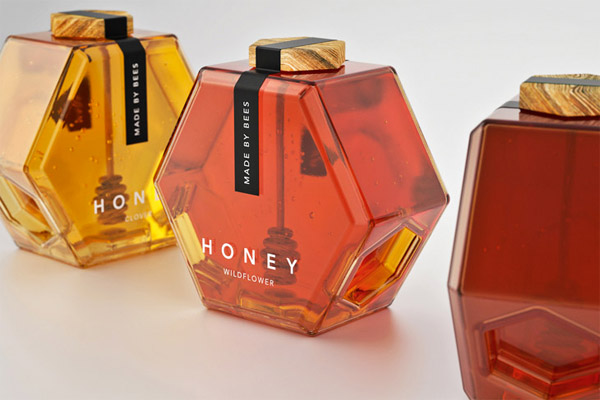
Source: http://lovelypackage.com/hexagon-honey/
Which of these designs do you like best? Do you know of any examples that you’d like to share? I’d love to hear your thoughts in the comments section below!



Very creative and innovative ideas, thanks for sharing the aticle