4 Creative, Bold and Simple Sticker Designs Ever for Your Inspiration
0In my opinion, stickers are one of the most underutilised forms of marketing in the modern business world. These days, a lot of companies are investing heavily in online marketing techniques that aim to build brand awareness and increase sales, but most of them are forgetting about the old tricks that businesses used back in the day, before the internet was the first port of call for marketing professionals.
The great thing about sticker marketing is that it not only provides a great way for you to build brand awareness for your business, but it’s also extremely cheap. Think about it, how much is a bunch of custom stickers going to set you back really? In terms of your overall marketing budget, probably not much and what’s more, they will usually generate an extremely high ROI for your business.

Having said all that, stickers are no different to any other form of marketing, and if they’re not designed well, they are not going to have the required effect. Stickers need to be simple, bold and eye-catching, otherwise they’re not going to stick in people’s minds (no pun intended there) and emphasise your brand.
To give you some inspiration, I thought I’d round up a few of my favourite bold and simplistic sticker designs with the hope of convincing you guys to give them a trial run in your business. Who knows, they could bring incredible results!
#1 – WD40
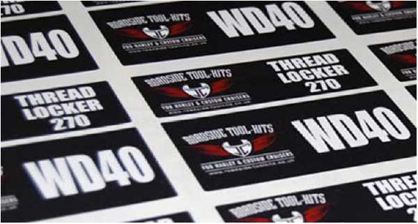
Here’s a really simple, yet bold and eye-catching sticker design created on behalf of a client by the guys at Discount Banner Printing in the UK. The aim of these stickers was to build up brand awareness for a company providing Harley’s and custom cruisers so clearly, they had to be eye-catching.
First of all, you will notice that the main reason their stickers stand out is thanks to the clever use of contrasting colours. Utilising contrasting colours is an old design trick and once you are aware of it, you will likely start seeing it pop up everywhere; from stickers to business cards to TV ads.
The use of black, white and red all complement each other and when used together, they each help the other colour stand out. The white “WD40” text stands out perfectly on the jet black background, as does the red.
You will also notice that these stickers are not overloaded with information. They tell you the name of the company, what they do and a few other details, that’s all. If you start overloading your stickers with information, you will destroy the simplicity.
#2 – Seattle Museum of Toys
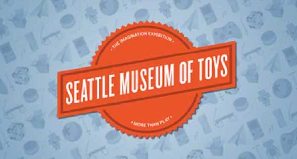
Again, here’s another great example of a simple, yet bold and hugely eye-catching sticker design that was created by the Seattle Museum of Toys. Clearly, this is a sticker that is going to have a certain target audience of children or playful adults, and this is something that has been kept in mind during the design process.
The font that has been used in the design is slightly playful and not too over-the-top, which helps the sticker to appeal towards its intended audience. Plus, the sticker makes use of the primary orange/red colour, which will no doubt ensure that the sticker stands out and catches people’s eyes, no matter where it happens to be placed.
The actual content of the sticker has been cleverly thought out to ensure that it doesn’t overcomplicate things and that also, the eyes are drawn to the most important message. The name of the museum is written in a large font, while the slogan(s) are written in a small font.
This helps to ensure that the sticker isn’t cluttered and has a clear hierarchical structure that is based on the importance of each piece of content.
#3 – SXSW 2012
SXSW is an annual film and music festival that is held is Austin and to promote the event, this sticker design was commissioned back in 2012. The idea was to use the sticker on all promotional items for the event, thus raising awareness and helping to emphasise the brand among film and music enthusiasts.
As you can see, it’s a pretty simplistic sticker that makes use of only one colour; a dark grey/black colour. The sticker is actually see-through, which helps it to blend into any background and appear unique wherever it happens to end-up.
Clearly, the aim of the sticker is to build brand awareness. There are no lengthy messages, just a simple logo and year. This is all a sticker like this one needs.
#4 – Declaration
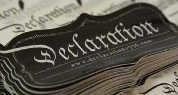
Declaration is a clothing brand based in the USA that produces t-shirts based on American History. They are a unique brand with a unique style that also appeals to quite a unique audience. Their clothes are trendy and cool and therefore, their sticker design needed to reflect this.
As you can see from the outcome above, they certainly pulled it off. This sticker is pretty simple as it contains the company’s logo and website address, but the overall design is very minimalistic and trendy. There is even an air of luxury about the design.
Also, notice the use of contrasting colours once again. The sticker has a black background with light/white text which helps the brand name to stand out. Plus, the shape of the sticker is pretty unique which, once again, helps it to appear bold and eye-catching.
Conclusion
Although stickers might not be your first and most important choice when it comes to marketing, they really should play a more important role. It doesn’t matter what kind of company you’re running, or whom your brand appeals to, you can almost guarantee that if sticker marketing is used in the right way, the ROI will be significant.
Plus, stickers are cheap and fun, something that a lot of marketing campaigns are missing these days.
Editor’s note: This article is contributed by Chris. He is a lover of all things creative, particularly marketing and advertising materials. He works for the UK based sticker printing company.


