5 Tips for Designing Business Cards That Don’t Suck
0Traditionally, business cards were of one type and this type meant a rectangular paper with sharp edges and text on both sides. At the most, all people did to play around with how their cards looked was to change the font style and colour. This has considerably changed now and the traditional cards are now found to be very boring and mundane and are definitely not the best cards you will see. For this we need to give a special focus to the designing aspect and below mentioned are 5 cool designing tips to make sure your business cards do not suck.
Tip No 1: Move Away From Rectangles
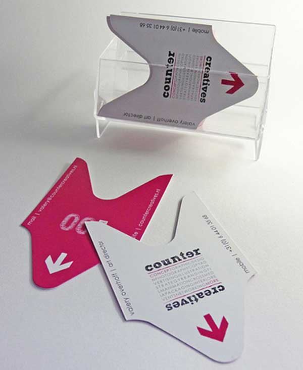
This is the first and the foremost tip which will be a deciding factor if your cards will be good and out of the box or the usual monotonous kind. Every regular business owners’ and customers’ first image of a business card is that rectangular piece of paper. Break the stereotype by choosing a shape which is unique and describes your business well and it can be anything which helps people relate to the service you have to offer them. For example, if you have a tailoring business then a card shaped as a scissor or a shirt would attract immediate attention.
Tip No 2: Ordinary Is Boring
This is the second tip you need to know to make sure your cards do not suck. Ordinary cards look like every other card which is not what you are looking for. With a shape that suits your card, you also need a layout and something else which gives the X factor to your card. Put up an image in the background which explains your service better than a thousand words could have. It should be high resolution and very appropriate for your service. You can even put up your picture to give a personalized look.
Tip No 3: White Is Out
Now that you have broken the first cliché, its time you break the white background code also. Your card background can be anything from pink to black depending on the service you offer and shape of the card. If you are a funeral director then your card could have a black background and if the service you offer is of a florist then it can be of any colour or a mix of colours. Do not stick to white and experiment what looks best on your card.

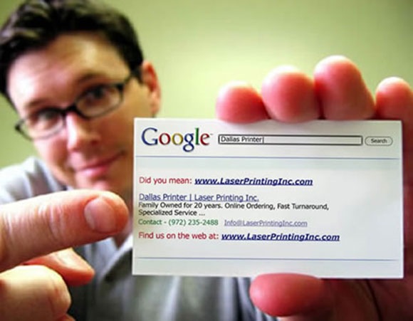
Google search inspired business card. The contact information appears clearly as the search results
Tip No 4: Clutter Is Unhealthy
There is a common habit in people to provide more information than it is required, and that is exactly what they do with business cards as well. Clutter and chaos is a huge mistake for your card and it’s important you understand that you do not have to provide every bit of information on the business card itself. Once you have put the important company details, draw the line and provide 1 or 2 connections where people can contact you and these should be something which you are most active on. These could be your phone number and email address. This way, your card will look clean and to the point and you can do more with the empty space you have.
Tip No 5: Do Not Let Inconsistent Printing Spoil The Day
Even if your design is perfect, you need to be sure that your printing is also up to the mark as if you are negligent, your cards may not look anywhere near to what they were on screen and this will ruin the complete lot of cards. Choose a press which is known for consistent good work and choose a paper which suits your cards shape and colour. Check for samples beforehand and make sure your first card is perfect and doesn’t have any spelling or other errors.
These 5 tips will be of a great help to make sure your cards do not fall into the ‘bad mundane cards’ category and they will turn out to be unique and well customized as well.


