5 Useful Poster Design Tips
2Unlike brochures and flyers, poster designs present a very common method of delivering your advertising idea by grasping the attention of prospective consumers who can see these posters in the streets, bus stops, and halls. Poster design tips will help you build successful ad designs that get the consumers’ attention and deliver the message high and loud.
Unlike flyer or brochure designs that you can hold in your hand, poster design requires you to work on a design that the viewers will see from a long distance. Therefore, you will need to create your design in a large size, for example A3 paper size or larger such as billboard ads. While practicing and viewing different poster design ideas and learning from them can fuel your mind and stimulate you to come up with new ideas, poster design tips can help you avoid common mistakes that many designers make when they design posters, especially for larger poster sizes.
Out of the box ideas
How many posters do you come across, but never look at when walking in the streets? There are posters on every wall of every street and other places. All these posters have made the viewer’s eye to get used to them and never notice their content or the advertising message that poster designs should deliver.
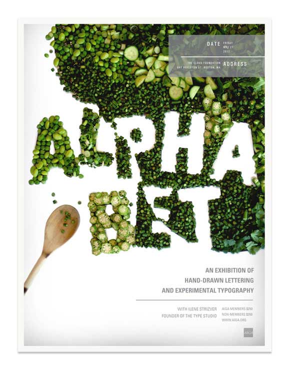
Thus, your poster design idea should be unique and attractive enough to stand out from the crowd of other ideas. You can use different materials to visualize your idea or extend your design outside the poster’s borders similar to the examples below.
Keep it simple
Try to make your idea simple and direct. Poster viewers usually see the posters for only a few seconds before they continue on their way to work or home. Therefore, you need to make your poster simple to allow them to learn about the marketing target or poster idea.
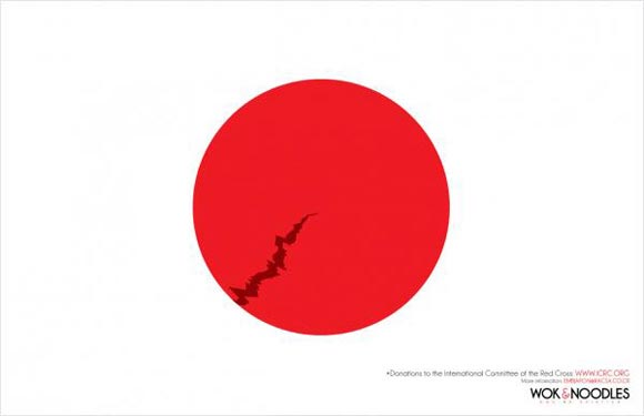
You can apply simplicity to the design by many methods including implementing space areas in the design and using fewer elements to deliver you message. Minimal poster design is an example of how to use empty space and a few design elements to express a specific idea or marketing campaign.
Focus on the message
As we have mentioned earlier, viewers take only few seconds to get attracted to the poster design and read its message. Therefore, you need to keep you idea focused to deliver this message in a short time, or you will never be able to deliver at all.
The secret behind a focused message is to narrow your ideas down to one sentence or slogan that reflects the marketing campaign, and then you can build your design around this idea. You can use visual elements such as photos, illustrations, 3D objects, or typography. The more reflective the visual elements are, the simpler you idea becomes, because you will not need to complicate your design with other elements in order to deliver you idea.
Fonts, fonts, and fonts!
One of the poster design tips that you should consider is related to typography. Text plays an essential role in poster design because it includes the message or the important information that you want the viewer to see and read, such as the company name, slogan, social information, etc.
When you choose your font you need to consider the target audience. For example, when designing a poster for old audiences you need to choose a font that is large and easy to read. In other cases you may think of using casual and funny fonts in kids’ posters to attract this type of little people.
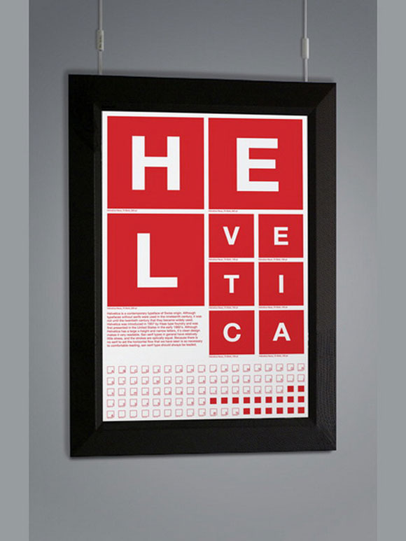
Generally, you need to choose easy to read fonts that suite a large number of people, such as the Helvetica font that many designers like to use because it is user friendly and has clear letter glyphs.
Use colors carefully
The last one in poster design tips is the colors. You can do a lot with colors such as attract the viewer’s eye or turn an empty space into a useful element in the design. Colors can also act as a container for the design elements, such as in the Swiss design style. When you think of colors, you have to choose the ones that really reflect your idea and are in harmony with each other in the poster design. For example, you can use bright colors to attract the viewer’s eye or soft colors to reflect a message of peace.
The poster design tips above overview some ideas that can help you improve your poster design and make it more effective so you can deliver a real and clear message to the viewers. You can also learn more tips by viewing different poster ads and ideas to explore new sources of inspiration and concepts to help you when you are designing your own poster and you can check How to Create Effective Poster Design.






It is very interesting and attractive
Thanks for the tips, they really help!