Give your new flat design the edge: 3 success factors
0The days of wowing website visitors with flash animations and 3-D buttons are long gone, as many designers focus on giving consumers the clean, information-centric sites they want. Simplicity is more important than ever for today’s designer, who is challenged to create pages that display on a variety of screen sizes.
The drive toward flat design means graphic designers have to try harder than ever to create sites that stand out from the competition. Since flat design means striving for simplicity, graphic designers must work harder than ever to use visual cues like logos, colors, and images to convey a message. Here are a few things designers can do to make their websites in the flat design style have the edge.
1: Use Top-Quality Images and Graphics
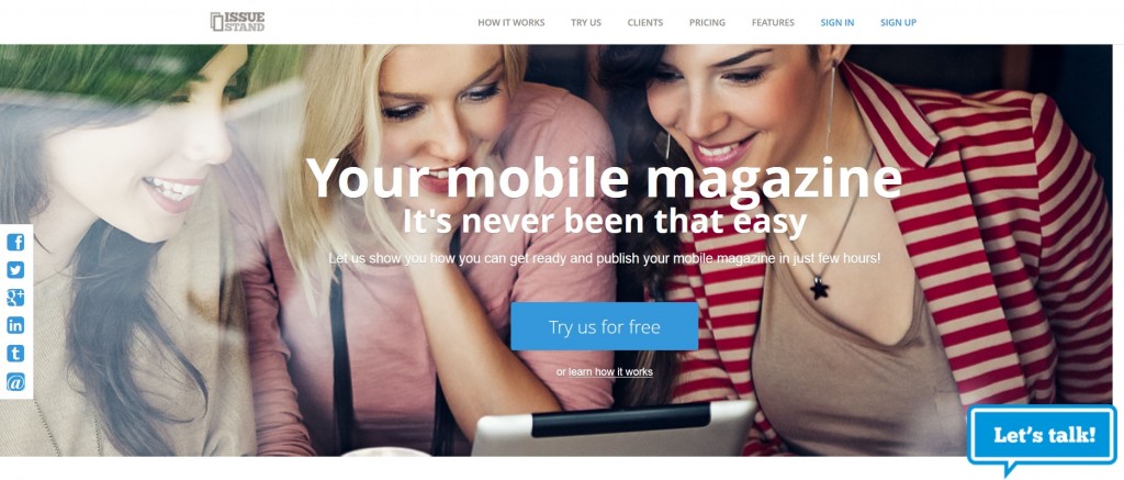
Even the simplest of website designs can benefit from creatively incorporating photos. It’s important not to go overboard in this area, though. Too many photos can create clutter and slow down load times, which can wreak havoc on SEO. For best results, choose an image that blends well with the color scheme of your page. Here are a few examples of sites that use one simple eye-catching image to draw visitors in.


2: Put the Brand First
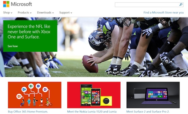
A great page design puts the logo first, creating everything else around it. This is an important step toward establishing and communicating a business’s brand. Microsoft is a high-profile example of a company that maintains consistency between its logo and its overall page look, with each aspect of its page reiterating Microsoft Windows 8’s Metro “tile” design. It’s important to communicate more with less, which requires using graphics and colors that convey the same message that would otherwise have been communicated through words.
3: Make use of clear graphics and icons, and less words
Designers communicate complex concepts simply, sometimes through nothing more than an icon or word. This is especially important when making flat designs. Fitbit does a good job of this on their website. Using only four icons and eight words, the company lets customers know what the wearable technology company provides with its bands: get active, eat better, manage weight, sleep better.

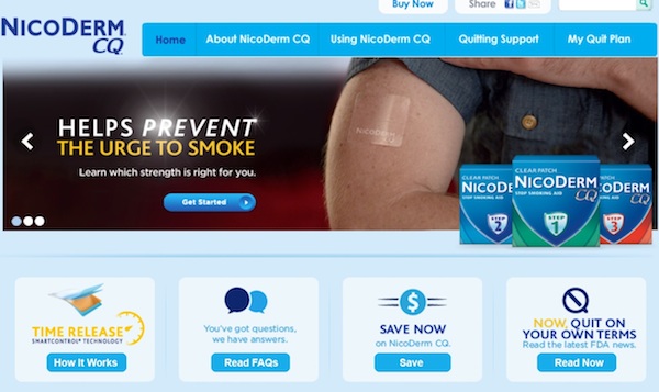
Here are examples of other flat designs that conveyed an idea through icons and imagery together with short texts.

Conveying a complex concept through a few visual cues utilizes the type of artistry that drew most designers to the field in the first place. By removing the clutter, designers can craft a visually-appealing site that draws visitors in and helps communicate each client’s message.

