How to design a compelling leaflet
0Designing a leaflet is never an easy process, especially if you have limited/no design experience.
However, even if you happen to be the greatest graphic designer on the planet, you may still find it difficult to design a leaflet that really generates results.
Why? Because the aim of a leaflet isn’t to be a pretty, award-winning piece of art (although that never hurts), but rather to generate a return on investment for you (or your client).
But how exactly do you design a leaflet that does this?
Well, as mentioned, it never hurts to make it pretty; but aside from that, you should ensure that your leaflet follows the AIDA marketing checklist.
AIDA stands for Attention, Interest, Desire, and Action, and serves as a blueprint for marketing materials such as leaflets.
But how exactly do you achieve these four things?
Well, here’s a checklist with some advice:
Grab Their Attention (“Attention”)
As mentioned, the first step is to capture the “attention” of your target audience.
This can often seem like the most difficult part of the process, especially as there’s certainly no shortage of leaflets out there. Chances are that your competitors probably have leaflets too, so your design is competing with them, amongst others.
But how do you stand out from the crowd and grab the attention of your target market?
Perhaps the easiest tactic is to simply make your leaflet bright and colourful, to ensure that it’s easily visible from a distance.
Now, by no means does this mean that you’re limited to neon-like colours such as yellow and orange; it simply means that you need to use colour to your advantage, and at least use somewhat bright colours.
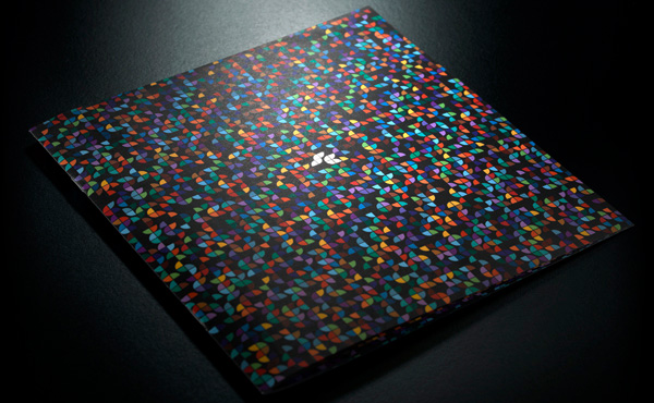
A good example of this is the leaflet above from Southern Colour.
You can see that they make beautiful yet subtle use of a number of bright colours on the front of their leaflet. You can see how this would help to grab peoples’ attention.
However, although you might be tempted to use every colour under the sun in your design (in order to make it as bright and outstanding as possible), it usually pays to stick to just 2-3 colours.
This will help to keep things simple and consistent. Too many colours will only “water down” your design, and in most cases, end up producing a less eye-catching design.
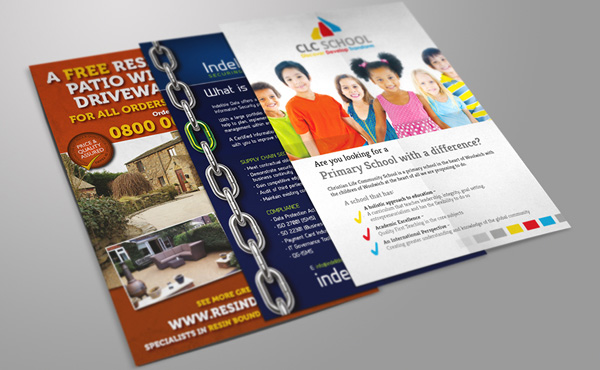
You can see an example of how 2-3 colours can be used to your advantage in the image of the three leaflets above.
All three of these leaflets are very different from each other, yet they all use just 2-3 colours (minus any imagery) to produce attention-grabbing designs.
Note: The trick is to ensure that all 2-3 colours you use compliment each other and are highly contrasting. This is what will produce an attention-grabbing design.

Another top tip for creating an attention-grabbing leaflet is to make uses of beautiful imagery, like the leaflet above.
Beautiful images (such as the fruit on the front of the leaflet above) almost always serve as attention-grabbers; so if you have images available, use them.
Note: You can buy beautiful stock images online for just a few dollars/pounds if you need them.
Keep Them Interested (“Interest”)
The next stage of the AIDA process is “interest”; this is basically the process of keeping the reader interested enough to actually read through your entire leaflet.
There are a few ways to do this:
One of the things you’ll want to do is to make sure to use the sort of language that will resonate with your target audience.
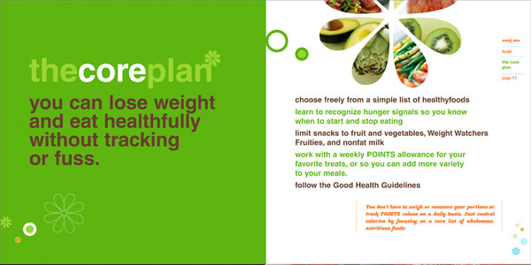
For example, take a look at the leaflet above from Weight Watchers.
It uses language that is likely to really resonate with the target audience (i.e. people looking/struggling to lose weight).
The whole premise of Weight Watchers is based on simplicity (hence the points system), and you’ll notice that the language used throughout the leaflet takes an extremely simple and “no nonsense” approach.
It uses words like “fuss” and phrases like “hunger signals”; it’s this sort of language that is likely to keep the target audience interested.
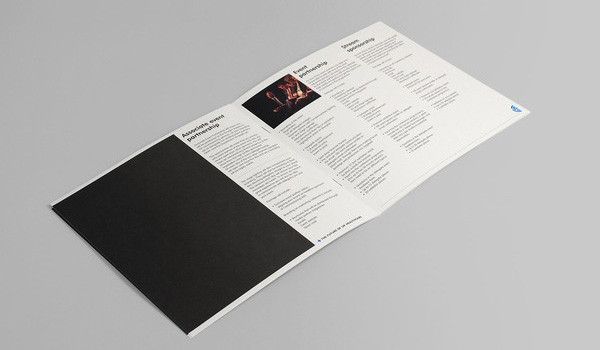
If you were creating a leaflet targeted towards a community of corporate-minded businesspeople, this language might not keep them interested, as they may prefer a more in-depth, information-heavy approach.
You can see an example of this in the image above; it’s packed with information and certainly would appeal to a different demographic when compared to the Weight Watchers leaflet.
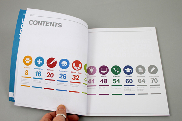
Another tactic you can use to keep people interested for longer is to break up large quantities of information/text into bite-size chunks; you can even add a contents page if your leaflet is long enough (like the leaflet above does).
Create Desire (“Desire”)
Ok, so by this stage you’ve managed to actually grab the attention of your target audience, and keep them interested for a significant amount of time, but now you’ve got an even more difficult job on your hands: create desire.
This is the process of actually creating desire for your product/service/scheme amongst your acquired readers, and it can be quite difficult.
However, there are a few tactics you can use:
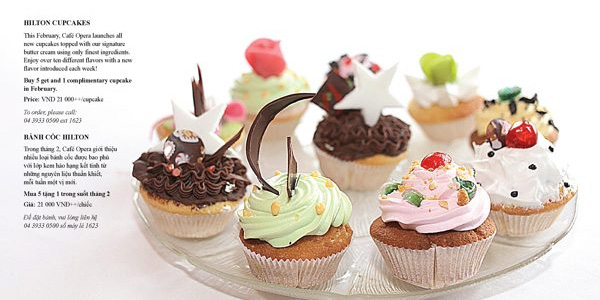
Once again, this is a good time to make use of imagery (much like the Hilton leaflet above does).
We already discussed using images briefly in the “attention” section of the checklist, but you can also use them here, as they’re often perfect for creating desire for particular products/services.
In particular, they work well for highly visual products/services, such as food (see the Hilton example), drink, holidays, experiences, etc.
Why? Well, take a look at those cupcakes in the Hilton example above and tell me that you don’t desire to eat one of them right now. You can’t, right?
That’s desire.
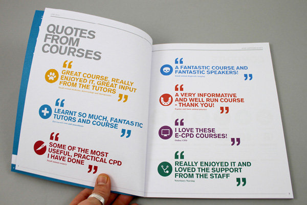
Another tactic is to use “social proof” in order to create desire.
“Social proof” is nothing more than the process of letting your readers know about the fact that other people have enjoyed your product/service, and telling them exactly what they thought about it.
Word of mouth has always been the strongest form of marketing, so if you can incorporate this into your leaflet (with testimonials, for example, as shown above), chances are that you’ll skyrocket the level of desire for your product/service.
People will think “wow, they enjoyed it, so surely I would”. Plus, people don’t like to think they’re missing out on something that others have enjoyed; it’s human nature.
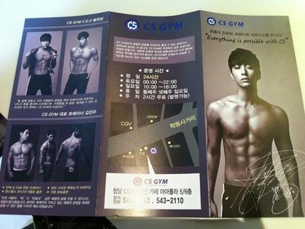
Last but not least, you can also create desire by doing the following: showing your audience something they want (e.g. the body of their dreams, as pictured above), and pitching your product/service/business as the solution that will enable them to achieve/obtain that particular thing.
It’s about knowing your audience and knowing what keeps them awake at night.
Encourage the Next Course of Action (“Action”)
At this stage, you’ve got your target audience hooked; they’ve been intensely reading your leaflet and have decided that you offer the solution to their problem.
Now what?
It’s time to encourage the next course of action, and you do this with your CTA (call-to-action).
Note: If you don’t make sure to do this part, it won’t matter if you’ve nailed every other stage of the checklist; you won’t experience success, so read carefully.
Your CTA is nothing more than the process of explaining exactly what course of action the reader should take next.
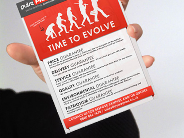
It could be something simple like “contact us” followed by a phone number or email address (such as in the image above), or something much more elaborate (e.g. “Enter the code DISCOUNT1 at the checkout for 20% off your first order”).
Typically, the more specific your CTA is, the better, but a simple “get in touch for a quote” will suffice if you’re not feeling particularly creative.
Conclusion
There you have it: a simple four-step checklist for your leaflet based on the AIDA principles.
It’s important to remember that the AIDA principle works a little like a funnel; you won’t be able to get the reader to continue to the bottom of the funnel (i.e. “action”) without taking them through every step in the process beforehand.
So, it’s important that you make sure your leaflet incorporates all of the four principles above.
As a quick recap, first you need to grab their attention, then you must garner their interest, then you need to create a sense of desire for your product/service, and lastly, you need to tell them what action to take to progress to the next part of your sales funnel.
It’s a simple process, and it works well, so stick to it!


