Tips for Designing Email Newsletters
2As technology evolves, it brings about numerous avenues in reaching out to the right people. This kind of targeted marketing is beneficial for the companies because they get higher revenue and it also helps people to find the products that interest them.
Email marketing through regular newsletters is one such technique that brings together the consumers and producers of a product and results in a win-win situation for all parties concerned.
Due to the nature and importance of these email newsletters, it is important that a good amount of time is spent on its design. It should be captivating and the reader should feel like looking into its contents. In order to achieve this end result, the aspects mentioned below should be kept in mind while designing an email newsletter:
Understanding Your Target Audience
The fundamental step in designing an email newsletter is to understand the target audience. The average email inbox receives more than ten junk mails or spam messages everyday and this is viewed as a nuisance by the users. Your email newsletter should not fall into this category; this can be ensured only with a top of the line design.

Firstly, you should have a catchy title that will induce the reader to go through the remaining content. The colors and layout should be pleasing and most of all; the text should be simple and precise. Another aspect that you should understand is the laws and policies that will apply to the emails you send out. This is to protect the privacy of the readers and to ensure that you do not spam their inbox. So, check with the reader and ask him or her if she would like to receive more information on this topic. Show an example of what you have to offer and let the reader decide. In order to be successful, your design should be simply amazing and this is exactly where you have to work on. This is also one of the best avenues to exhibit your talent and creativity as a designer.
Have an Objective
Every email newsletter should have a purpose and it usually is about promoting a website or selling a particular product or service to interested clients. This objective should be well understood and it should reflect in every aspect of the newsletter including the color, layout, text and the overall look and feel of the newsletter. For example, if the website has used certain colors or has a particular pattern, then it is a good idea to have a similar theme for the newsletter too because it is easy for people to relate the two things together.

While designing the newsletter, it’s important to understand the objective and the end result that is expected out of it. When these are understood, the design and the flow would be relevant and at the same time attractive to the reader.
Crisp, Relevant and Clear Message
An important part of every newsletter is content. You have to pay more attention to the heading because this grabs the attention of the readers. This heading should be relevant to your business and at the same time, should be attractive for the reader to open the email and go through the rest of the content.

The remaining content on the newsletter should be simple and it should be readable by people with various levels of English knowledge. In this global environment, it’s absolutely vital that the language is kept simple because it will bring about a wider audience and subscription for your newsletter. Also, the message should be crisp. You have to convey your message right away without spending too much time on greetings and other pleasantries.
Another aspect about the information is it should be relevant to them and it should relate to the product you are trying to promote. There is really no point in talking about the industry or the trends that are likely to happen in the future because all that you will do is bore the reader. Your design and its content should avoid these pitfalls to become popular so that your final objective will be attained.
Finally, make sure you include links to your website or product page so that users can visit the page if they need more information. Also, give them an option to view the newsletter in a browser so that they can have a better idea of what you are trying to convey if something goes wrong with the email client’s display.
Formats
Your newsletter should be visible to people using any email client and in order to make this possible, you have to keep it simple. Some email clients do not render HTML and CSS tags well and this can result in a dismal appearance for your newsletter. In turn, the reader may simply unsubscribe. To avoid these hassles, you have to use CSS inline styling. You can also keep it simple by sticking to a plain text version for people who are not interested in seeing HTML in their emails.
The design of your newsletter should cater well to these different formats. Depending on the user and the email client, it will be rendered differently and yet the message should be crisp and clear for everyone to read.
Exclusive Deals
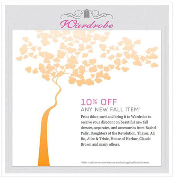
One primary reason for the popularity of newsletters is the unique deals that viewers get through it. You can make use of this trend and include some exclusive deals or offers to the readers of your newsletter. This is a good way to retain the interest of existing users and to bring in more users to your mailing list.
The example below shows the exclusive deal that is being offered to the subscribers of this newsletter.
Unsubscribe
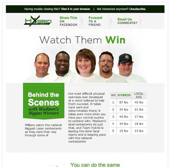
It is vital that your email contains an option for the user to unsubscribe from the mailing list. Though having this feature and other disclaimers is not pretty, nevertheless, it is important because you have to give your reader a choice to opt out. It really makes no sense to send your newsletter to people who are not interested and so, to make it easy for everyone, this link should be present on every email newsletter. It’s even a good idea to make it prominent because it will give the readers a confidence in your newsletter and it will assure them that you are not spamming their inbox.
In the example below, the unsubscribe link is given right at the top so that readers who are no longer interested in the topic can opt out of the newsletter.
Examples
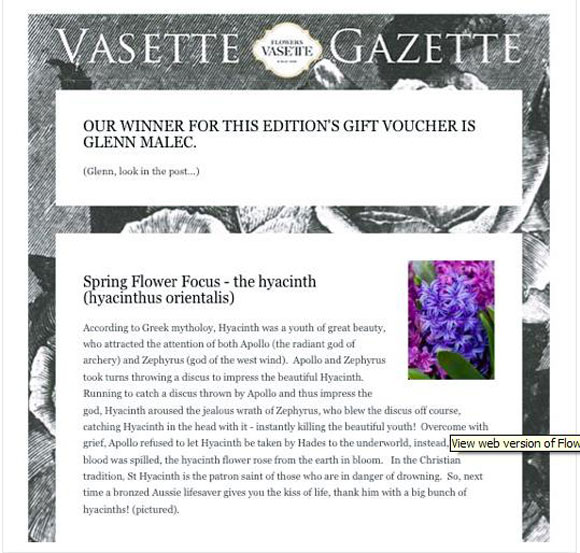
The first example is a simple newsletter that is informative and attractive. A special mention is the black and white image of flowers as the background that is so well-suited to the topic.
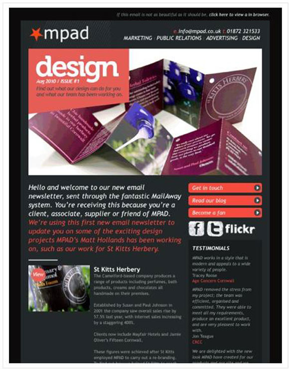
The second example has an aesthetic design and vivid colors with many links to the website that is being promoted. Also, this newsletter uses CSS inline styling.
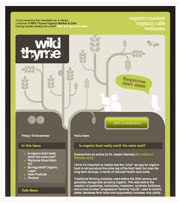
This is a unique design with many curves as the separating element. They go well with the theme of the newsletter and it uses earthy colors for added effects.
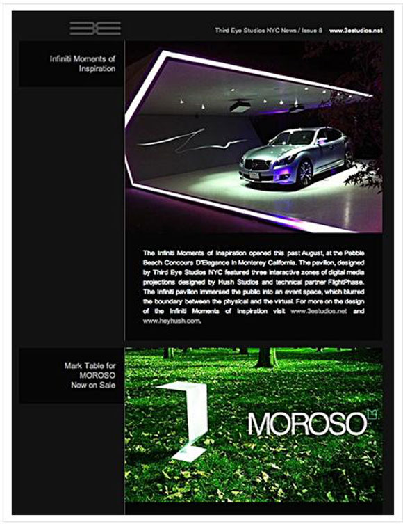
This design is simple and at the same time, striking. The images contrast well with the black background and make it attractive for any reader.
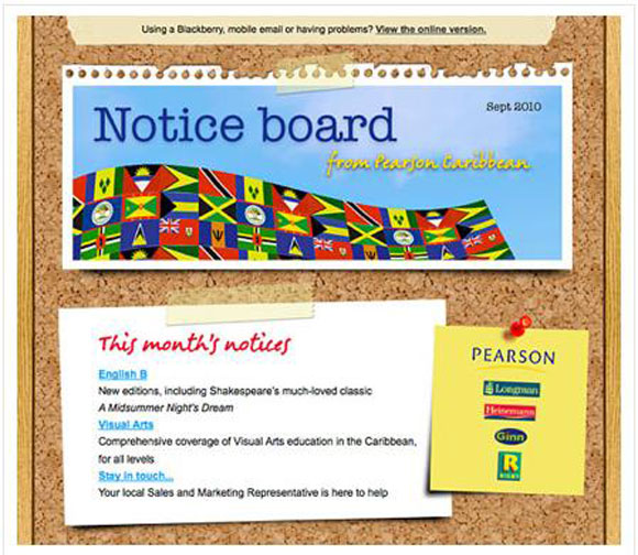
This is an innovative design that takes everyday things in life and converts them into a newsletter. It is easy to relate to and the text is crisp and clear. One glance will help the reader to understand what is being said and such simplicity is the hallmark of this newsletter.
Conclusion
In short, designing an email newsletter is a lot more complicated than it meets the eye because it involves many factors including some external factors such as email clients. The suggestions mentioned above will go a long ways in helping to gain more and more dedicated viewers for your newsletter.


[…] Tips for Designing Email Newsletters […]
[…] Tips for Designing Email Newsletters […]