Best Web Design Practices for the Start of Year 2011
2Web design developed fast and the style of 2011 is similar to the one when 2010 ended. Minimalistic webpages are really appreciated nowadays and if you are a webdesigner, you need to focus all the time on what the client wants. But, as many years of web design taught us, clients do not always want what is popular or easy to do.

This is why you have to educate your client and explain to him why you should do it your way. As a bottom line, you are the expert and he is the rookie. But as long as you work on his money, you have to convince him first.
Here are some of the very popular practices in web design for this year’s beginning. Take a look at them and try to convince your client that this is the right way to do it. Researches done by experts showed those practices will be with us for a lot of time.
Clean Things Up and Avoid Clutter
The layouts filled with too many details, text, elements, heavy webpages and dark color palettes were placed on a quick slippery slope lately. The minimalistic approach took over the world of webdesign and experts made more place for clean interfaces, white space and well-distributed information in their work. Beautiful and elegant interfaces are now filled up with lots of white areas and bold typefaces. But, even with lots of details on the page, websites do not look heavy and overfilled in the minimalistic approach. Rob Treutel‘s portfolio is a very good example of how white space can be used. Gunner‘s webpage is even a better example. Some may say he took it to the limit by using too much white space, but the page looks really good. It’s not heavy on the user or the browser and is interactive as well.

Image by shutterstock
Use Dropdown Menus
If you have a webpage with three links, there is no need for it. But, if you have lots of pages and want to keep it simple, you can always use a dropdown menu. This is nothing new to the web; there are many others dropdown menus today than we’re missing five years ago. Furthermore, the internet is filled with tutorials on how to create a dropdown menu yourself so, do not be shy. Play with them until you manage to put all your contents into it. You will spare a lot of space and help the user to navigate easier.
Typefaces can Totally Change a Page

Image by shutterstock
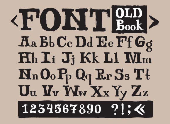
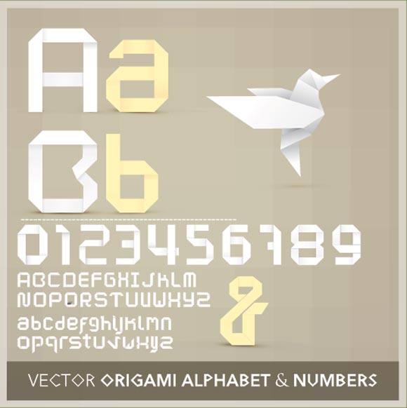
With thousands of fonts and typefaces available on the internet today, the only thing you need to do is play with them. A few years ago typefaces were not important, because they were just a way to display information, but today the approach changed. Do not be afraid of using big bold typefaces in the header of your page. Nowadays, we use it for grabbing attention. If you play with it and make it fit within your page, it will not look as a mistake and will definitely get the attention of the users. A 55pt text can’t just be skipped by the eyes and it doesn’t look weird anymore.
The advertising business understood the effect of playing with typefaces few years ago and it works well for them. This change will soon apply to the web design community as well. If you are able to grab the attention of the visitor with a big, well-positioned font, you will keep him interested in whatever you are offering. Otherwise, he will click away in an instant. Remember that average users see tens of new webpages daily, so making them remember yours is an important step in building a powerful brand. Benny Roth‘s portfolio is a very good example of how can big fonts is useful. His page would have been shocking three years ago, but today is popular and often given as example.

Image by shutterstock
Plain Backgrounds get Replaced by Textures
Plain backgrounds were very popular at the beginning of the web era, but the trends changed in the last years. Do not believe heavy textures are the new thing, but grungy textures along bold typefaces and clean interfaces are more appealing nowadays. Many designers are afraid of using white space when working on a white background because their page might be too boring. But when you use a smooth texture, there is almost no white at all on the page. So, leaving a lot of white areas will not be such a difficult task anymore. Do not get confused. The terms of white areas or white space do not mean the actual white color, but a lot of free space.
Textures spice the looks up a bit because they add richness to the layout. Noisy and grunge textures are popular this year, along wood and metal like textures. Do not be afraid to create your own texture in Photoshop. You might end up with something better than what you can find on the internet. Take a look at some examples on how a texture works: one, two, three.
Pictures can go on the Background as Well
This technique was very popular few years ago and now, it seems to come back in contention. Many designers decide to employ splash pages on their work simply, because it is more appealing to the eyes that it grabs attention. Technically, it is even easier to develop than a page full of dives and boxes. However, it is more difficult to make it work from the visual point of view. The cons are the facts that the page loads slower and that you might encounter some issues when having to adapt the content to your picture. This is a good example of how should such a page be designed.
TIP: Do not use the same background picture for every page. First, create the content; then the menu, and then search a picture which is not interfering with the most important stuff on your layout. You don’t want your users to focus too much on the photo and not at all on the content.
Lighter Interfaces are More Popular
Web Designers worked on a lot of heavy and oversaturated websites in the last decade. Many of them had a dark color palette with bright fonts on top of them. Not only the text is more difficult to read, but this approach gets less and less popular nowadays. Thanks to the better-looking bright interfaces.
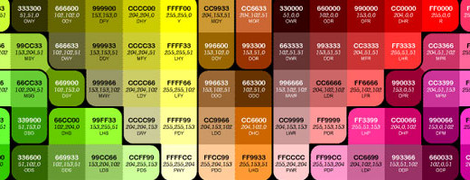
Cleaner and minimal approaches come with a preference for lighter colors, with light palettes and pastel colors. Brightening up the page is something you should look into, and not only because it is popular, but because it helps the users more as well. Content is very difficult to read if it is written bright on dark, than the other way around. By not employing this approach you might only scare the user away. Though it looks better, keep in mind that what you have to say is far more important than how your webpage looks.
Round Corners Look Better
We know, Internet Explorer didn’t offer support for round corners, but with the addition of Internet Explorer 9 on the market, round corners are possible in Microsoft’s browser thanks to the border-radius properties. Other browsers do not have problems with round corners support, so there is not an excuse anymore.
Because the trend is to keep everything light and smooth, round corners will help you maintain this approach. They look more appealing as well, and make more sense within a minimalistic layout than 90 degrees corners.
Round corners can be designed not only in the new great coding tools, such as CSS3, but also with graphic applications such as Illustrator and Photoshop. So, there is no reason for you to avoid this.
Web design trends in 2011 changes fast, as the whole world of IT, webdesign and web development does. A huge amount of research has been made in the beginning of this year and most of it offered the same conclusion. The trends that I have recommended above are going to say with us for at least two-three years, so you would better get used to them. Sure, there’s no problem designing your own way, but doing it within some normal lines might help you get a bit more appreciation in the world of web designers.
What do you believe about the new trends of 2011? Have you encountered problems with clients because of them? What more trends are you making use of this year?


Most of the business organizations now wants to do business online. They have now realised the importance of the online presence to their customers. They have now understand how important it is to be in touch with your customers 24/7. Nice post..
Thanks for sharing nice tips on web development designs and animations. I think, using background images which are light with less loading time, is a key feature that needs a more focus, as we often tend to concentrate more on design , while neglecting the real side effects of rich designs that end up taking huge loading times. This might actually be abd in terms of optimizing your site in search engines..