How to Create 3D Cruiser in Photoshop Tutorial
3In this Photoshop tutorial, we will learn how to use the 3D features in Photoshop to create 3D cruiser scene.
In this exercise we will combine three different landscape-type images to serve as a backdrop for the emerging figure coming forth from beneath the depths. We will start by combining the landscape image.
Related posts:
- Quick Tip: How to Create a Seamless Pattern in Photoshop
- How to Create Islamic Style Poster in Photoshop
- How to Customize Skyscraper Background in Photoshop
- How to Create a Photo Manipulation Poster in Photoshop
- How to Create a Comic-Book Style Image of Yourself
- How to Create HDR Photos in Photoshop CS5
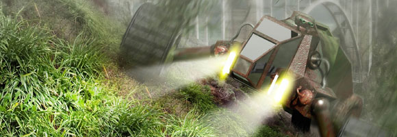
Then we will add custom-created clouds to enhance the scene. Next we will add the human figure, which we will later clothe in a series of textures. This will be fun, but be patient and take your time.
You can access the files required to complete this tutorial by clicking the download button at the end of the tutorial. This tutorial is part of Photoshop CS5 Trickery & FX book written by Stephen Burns.
Step 1
Create a 8.5 X 15-inch file with a resolution of 300 ppi. Access the tutorial files and open the bridge image.
Position the bridge as shown in figure 6.1 leaving some space for sky along the upper age as well as space to the left for extending the foliage. Select a large portion of the hillside to the lower left and we will use this to assist us in rebuilding the hillside.
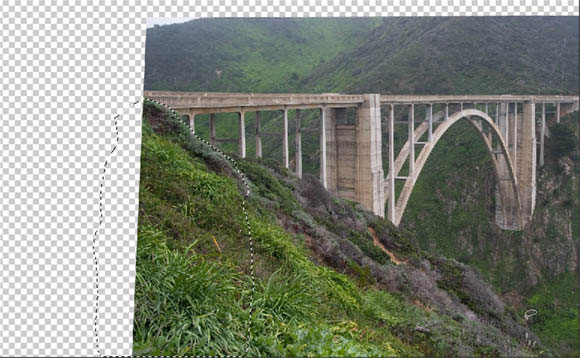
Figure 6.1 Position the bridge and the lower right corner.
Step 2
Copy (Ctrl-C/Command-C) and paste (Ctrl-V/Command-V) the selected area onto a new layer and apply free transform (Ctrl-T/Command-T)to produce something that resembles Figure 6.2. (see Figure 6.2).
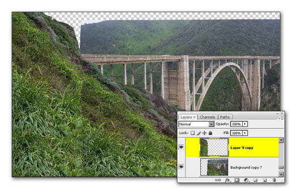
Figure 6.2 transform the foliage to cover the right side of the composition
Step 3
Create a new layer(Ctrl-Alt-Shift-N/Command-Option-Shift-N). Activate the Stamp tool(S). Now we’re going to blend the two layers together so that the entire foreground appears seamless. It is usually a good idea to apply editing techniques that will make it as easy as possible for you to make changes if your client desires them. So, we will apply the clone technique onto a separate layer. To effectively do this make sure that “Aligned” is checked. Also, in the “Sample” drop down list make sure that “All Layers” is selected. You have now told Photoshop to allow you to apply the stamp tool onto the blank layer but utilize the visual information of all layers underneath and apply the technique to the current layer selected.(see Figure 6.3).
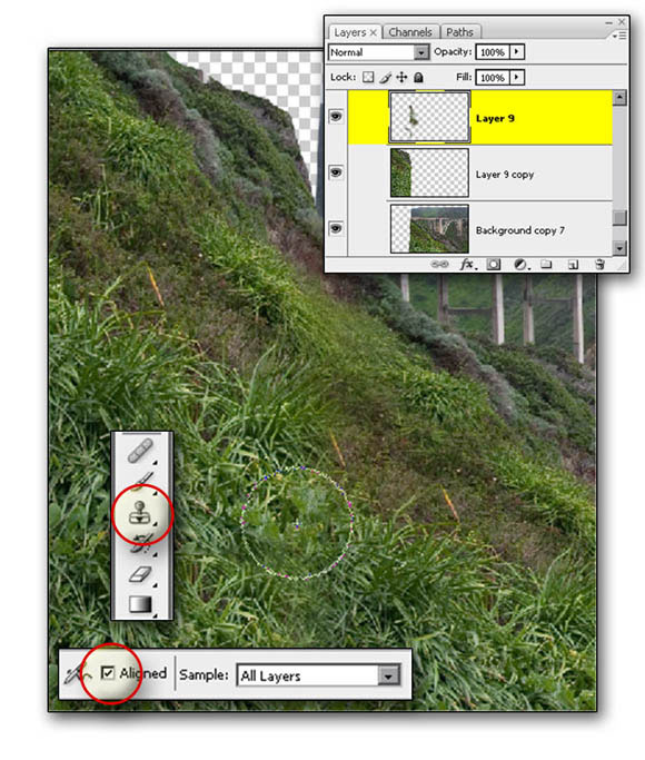
Figure 6.3 use the stamp tool to blend the grassy areas.
Step 4
On the CD-ROM and the chapter 6 tutorial open the “sky002.jpg. Place it and position it into the scene as shown In figure 6.4.
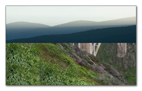
Figure 6.4 Add the sky to the scene
Step 5
Duplicate the bridge layer and apply a layer mask that isolates the bridge. Place the bridge layer on top of the sky. For creating a mask use the techniques that you’ve learned in chapter 3 in using channels to create masks.
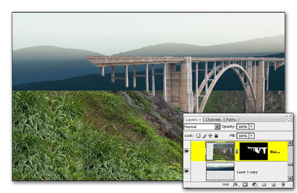
Figure 6.5 duplicate the bridge layer and apply a mask to isolate the bridge.
Step 6
Now, apply a layer mask to the sky and use your paintbrush with your WACOM Pen to isolate its visual aspects to the area’s behind the hill as well as the bridge(see Figure 6.6).
Figure Figure 6.6 apply a layer mask into the sky
Step 7
The goal is to apply a hazy atmospheric effect to the background of the scene. That means the bridge will lose detail as it becomes more dominated by haze. Let’s use the technique of applying a layer style of overlay to the bridge and the sky layer. When you select overlay make sure that the color you designate for the overlay is a color that already dominates the sky area. Next, Bring down the opacity of the color fill so that the bridge isn’t completely lost of detail.(see Figure 6.7 & 6.8).
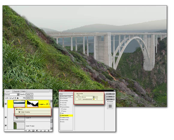
Figure 6.7 apply a layer style of Overlay to the bridge.
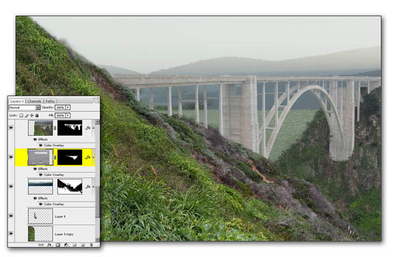
Figure 6.8 applied layer styles to the clouds
Step 8
The bridge is coming toward the forground at an angle and should reflect less distortion from the fog than the right side. To give this appearance duplicate the bridge layer and double click on it to open the Layer Styles dialogue box. Pull the opacity slider for the Overlay effect to the left to reduce the haze and revel more texture detail in the bridge overall. Now, apply the layer mask to restrict the results to the left side of the bridge leaving the right to maintain its ghostly appearance. (See Figures 6.9) Let’s continue on and give the image some warmth.
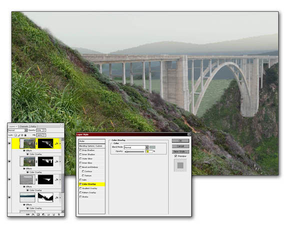
Figure 6.9 duplicate the bridge layer and change the strength of the layers style
Step 9
So far the image looks a little blue and the drab so use a Curves adjustment layer and select blue as the color that you would like to alter. If we push the curve upward it will become dominated by the blue hue to a greater degree. In other words the blue channel is being directly affected. To warm up the scene we will use yellow which is the opposite of blue. So pull out some blue near the lower tonal area of the curve as shown in figure 6.10.
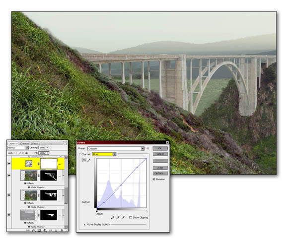
Figure 6.10 Apply a Curvea adjustment layer to adjust color.
Step 10
Merge all of the layers into a new layer by holding down the ALT/Option key and accessing the layers submenu and selecting “Merge Visible”. Commit this new layer to a Smart Objects. Apply Gaussian Blur ( Filters > Blur > Gaussian Blur) to the smart object and set the radius to around 21 pixels as shown in figure 6.11. The idea is to establish a shallow depth of field so restrict the blur effect to the upper portion of the image using a gradient on the mask. Make sure that you apply white to the upper portion of the mask and black in the lower portion.
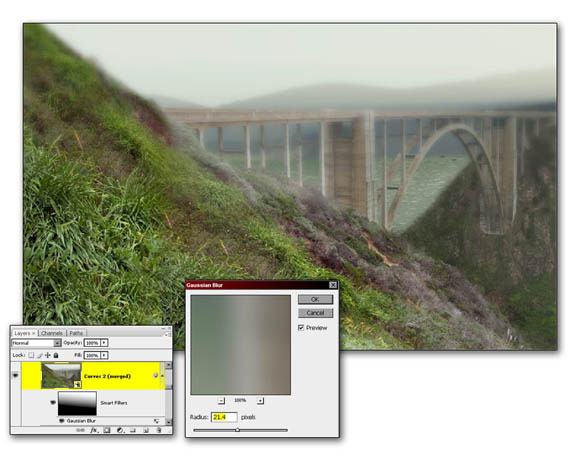
Figure 6.11 creates a shallow depth of field.
Step 11
Apply the same technique of adding a layer styles color overlay but this time set the layer blend mode in the overlay panel to “Luminosity” as shown in Figure 6.12.
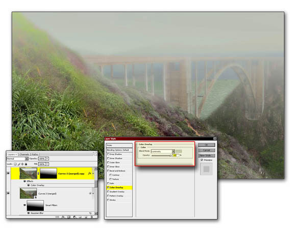
Figure 6.12 apply layer style of overlay and give blend mode of luminosity.
Step 12
Finally, we’re going to add some subtlety to the atmospheric fog with the use of the Gradient adjustment layer. Apply a Gradient layer that establishes a gray with a slight greenish cast on the left and gradiates toward white on the right. This is to give the appearance of the ambient color being more dominant in the foreground due to the fact that the foreground is closer to the viewers perspective. The human eye will be able to perceive subtle colors in its immediate vicinity. The further away we get the denser the fog will become which will take on a more neutral effect visually, therefore any objects in the background will lose its identity and take on the soft luminance of the fog. To duplicate this affect we have applied a more greenish fill to the areas that are closer to the camera which is in this case to the left hand portion of our composition.
Next, use a layer mask to restrict the effects of the gradient to the upper portion of the image. Notice that in figure 6.13 and initial gradient has been established applying black in the lower half and white in the upper half. The computer often applies clean, predictable results and this often makes your image easily recognizable as being computer generated. To break up this predictability edit the mask with your paint tool to remove the effect from the areas that are closer to the foreground by hand. Use your own creativity to establish the final result.
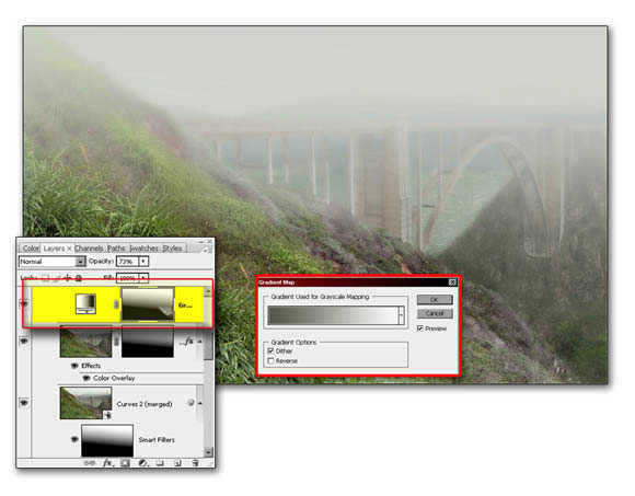
Figure 6.13 edit the gradient mask
Step 13
The sky looks a little boring and needs a sense of life so go to the CD-ROM and navigate to the tutorials chapter 6 folder and open the “birds in flight” image. Select out one or more of the flying birds and place them into the sky. Now we are ready to add the futuristic land patroller.
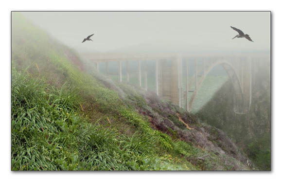
Figure 6.14 apply birds to sky
Working with 3D layers
The wonderful feature of importing 3D objects into Lightwave will save an illustrator quite a bit time from having to render and rerender their models in the exact positioning and perspective desired to fit into the initial creation.
Let’s take a look at the features and capabilities that you now have for a adding 3D object to your illustration.
Step 1
Up until now Photoshop has been primarily a two dimensional program in that it utilizes a “X” axis (left to right) and a “Y” axis (up and down). This information is consistently displayed in your “Info” palette.
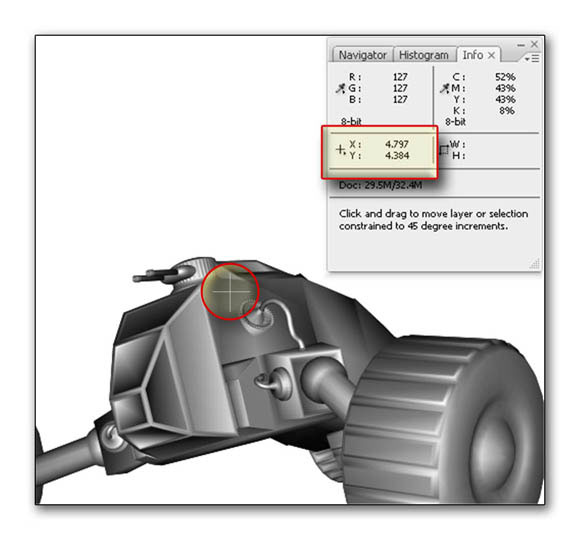
Figure 6.15 the information palette displays “X and “Y” location of your cursor.
CS3 adds a new dimension to the 3D layers. This dimension displays the “Z” depth (foreground to background) which now gives the user three dimensional capabilitiesc where the positive “X”axis is to the right of zero and the Positive “Y” direction is heading above zero and vice versa. The “Z” axis often referred to as “Z” depth has a positive direction going into the scene.
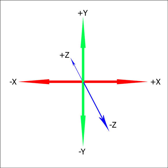
Figure 6.16 the information palette displays “X , “Y” and “Z” vectors.
To view 3D objects CS3 uses a special layer called 3D layers. Access the Chapter 6 folder in the Tutorials folder of the CD-ROM and open “ch 6 3D model.psd”.
If you click on the layer the option bar will remain displaying the current selected tool from your Tools palette. To display the 3D options double click on the layer’s thumbnail and take a look at your options bar.
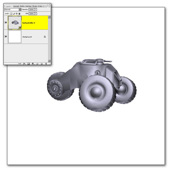
Figure 6.17 open the 3D file
Step 2
There are two different ways to view your 3D scene. One way is by viewing the object as you move it around in 3D space to resize or reposition it. You can access this view by clicking on the 3D Object icon on the options bar(figure 6.18A).. The other way is to view everything through the camera. On the options bar click on the camera which is next to the 3D Objects option button(figure 6.18B). Let’s go explore the capabilities of this new feature. For now, select the object view and let’s continue on.

Figure 6.18 view the camera and object options.
Step 3
Let’s take a look at the navigational commands for your 3D model. Start by selecting the rotation command and navigate 360° around the model.
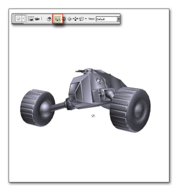
Figure 6.19 rotate the model.
Next, select the Roll command and roll the model on it’s pitch.
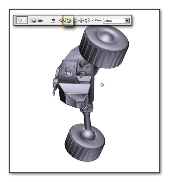
Figure 6.20 roll the model
Use the Slide command to move the model closer or further away from the camera. The results of this is that the object distorts as a gets closer to the camera. This is the similar effects of using a wide angle lens on a photographic camera.
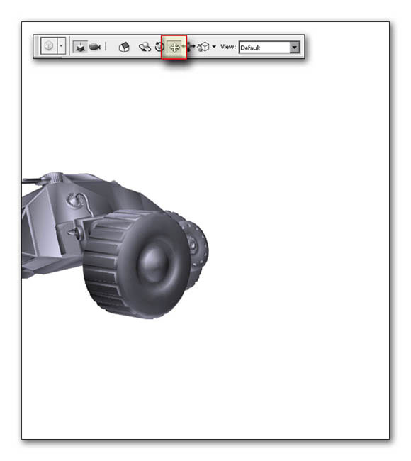
Figure 6.21 Slide the model
Select the Drag command to move your object anywhere in your frame.
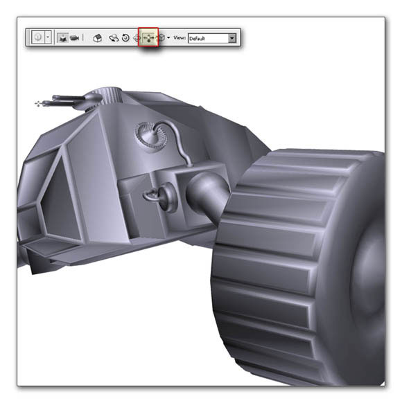
Figure 6.22 Drag the model
Finally, you can Scale your object so that it takes on a larger are smaller size. In addition you have a chance that will allow you to position it. Use this for placing your object throughout Racine without getting lens distortion.
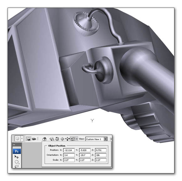
Figure 6.23 Scale the model
Step 4
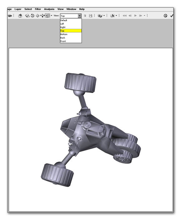
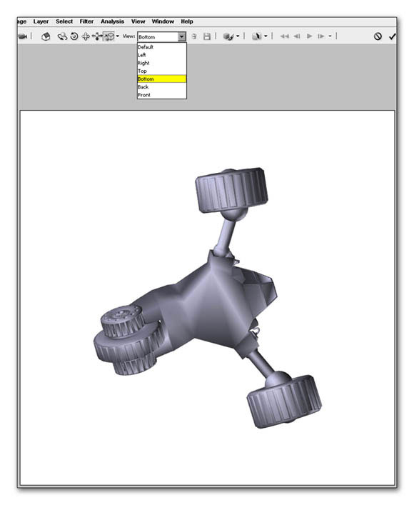
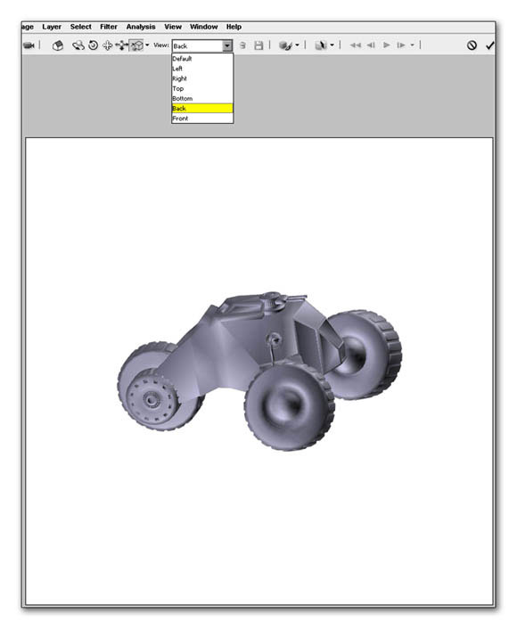
You also have the capability of using orthographic views. In other words these are views from a single location. They are as follows:
1) Custom 3D view (Figure 6.24)
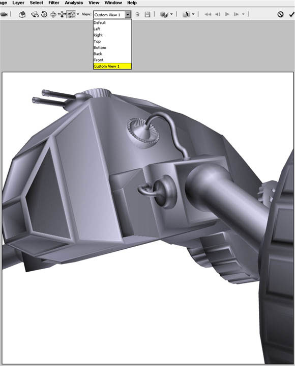
2) left view (Figure 6.25)
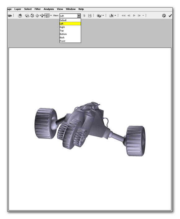
3) right view (Figure 6.26)
4) top view (Figure 6.27)
5) bottomed view (Figure 6.28)
6) back view (Figure 6.29)
7) front view(Figure 6.30)
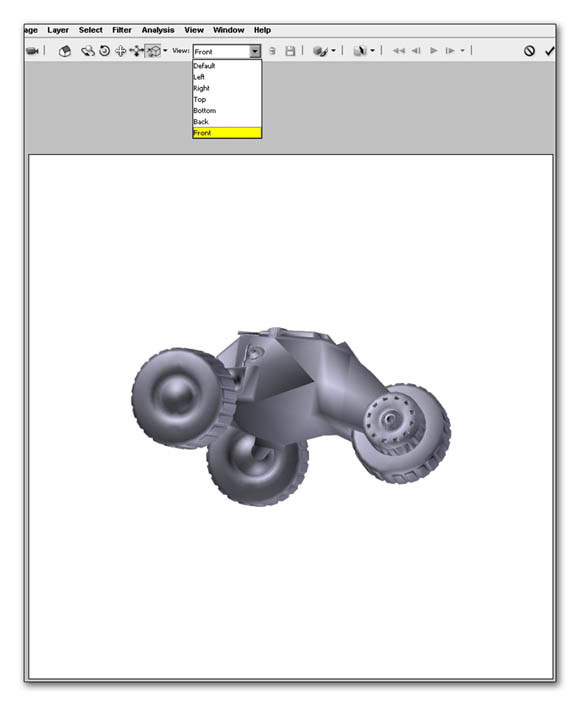
Step 5
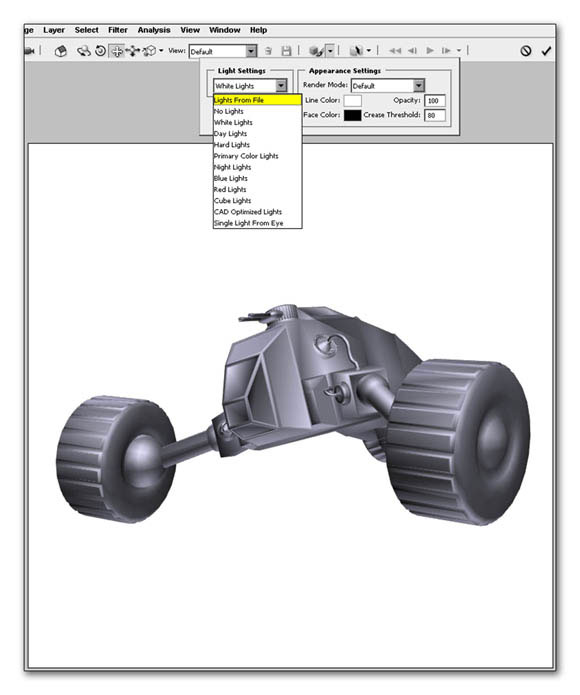
Although we don’t have the ability to add as well as reposition lights in our 3D file CS3 does give us some lighting options. We would take a look at a few those are options however go through all of them on your own time and take a look at their potential.
1) Lights from scene: displays the original lighting style from your 3D modeler. (Figure 6.31)
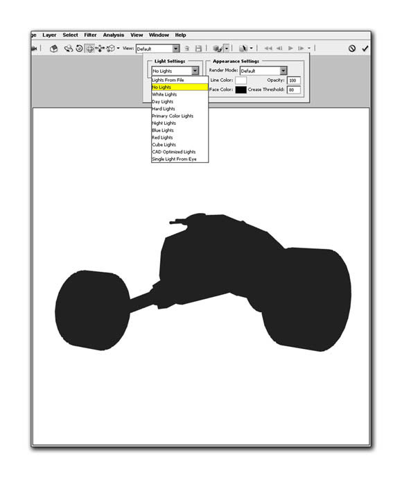
2) No lights: this turns off the light source be giving you black filled shape. (Figure 6.32)
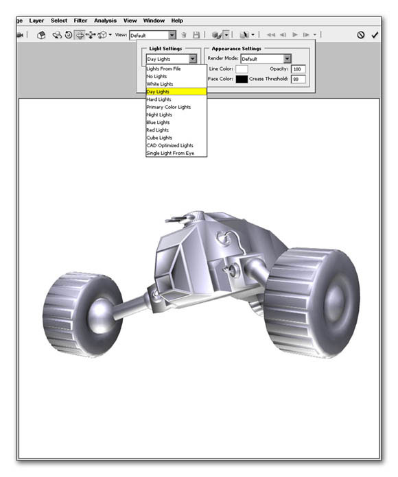
3) Data lights: this command tries to simulate daylight lighting by adding greater intensity and contrast to the final result. (Figure 6.33)
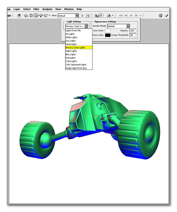
4) Primarily colored lights: this adds red, green and blue lighting styles to your 3D object. (Figure 6.34)
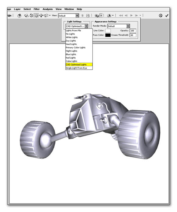
5) CAD Demise to lights: simulates the lighting style in a CAD program. (Figure 6.35)
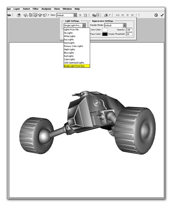
6) Single light from the eye source: this is you’re on camera style lighting which will illuminate the object face on. (Figure 6.36)
Step 6
If an artist’s does mechanical illustration the next feature is going to be a godsend. This feature is called “ Cross Section”. On your options bar select the downward triangle next to the Cross Section button and let’s take a look at its capabilities. This allows you to slice your model to view its interior can add other features and details to illustrate the function of mechanical instrument or you could apply slices to give an inside look of architectural interior. The possibilities are endless.
As you can see you have the ability to isolate the slice along the X, Y, or Z axis. Utilize the sliders to adjust positioning or rotate the slicing plane(Figure 6.36). You can also flip the cutting plane by checking the “flip” box(Figure 6.37).
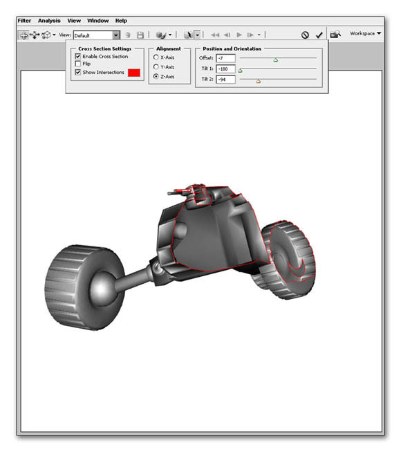
Figure 6.37 view of a cross sectioned image.
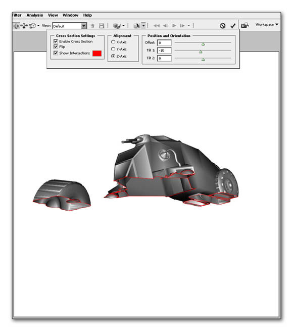
Figure 6.38 view of a cross sectioned image with “flip” activated.
A creative way to integrate the 3D model
Over the the landscape comes forth a futuristic military vehicle speeding toward the camera with such a great determination. As it’s moving forward its powerful tires kick skyward grass and dirt.
In this exercise the 3D object has already been textured and committed to a smart object to facilitate the creation of this tutorial. If you would like to try your hand at texturing the model in your own 3D program the “land patroller.obj” 3D has been provided for you on the CD-ROM. For now we will use a Smart Object derived from the 3D file to complete the tutorial.
Step 1
Go to the ch 6 Tutorials folder and open “land patroller.tif”. Drag this image into the new file, resize and position it similar to what you see in figure 6.39(see Figure 6.39).
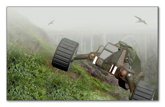
Figure 6.39 place the land a patrol are into the landscape scene
Step 2
Now we’re going to make a modification to an existing brush in your brush palette. Select the grass brush that is shown in Figure 6.40.
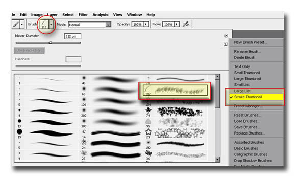
Figure 6.40 select the grass brush
Step 3
Modify the brush properties to match what you see in figure 6.41 A through 6.41D.
In essence we are adjusting the scattering, its rotation, and its shape dynamics to match the grass configuration of the hillside.
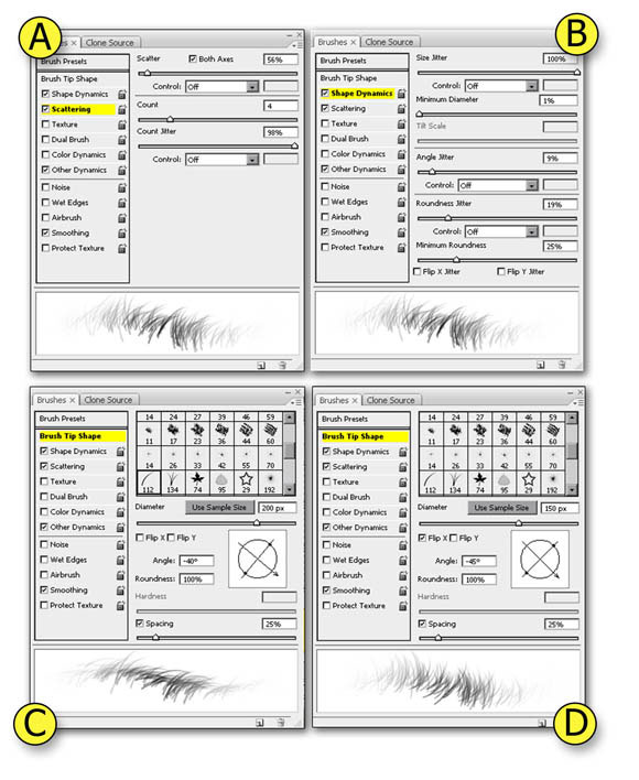
Figure 6.41 modify the existing brush properties to match the grass
Step 4
Apply a layer mask to the Smart Object and use your newly created brush with the foreground color set the black to edit the mask so that the grass shows through. And immediately you can see the advantages of creating a brush that duplicates the appearance of the grass. Although we could paint the grass on a separate layer this is a down and dirty trick for getting quick results.
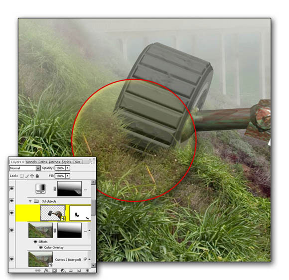
Figure 6.42 edit the mask with the newly created brush.
Step 5
Use the gradient technique to make a circular flare on a new layer above the vehicle. Resize it if necessary to match what you see in Figure 6.27. This will represent the headlight source for the land vehicle.
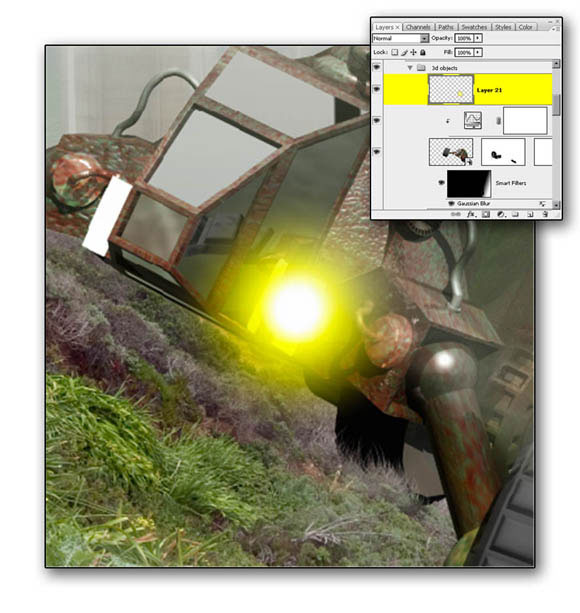
Figure 6.43 create a headlight source
Step 6
Create a rectangle selection on a new layer and fill it with white. Now, use Free Transform (Ctrl-T/Command-T) to modify the shape that will represent the light beams.
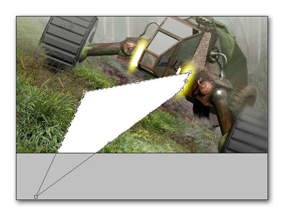
Figure 6.44 create the light beams
Step 7
Add some Gaussian blur to the beams as well as a layer mask two apply transparency to the section that is further away from the light source(see Figure 6.45).
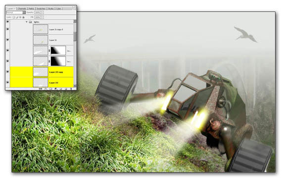
Figure 6.45 apply Gaussian blur and layer masks
Step 8
We’re going to add a slight vibrating motion to the vehicle. Duplicate the smart object and apply “Motion Blur”. You now have a smart filter and along with this filter there is a mask associate it with it. Use your paintbrush to apply the blur to the wheels, the axles and the rear part of the vehicle. This helps establish which parts are vibrating the most.
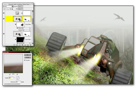
Figure 6.46 apply motion blur
Step 9
You’re going to find another use of that grass paintbrush that we created in step 3. Select the grass paintbrush and make sure your colors match two extreme a greenish hues in the landscape area. Use your Eye Dropper to set the foreground color to a light green and your background color to be a darker green. Make sure that you checkmark “ color dynamics” in the secondary paint options so that the paint engine will utilize the two colors. Also, give your brush some scattering to represent the grass flying into different directions. Finally, activate “ other dynamics” and select “pen pressure” if you are using a pen and tablet. Use your own creativity but try to get close to what you see in figure 6.47.
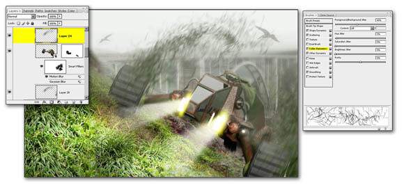
Figure 6.47 paint in the flying grass
Figures 6.48 shows the final results of this tutorial
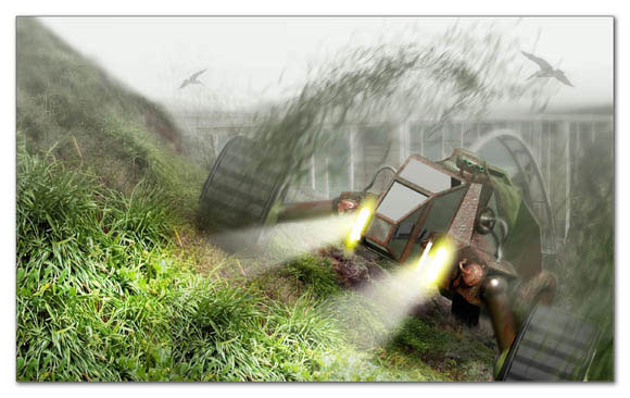
Figure 6.48 final results
[amember_protect guests_only] If you are already a Premium Member then just sign in and you can download the source files of this tutorial.Not a member? Sign up today or read more about our Premium Member area.

[/amember_protect]
[amember_protect user_action=’hide’ visitor_action=’hide’]



Great tutorial. It looks very realistic! Thanks
Great and (thinkfull) i really really like it
And i’ll try doing it soon
Thanks alot
Awesome tutorial – it’s a great effect to bring the 3d into photoshop without having to sort out any textures!