10 Captivating Background Videos
1The ever–changing capabilities of personal technology have made for some staggering advances in design and marketing.

Businesses can adapt their sites to take advantage of the better updates of classics like HTML and Flash, and make something truly unique for the users. Gone are the days of backgrounds and ads being all but ignored.
Sometimes this can be annoying as a visitor to a website. But more companies are starting to use background videos, and they are far from some boring and worn out TV ads being forced down our throats through our computer screens. Instead, they have become complex and interesting, often entertaining or even inspiring.
Below are ten magnificent examples of websites that have used background videos to keep our attention… and succeeded.
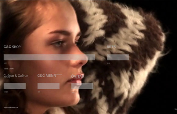
This Italian designer made their website to provide the exciting environment of a runway show. It is stylized and fun to watch, with some great sound that can nevertheless be turned off by a button at the bottom. If you like these clothes and love runway shows, you will be happy with this combination of both.
2. Razor Fish
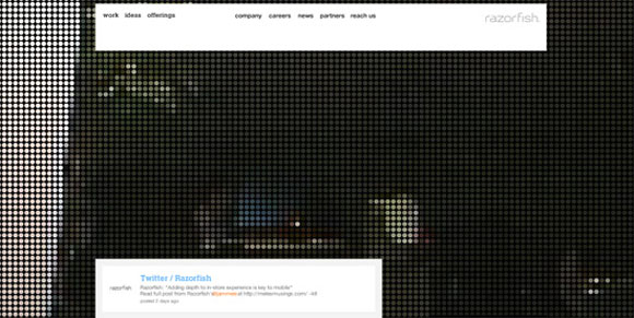
An innovative and somewhat abstract video in the background of Razor Fish definitely makes you stay to try and understand what is going on there. A tiny control panel at the bottom of the screen lets you switch to another movie to play and mute the sound.
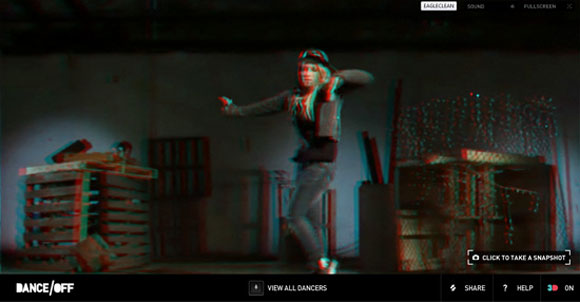
This site is a little lag heavy because so much is going on. If you don’t mind the loading time (which is still slightly high, even on a cable connection), it is great to check out. It shows a selection of dancers that you can watch in any order you choose. Using your keyboard you can pause and zoom in to check out the clothes. It is an awesome concept that was maybe a little too ambitious because of the time issue.
4. The Wood
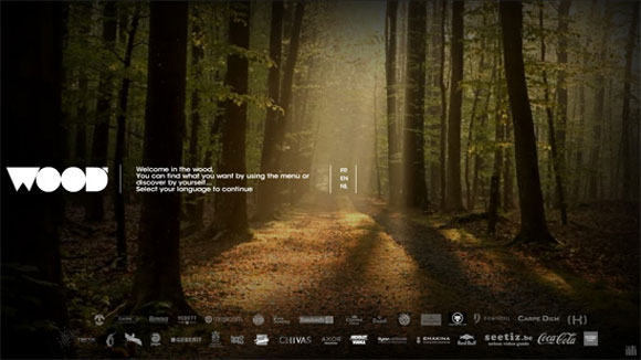
The Wood is a stylish and popular new restaurant centered in Brussels. As many other modern eateries of a certain type, they have gone with a natural and quiet atmosphere for their business. The website’s background video has tried to capture the essence of this by staying true to the name. There is nothing exciting about the video, but it is beautiful and very relaxing. The ambience makes it a great triumph for the designers, who created a gorgeous forest.
5. Jazzownia
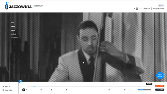
One of the best uses of background video I have ever seen. Cool and slick, this restaurant site shows a video of the golden days of jazz, with performers from live shows of the past. Not only is the video itself really cool, but the music is superb and it all ties in to the theme of the eatery. I ended up spending a lot of time watching the video at this site.
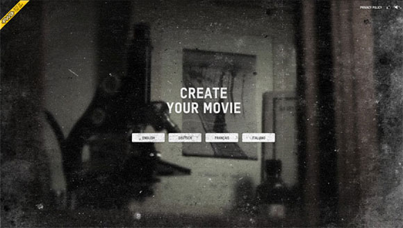
Swisscom came up with an idea to both promote their TV service and be interactive. It works by connecting to your social networking account and it puts you and your friend list into the video. This creates a movie trailer for a ‘film’ called Los In Val Sinestra. You can choose what they call the ‘thrill level’ to change what content you will receive. What I enjoyed was that it wasn’t a cheesy cut and paste head job. Instead, they put the images in things like passport photos, lockets and portraits.
7. Eagle Clean

A minimalist video is hard to pin down when working for advertisements, but this London-based cleaning company did it. It is just a general website in stark black and golden yellow.
But every once in a while a gloved hand appears to ‘clean up’ the site, rubbing spots and brushing off dust. It is realistic and interesting, and doesn’t at all hinder the usability of the website.
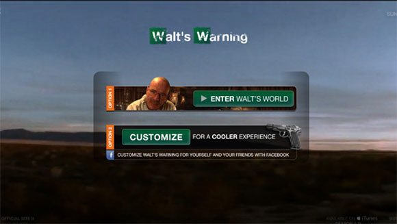
Breaking Bad is one of the greatest and most successful TV shows to come out in years. Thrilling, dramatic, interesting and entertaining, it hits all the right notes, while offering a collection of characters that change so much over the course of the plot that it is hard to remember where it started. Walt’s Warning is a video that puts you into the main character’s world. I won’t give too much away because of spoilers, but it is very cool.
9. Yoda Baz

Artist Yoda Baz used two video effects for his portfolio site. First, there are the running numbers thrown chaotically at the screen as it loads. Next, there is a simple video of his body (I assume) standing in the background. It moves and occasionally walks out of frame, and then comes back. You never see his face, and the quality of the picture makes it all the more intriguing. It is like watching an old – and slightly creepy – home movie.

My favorite background video ever, this brilliant Poilish design studio created something that I can truly say is totally unique. The video opens up with a creature that I assume is a hippo, but it is hard to tell for sure. It is blinking and moving. Suddenly, there is a bunch of TV snow and then you start to get quick clips of science fiction shows and movies. They show a little X-Files, RoboCop, and even some obscure B-films.
These are only a few of a very, very long list of sites I have come across that use background videos. But these, to me, are the best that the web has to offer. Check them out…what they show on their site is even more interesting at times than what they are trying to sell!





Nice collection duddette 😀