10 Smart, Interactive Infographics
2There are plenty of examples of fun and dynamic infographics that manage to grab the viewers’ attention while providing relevant facts. Some are perhaps more useful than others, but they get the job done. Even when the job isn’t a serious one.

A slightly less common style is an interactive infographic. This is a format that not only engages the readers attention, but also their participation. It is fundamentally proven that such tactics in a learning environment are positive and effective.
Related posts:
- Useful and Creative Examples of Infographics
- Amazing Examples of Infographics to Visualize You Ideas
- Creative Infographics to Visualize Information
- Introduction to Infographic Design
While there are fewer examples of this type of infographic available, they are always worth taking note of when you find one. Here are ten excellent interactive infographics on various topics to enjoy.
Gulf of Mexico Oil Spill
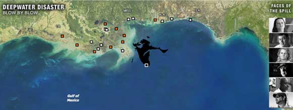
The Deepwater Horizon oil spill was one of the greatest environmental disasters in recent memory. A huge amount of crude oil was dumped into the Gulf of Mexico following an explosion that killed almost a dozen rig workers. This infographic gives all the relevant details of the event through a play by play animation and written info that goes by day. There are also different selectable views, and a ‘Faces of the Spill’ section where you can watch videos of those who were impacted by the tragedy.
How Many Households Are Like Yours?

Have you ever wondered how many people living in the US are single, in a straight couple or in a gay couple? How about how each of these people match up statistically when added factors like kids are brought into the picture? If you answered “Yes”, then you will love this infographic. It allows you to select what kind of a household you live in, including children, relatives, roommates and more. Then it gives you a percentage of all similar households, average income levels and other interesting details to peruse.
Jobless Rate (For People Like You)
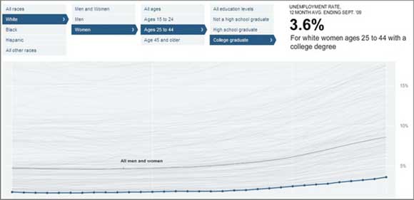
A little outdated, but still interesting, this infographic gives you a glance at the unemployment rate in 2009. You can select by race, gender, age and education level. It will tell you the percentage of each factor, while providing a visual graph below that represents the figures. The disparity between races and gender are especially surprising, and the effect of education on jobless rates is eye opening.
Is It Better To Buy Or Rent?
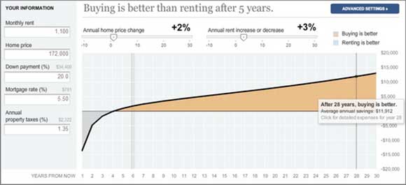
It is a buyer’s market in real estate, or so they say. But this statement doesn’t take into account a number of factors, such as the current mortgage interest rates, banks’ frequent unwillingness to loan, the major housing crisis that left the economy crippled and more. It certainly doesn’t take into account the personal issues faced by the average homeowner.
This infographic does, however. You put in your monthly rent you are paying now, the price of your theoretical home, the percentage of a down payment, the mortgage interest rate and the annual property tax. It will then tell you the analysis based on the number of years you select and whether it would be cheaper to buy a house or continue renting.
The Evolution Of Western Dance Music
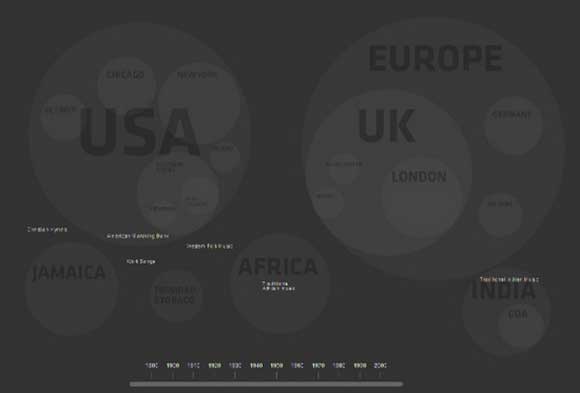
If you were ever curious about what music came from where, this is a great infographic to find out. It is a collection of details on the origins of Western dance music, such as disco, trip hop and techno. It shows the original starting points for these various genres and how they traveled from place to place. From there they formed new styles, such as traditional African music influencing the creation of jazz, which led to swing, which led to disco, which led to house and then deep house…you can see the pattern. You are able to turn it on as an animation, or slide the timeline through the years. You might be surprised to see some genre origins.
Nikon’s Universcale

Certainly one of the most intense and descriptive interactive infographics on the web, this is a great one. Nikon created a kind of moving scale to show the difference in size between various creatures and types of matter. You start at the far left that shows the early creators of the universe, such as particles and atoms. Then you move into bacterias, insects, small animals and eventually to planets. If you want to feel really small, be sure to check it out.
World’s Best Countries
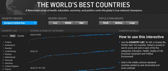
What makes a country the best? This is a hard topic too gauge because ultimately the factors will be relative to the person answering the question. But Newsweek created this cool infographic based on studies done into what makes up the best of the best. Their parameters were simple but effective: education, health, quality of life, economic dynamism and political environment. Unsurprisingly, several Scandinavian countries were in the top slots, with Finland, Switzerland and Sweden in the first three. The United States was eleven, Germany twelve, the United Kingdon fourteen and Italy twenty-three. You can narrow results of the 100 countries by selecting a country group, income group or population group.
Picturing a Lifetime of Clean Water Access
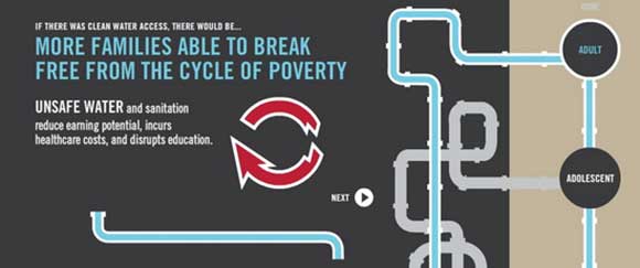
A shocking amount of people are exposed to unclean water every day. Many don’t have access to anything else, having to choose to consume unclean water in order to survive. It causes health issues, kills one in five children due to severe dehydration caused by diarrhea and causes many girls in affected regions to drop out of school due to no adequate toilet access during menstruation. These are only a few of the facts you can learn through this infographic, seeing the impact unclean water has on adults, teens and children.
Eurozone Debt Web
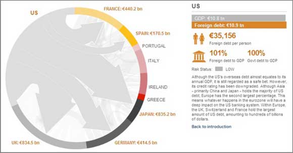
The Eurozone debt crisis is a mess. The EU has been in frantic struggle to keep countries like Greece viable as citizens revolt against government boot tightening. Billions of euros have been lent from one country to another with Germany footing a great portion of the bill. There are debates on what to give who, and when it has to be paid back. But even those countries who are lending owe others, who in turn owe them back. It is confusing and convoluted. This infographic attempts to break it down, showing exactly who owes what and where that money would go. Ironically, little of it is likely to ever be paid back.
The Future of Workplace Mobility
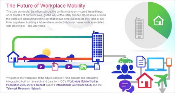
With the creation of better mobile devices, we are experiencing a change in the viability of a mobile workforce. Fewer people want to work from the office and would instead prefer the freedom to do their work from home, or just out and about anywhere they like. Which is becoming a very real possibility, and you will see in this inforgraphic that presents a large number of interactive charts on current mobility, future mobility and the benefits of this style of work.
Conclusion
These are all excellent, interesting infographics that really engage the user by making them a part of the overall process. You can create some amazing work using this tactic, and provide clearer information than ever.


These are brilliant examples of this ever growing graphic style. Thanks for sharing it with us.
I must thank you for the efforts you’ve put in writing this site. I’m
hoping to see the same high-grade blog posts from
you in the future as well. In truth, your creative writing abilities has inspired me to get my own, personal website now 😉