Building Websites for Kids Best Practices
4
Designing websites for kids is challenging and at the same time, interesting. This is the best opportunity for any designer to bring out his or her creativity because kids like to see larger than life images, bright colors and even something outright funny. As a designer, it can be a unique experience for you to design a kids website because it is completely different from a website designed for adults.
As the number of Internet users between the ages of 3 and 12 are increasing, so are the number of websites required to cater to this growing demand. To be successful in designing top of the line kids websites, its important you understand the best practices that have to be implemented.
Eye-catching design
The first thing that captivates a kid when he or she visits a website is the design. When you use bright colors and attractive fonts that are easy to read, they tend to love your design. Kids of any age love bright colors because it stimulates them. So, colors that can never be used in a website for adults, can be used here.
The second part of the design is the choice of fonts. They are not interested in reading large volumes of text and so the amount of words used on the page should be minimal. It is better to have animation or images instead of words for communication because it is easy for them to understand.
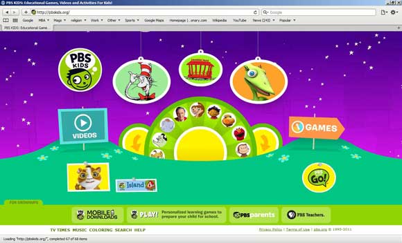
A good example is the PBS kids website. The colors are bright and there is minimal text in the site.
Popular characters
Kids are fascinated by cartoon characters and most have them some favorites. So, if you include a wide range of popular characters in your website, then it is sure to attract kids. They would want to linger on the site for a longer period of time. Also, if you can design activities related to these characters, then it is an added bonus.
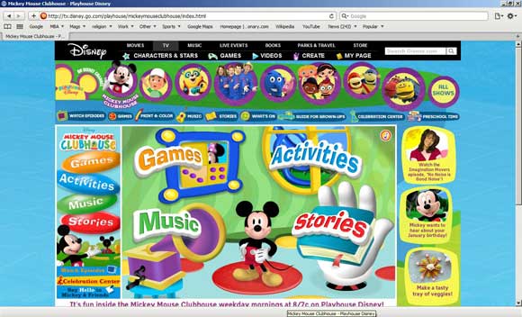
The Mickey mouse club site example shows how the designer has made good use of Mickey as the central character in the page. The activities revolve around this character.
Animation
Animation fascinates kids of all ages. They like to see the characters move around or do something that is funny. Also, when the characters on the page speak, it fascinates them even more. They tend to imitate the conversation as well as the body language of the characters and you should keep this in mind while designing websites. When you use animation in your website, you are guaranteed to retain the kids’ attention for a long time.
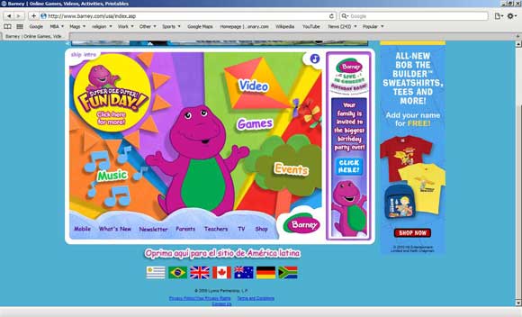
A good example is barney.com. The animation is simple in the home page and yet, it is familiar and fascinating.
Immense imagination
Kids love imagination. They try to put together unrelated things and weave a story around them. One of the best ways to attract kids is to let your imagination run wild. There are no bounds to what you can or how far you can go when it comes to kids websites. Use this opportunity to bring out the imagination in you to create some astounding sites for kids. However, a word of caution here. While designing, ensure that the language and the actions are age-appropriate and do not induce violence or negativism.
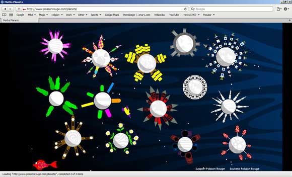
The snapshot of possion rouge page shown below depicts planets. Each planet is designed differently and this is a classic example of how to let your imagination run wild.
Easy navigation
Kids are not adept at using computers and they would not be comfortable navigating from one page to another. It is best to plan well before you begin the designing process. It is a good idea to group together different activities or information so that the number of clicks they have to make is reduced. Also, navigation should be simple. You can probably have just one word like videos or music and with one click, they should be able to get to the videos page. Multiple and in-depth navigation is not ideal for kids website.
The PBS kids site is a good example for this practice. It has just two options – video and games. One click can get you to the popular games or videos.
Sound interaction
Sounds and kids always go together. The ground rule for any kids website is music and sound. Most kids websites have music in the background and when you choose a song, it should be appropriate to the theme. For example, if you have a jungle background, then its important the sounds are based on the noises found in a jungle. On the other hand, if you have Winnie the Pooh theme, then the song of the characters should be played. This is vital because kids can easily make the connection with familiar sounds and objects.
Short videos
The videos in the website should be typically short and geared towards kids. Younger kids have a small attention span and they may not have the patience to see more than a few minutes of video. Older kids, however, can watch longer videos like an entire episode. So, make sure you provide suitable length videos for different ages.
Simple games
Kids learn best through interaction and games and so they should be an integral part of your website. One catch with games is that they should cater to kids of different ages. Your website should provide ample entertainment for kids of all ages and to make this possible, you have to provide different kinds of games with varying difficulty levels.
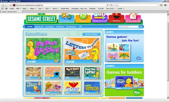
A good example is the sesame street website shown below. They have a wide range of games and kids can choose what they want to play. When you provide options, it makes them feel empowered and happy.
Promoting learning and education
Websites act as a supplementary learning material for kids. So, your website should also promote learning and education through various media like music, videos, graphics, animation and games. A visit to the site should be stimulating and beneficial for the kids. Such educational content add more meaning and depth to the site and should be incorporated.
Parental information
Parental information is another integral part of kids websites. Most parents watch what their kids browse on the Internet and so it makes sense to involve them as well. Your website should provide some fun options that parents can do with their kids and also some pointers for parents on a particular topic. The site should also give an option for printable materials that can be downloaded and printed by the parents. Some sites have a pointer or tip for the parents while others have an entire section devoted for parents. This depends on the design as well as the objective of your site.
The PBS kids site has a separate section for parents as well as teachers so that they can supplement the information provided by the site even after the kids go offline.
In short, designing a kids website requires a lot of imagination and creativity. The good side is that there are few restrictions and you have a choice to bring your creativity to the fore. The above mentioned practices can go a long way in making a kids website attractive and user-friendly.



Awesome list here !! Great Article !
To attract the attention of the kid is more challenging that anything else great post thanks for sharing
This information was very informative to me and vital toward the website I am going to design. THANKS!!!!! :^)))
I know this if off topic but I’m looking into starting my own weblog
and was curious what all is needed to get
set up? I’m assuming having a blog like yours would cost a pretty penny?
I’m not very web savvy so I’m not 100% sure. Any tips
or advice would be greatly appreciated. Kudos