Designing User Friendly Navigation Menus
1Navigation is one of the most important design elements in any web page because it plays a vital role in providing the user with a concrete idea of what the website is all about.
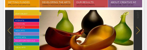
It gives a sense of direction and helps users to move across different pages with a lot of ease. This is why a menu should always be simple and user-friendly.
While designing menus, it’s important that the designer should put the needs of the user ahead of any other factor. If the navigation menus are user-friendly, it can make a big difference in the readability and usability of the website. At the same time, designers should also be open to the idea of trying a new and original design to make it stand out from thousands of websites that exist today. This article will discuss more about some of the criteria that should be present in a navigation menu in order to make it more user-friendly.
Animation
Navigation menus can be designed to have an animation effect known as parallax. Using this technique, it is possible to create different layers of objects that can be seen from different angles. This provides a rich 3D effect to the navigation menus or buttons. This also gives a subtle effect to the overall design. However, one disadvantage is that these menus are not conspicuous and this can be a problem for novice users. So, the designer has to take additional care in ensuring that the menus are a part of the design and at the same time, it is clearly identifiable to the users.
In the example below, NIKE had come up with a unique menu design. The dots on the right are the navigation menus and as you scroll down, the graphics change. Despite the uniqueness of the design, the navigation menus are not easy to locate and therefore it is a good idea to think along the lines of this design and make the menus more prominent.

Engaging
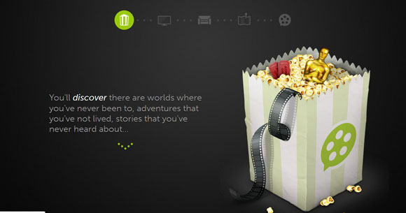
The main purpose of any website is to capture the interest of the user and engaging navigation menus can make a user to linger on the page for a longer period of time. There are many ways to engage a user through navigation menus and it depends to a large extent on the context of the site and the imagination of the designer. A designer can come up with an attractive and animated design for menus or use the menus to engage the users or create stories that are expressed through menus. Another option is to allow users to interact with menus and help them to get more information by just using the navigation buttons.
This is a good example on how to make navigation more engaging and interesting for the customers. Each of these menus can be scrolled vertically and provide a more vivid description of the website and what it contains.
Simple and Easy to use
Every navigation menu should be simple to locate and easy to use. A lot of the users are stereotypical and they would expect the navigation menus to be on the top or on the left side of the page. This is more of a norm and hence, it’s better to stick to this idea. Overly complicated menus that blend well with the design can score high on animation and illustration, but will not be successful because it lacks the vital element of usability. However, this does not mean that designers should stop innovating. They should go with the accepted rules and use imagination to come up with unique and eye-catching menus.

In this example, the navigation menus are located at the top and this makes it easy for the user to identify them. At the same time, the design of the menu is unique and it increases the interest of the user and makes him or her to stay on the website for a longer time and explore its contents.
Images
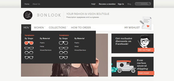
Images are a good way to capture the attention of users and using them on navigation menus adds clarity and beauty to the site. Images that are appealing and appropriate to the context can be used to enhance their usability. In the example below, the navigation has sunglasses and eyeglasses for men and women. It is possible to select them based on material and shape and this navigation helps users to identify what they want easily. The different shapes of glasses are images and this makes it easy for the users to navigate thereby increasing the usability of the site.
Originality and Out of the Box Thinking
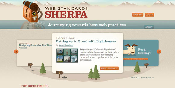
Originality and an out-of-the-box design help a website to be unique and stand out in the crowded world of websites. This requires extensive imagination from the designer and a neat implementation of the different ideas. A good example of originality is the site shown below. Here, the navigation is in the form of slides on the home page instead of a conventional header menu and this makes it original and outstanding.
Context Sensitive
The most important element for a user-friendly menu is its context sensitivity. The menu should blend well with the design as well as the context and content of the website. This will make a navigation menu more meaningful to the users and it will also create more depth for the website.
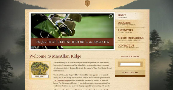
The example below is that of a resort and the menus on the right blend with the design and the context. They have the same earthy colors that are found through the rest of the website and their menu talks more about what the user can expect to find when they click on it. For example, one look at the accommodations link makes it clear that this resort is located amidst mountains while the amenities link helps users to understand that the place is fully equipped with all convenient features. Such a menu adds more depth to the website and makes it easy for the user to understand the information better.
Sliders
Sliders are used to present a lot of information in such a way that the user views only a small block of content at any given point of time. This is particularly useful when the designer has to work on a small space on the page and want to present specific information to the user.
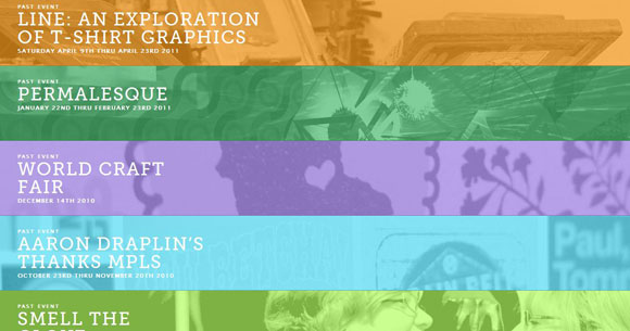
In this example, the user can scroll vertically to go through the menu options. This is a great way of presenting enormous amounts of content in a precise manner. In this page, the user will see only a small block of content and then he or she has to scroll down to look at more options.
Examples
These are some interesting and innovative navigation menus that can help the reader to get a better idea of how to design user-friendly and attractive menus.
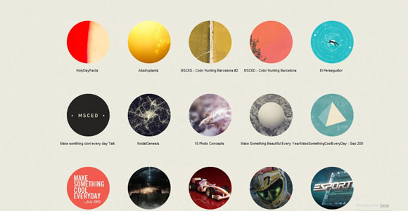
The first example is a photography website and the navigation menus are the circular shapes found on the page. A click on one of these menus will take the user to photos that are based on the mentioned category. This is a unique way to present categories for users instead of the usual drop down menus.
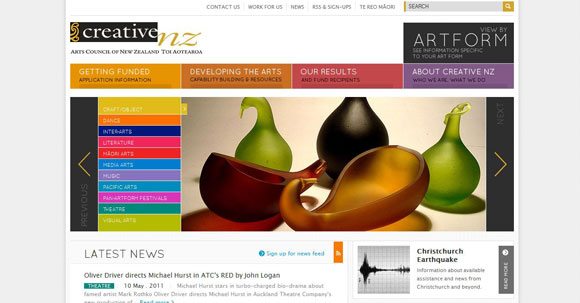
In the second example, a lot of information is presented to the user. However, they are clear and uncluttered and the navigation is surprisingly easy for this amount of information. It also sticks with the stereotypical menu locations on the header, and on the left side of the page. The use of bright colors makes it attractive.
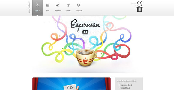
The third example makes extensive use of images on the menu to provide more visual clarity to the user and also to enhance the attractiveness of the page. It blends well with the design and the images add more depth to the page.
In short, designing user-friendly menus that are attractive and engaging can be quite a challenge. Numerous factors have to be considered while designing menus because they have to be original and also simple and easy to use. The above-mentioned aspects and examples can go a long way in helping a designer to understand the important elements that can make a navigation menu more useful and relevant to the user.


Great article! Navigation can make or break the way a layout looks and functions.