NameCheap redesigns their website
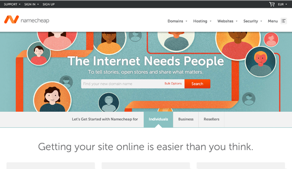
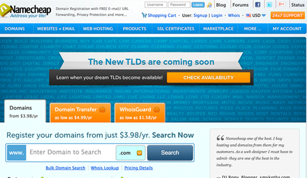
1NameCheap.com is one of the best known and largest domain registrars and hosters in the United States, and has launched a redesign of their website. The redesign is not only a new coat of paint. Instead, they have changed their logo, colour palette, message and structure of the entire page. A daring project!
In my opinion the new logo and colour palette are excellent. The old website had a standard blue + orange color scheme which is fine to get the job done but not very distinctive. The new logo and colours allow for more opportunity to make an an impression on their visitors. Recent trends like flat UI design are also followed. Though the latter should not be a goal in itself, the site looks much less dated now. Not taking into account the type of company they are, so merely by graphical merit, I like the new design much better than their old one.
Regarding the new message and structure of the home page, I’m not completely sure yet how I feel about it. I can imagine most of their customers do not arrive at their service to “tell a story” but just to buy a domain name and arrange hosting for it. I’m a big fan of removing clutter from interfaces, so that’s a good direction for the new design to go in. However at first glance now it’s not completely clear you are on the homepage of a hosting company anymore. It might just as well be some hip web agency. It seems NameCheap may want to do more than domain names and hosting in the future.
The below screenshots show the new and old looks of NameCheap. What do you think?
NameCheap’s new look after January 19th, 2014:

NameCheap’s old look before January 19th, 2014:


[…] Original on NameCheap redesigns their website […]