No, not that one! 16 types of stock photos to avoid
4Let’s face it, stock photography is easy to over-do. All too often we pick the exact same photos, especially if they are from an inexpensive or free site. Nowadays I usually try to create or draw my own graphics but that can be time consuming.
If you’re like me and don’t have a professional camera and your client often is not willing to pay for custom photos, then you can be forced to use stock photography. Do what you can to pick photos that are unique – even if it means spending a little more money on them.
Below I have listed types of images that are overused with reasons why you should not use them.
Important: I think the people in the pictures are lovely, it’s just the type of stock image that was used that I am commenting on!
The Business Team Pose
 There’s no way anyone can take this picture seriously. I’ve never seen an office where everyone smiles the same way, appear approximately the same age, look as though they all use the same shampoo and coordinate their clothes.
This place doesn’t exist so why would you use it in your design? If you want your work to be believable and realistic keep your work authentic and avoid using overtly staged photos.
The Handshake

You’d be hard pressed to find a genuine picture of a handshake. They all look like a variation of this picture: two hands coming out of pressed business suits sealing the deal with a good old fashioned handshake.
Look further than the handshake and think of other ways to signify a deal or friendship has been made. At the very least, mix up the business clothing and/or background before we completely lose interest.
People Looking Happy Doing Something Not Fun
 This family looks so happy to be food shopping! The kids are well-behaved and excited about eating the perfect fresh produce, the parents both have the time to shop together and no one is feeling rushed. This picture appears as if the family opted for the supermarket over a family vacation.
I’ve been to grocery stories all over the world and have yet to spot a family having this much fun in one of them. Most people would find it hard to connect with this picture. At least if it was realistic (the kid hanging off the grocery cart or eating an open bag of chips), it could get a good laugh because so many families would find it relatable.
The point is: make sure that people who look like they are having fun in your photo, are actually doing something that is fun.
Politically Correct Team
 Again, too smiley, too clean, too fake. This politically correct team looks forced together and they are all too close in age, size, etc. Of course, if it really represents your company then go for it, but with a more authentic and less posed image.
Customer Service Representative
 While we would all love to believe that the person on the other end of the phone is truly happy to help us, there is no way they are that happy. Customer service people deserve respect for dealing with mostly problems the entire day but pictures such as these are not only unrealistic but almost insulting because they are so fake.
Teenager

When you aren’t a teenager it can be easy to think that all teenagers are the same. Which is kind of ironic considering a lot of teenagers deal with bulling because they are different. The above classic example portrays teenagers as messy and disheveled which is often the kind of image used in articles about teenagers.
Making Eating Healthy Look Like A Blast
 This is a more specific case of “People looking happy doing something not fun”. It appears on so many sites that it gets a special mention in this post!
I love salad just as much as the next person. No, I really do. I love all the brightly colored vegetables mixed together with a delicious salad dressing, but I don’t think I have ever been ecstatic about it. Even when a meeting runs long and I’m famished for lunch, I have never eaten a salad as if it were saving my life and making all my dreams come true. Don’t use stock photos of people laughing alone while eating salad.
That is not realistic, it’s psycho.
Thumbs up!

Looking at this picture you can’t tell if it’s saying, “Great job!” or “You’ve got a deal!” The overly posed picture of a thumbs up looks as though it is just there as a filler. The problem with pictures like this one – an overly used pose – is that it doesn’t provide any value to your design. It is unnecessary and doesn’t enhance the voice of the piece.
Posed Happy Couple
 Including a photo that expresses love is much easier when the photo is not clearly taken in a studio. Capturing fun, happiness and love is pretty easy when it’s genuine and there are plenty of stock photos of people who look like they are really into eachother. Simply avoid the posed ones.
The missing link, connector or bridge builder
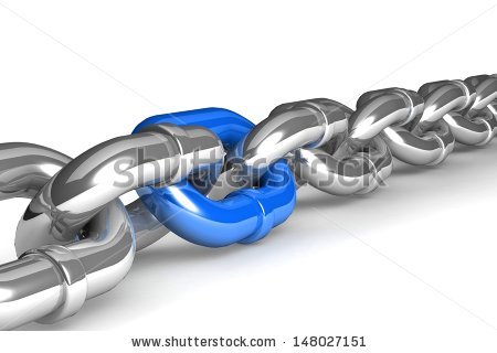 These kinds of stock photos are often seen on technology related company sites to signal that they are good at connecting software systems. Besides the example above, a bridge is also often used to indicate that a company “builds bridges” between stakeholders in a project. As a rule expressing these kinds of abstract concepts with large images does little for the reader and it’s often better to use the space to show concrete examples.
Fast Car to Prove Speed
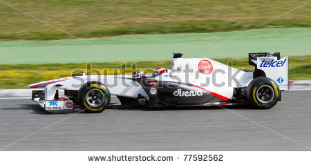 Unless your delivery guys are driving actually Lamborghinis then maybe you shouldn’t over-exaggerate your speed. If you told me “under an hour,” that would resonate much better. I know Lamborghinis are fast, but even if you’re driving a fast car you can get lost and then it wouldn’t be a satisfactory experience with your company. Tell me, the customer, what I want to hear. The service is fast. Prove it. I’d rather see a real picture of a delivery guy with a watch than a fast car. The fast car is not only over-used but it is over exaggerated and unrealistic. Again, with all your stock photos try to be as realistic as you possibly can so potential clients trust your company. The F1 car photo is also often used to indicate high tech knowledge, again I’m in favour of showing something more specific.
Fast Internet/Computer/Business
 Same concept as the car but this exaggeration is actually kind of funny. It’s also funny how everyone uses a picture of their computer blowing them away when they want to emphasize fast internet. It is such an overused image for computer services companies that it’s hard to tell the companies apart.
Overly posed Portrait
 These pictures of overly posed people give off an distant feeling no matter how big the person in the picture is smiling. For all the portraits you include in your designs, try to pick photos with a natural look.
It is practically impossible to never use stock photography. I’m not implying that you should drop it from all of your designs completely. Avoid going for the photos that are seen on too many (business) websites and find ones that look natural, show emotion or allow you to make a connection to the image.
To close on a light-hearted note, below you’ll find three types of really unusable stock photos. I’m having trouble coming up with categories for these!
Can you find a use for them?


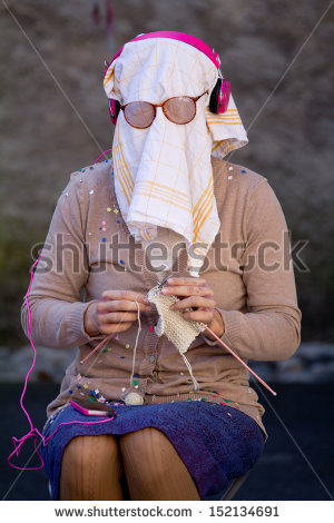




You nailed it with these! Especially the last one! I have had several memberships to stock sites through the years and am in awe of some of the ridiculous images. Often, the same photo will appear over and over, only slightly changing the pose or grouping with each! Like, one bad image is bad enough, but, that same image in 50 different poses!? LOL
Thanks for the good info and a good read!
Su
Thanks for the compliment! I had the same experience on many of the stock photo sites 🙂
I’ll be writing a post soon containing some links to somewhat lesser known good stock photo sites.
[…] http://www.graphicmania.net/no-not-that-one-16-types-of-stock-photos-to-avoid/ As a budding designer, if you’ve never used at least one of these cliched techniques, you simply didn’t try hard enough;) My favorite is the “People looking happy doing something not fun” photos… […]
I think you hit just about every bad photo category. What do people think when they use these kinds of images? So much better just to use text if you don’t have a good image or a reason for even using an image.