Tips and Resources For Creating a Web Presentation
2The most important part of any presentation is capturing the attention of your audience. The more you impress your audience with the quality of your presentation, the more likely it is that you will gain their attention and communicate the desired information effectively.

Lucky for us, the Internet is filled with tools and resources designed specifically to help users create captivating and attention-grabbing web presentations.
Related posts:
- 10 Free Online Tools to Improve Your Workflow and Presentations
- What Makes a Blog Outstanding – A Design Perspective
- Tips For Better Data Flow Design
- Eight UI Design Patterns You Should Consider
- How to Build a Better Design Experience
- Tips to Evaluate Design User Experience
Web presentations are a great way to reach audiences because new options and tools allow for faster presentations varying format solutions. Still, the web will only take your presentation as far as the presenter will allow. Here are 10 tips to ensure that your web presentation is clear and effective.
Tip #1: K.I.S.S
Keep it simple, stupid. Leave out unnecessary information and highlight the critical points of the presentation. By focusing only on what is actually important, the presentation will be short, sweet and to the point, allowing the audience to gain a clear understanding of the message.
Tip #2: Word Art
Simply put, use illustrations. Charts, pictures, art, etc. can help draw the audience’s attention to your message. Often a presenter can use one or more of these tools to highlight the main point instead of using a lot of text or losing the audience with bulk information.
Tip #3: Motion Control
Web presentations are attractive tools because they allow the audience to be in control of the presentation timing. If you are not using an embedded media player, allow your audience the option of moving between slides, pausing or restarting the presentation, etc. Slide-show presentations typically offer these options and they can be built in to most other formats as well.
Tip #4: Make It Personal
Every audience member watching your presentation begins with the same basic question: “Why should I care?” Answering that question is essential, especially in a web presentation format that can feel disconnected and impersonal. Address the audience through a common medium and explain why they should care or how they are impacted by the contents of your presentation. Check How to Design for Your Target Audience.
Tip #5: Variations
When using slides, vary the backgrounds, fonts, shadowing, etc., and when using HTML or embedded media formats, allow for variation in background settings and scenery. If the presentation includes a person or persons, include motion and subtle hand gestures to engage the audience and break the monotony. Check 10 Free Online Tools to Improve Your Workflow and Presentations.
Tip #6: Media
Adding in music, video clips and other forms of media can pleasantly distract the audience briefly while keeping their attention and livening the mood. Web presentations can get long and boring for an uninterested audience so use media clips to keep them happy and on your side!
Tip #7: Participation
Ensure that at least a portion of your web presentation requires the participation of the audience. Whether that means requiring the audience to visualize something, to follow on-screen directions or to repeat a catchy phrase or slogan, the element of participation allows the viewer the opportunity to interact personally with an otherwise impersonal web presentation.
Tip #8: Don’t Read
The most common mistake that web presentations incorporate is the verbal enunciation of text already included in the presentation. Repeating what is already on the screen is both frivolous and frustrating for the audience. Instead of repeating what is already on the screen, elaborate briefly and use examples.
Tip #9: Slow Down
If your web presentation includes a verbal component, make sure that your speech is slow and concise. Audiences get frustrated with poor public speakers, but are attracted to effective speakers who can get their point across quickly and effectively. Use the K.I.S.S. method to determine what is important and what can be left unsaid.
Tip #10: Link Up
When talking about products, services, companies or merchandise using a hyperlink function can allow the reader to dig deeper once your presentation is complete, or to gain a clearer understanding of the topic. Similar to tip #3, giving the reader control allows for more effective communication.
Web Presentation Resources
Now that you have reviewed these tips for creating an awesome web presentation, let us check out three handy tools that can help you mold and design your web presentation so that it is both attractive to the audience and effective in getting your message across.
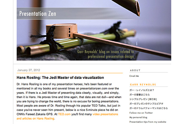
Resource #1: Presentation Zen

Presentation Zen is an informative blog published by one of SAY Media”s “100 most-influential people on the Internet” author Garr Reynolds. Reynolds offers tips, resources, books and commentary on issues related to professional presentation design.
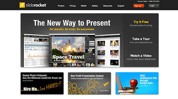
Resource #2: Slide Rocket

The Slide Rocket tool can be tried for free and is available at www.sliderocket.com. This tool allows designers to make great presentations that engage your audience and deliver tangible results. Slide Rocket allows you to use the resources you already have by importing your existing PowerPoint or Google presentations, or to simply create new presentations online allowing for easy collaboration and sharing.
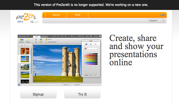
Resource #3: PreZentit

PreZentit is a free beta tool that is found at www.prezentit.com. With PreZentit you can create, show and share presentations on the web and others can even work on the presentation at the same time. Presentations created on PreZentit can be set to public or private modes, and can be downloaded and viewed offline as well.
Of course the web is filled with tools and resources to help you create and develop the perfect web presentation, but these tips and resources will allow you to captivate your audience like never before. Get your message across effectively and efficiently using these tips and resources and start impressing your audience.


Great write up here with some great points, I do follow the majority of them when presenting my website prototypes to clients. I make use of fireworks simple slicing/simple hover effects when making a prototype site so it shows clients how the site will function. Thanks
Nice post about web presentations, thanks for posting it.