Tips for Web 2.0 Style Design
4Technology is changing from time to time and the web is no exception. As people became more adept at using the web, they wanted more out of it, which led to the birth of web 2.0.
In simple terms, it is a set of web applications that make it easy for users to do a whole lot of different activities, such as sharing, communicating with others, blogging and social networking.
As the trend towards a user-centric web took shape, it necessitated changes in the design that are not only pleasing to the eye, but also functional.
In this article, we will look at some of the aspects that have to be kept in mind while designing a web 2.0 application.
Features of Web 2.0
The features mentioned below are typical for a web 2.0 application or website. Though each website does not have to contain all these features, most pages should be based on the combination of one or more of these features for increased viewership and revenue.
Simplicity
Simplicity is the building block of web 2.0. Some people may think that web 2.0 has to be a complex set of applications that are geared to keep the user engrossed. Though this is true in terms of functionality, nevertheless its design should be simple, clear and focused. This is important to ensure that the users’ attention is only on the core goal or functionality of the website. So the web page should use fewer design elements and clear text that aptly describes what the website does and how it can help the user. It is the responsibility of the designer to ensure that users will focus only on the core content of the web page and can understand the goal of the company or website within a few seconds. This can only be possible with an uncluttered and simple design that has fewer elements.
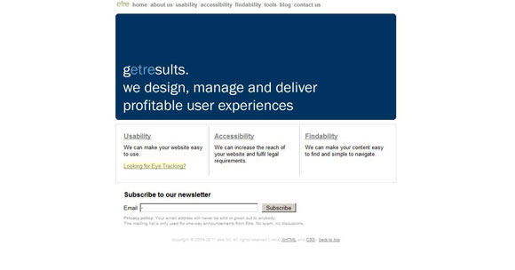
Below is a great example of simplicity. It uses only a few colors and design elements, yet it gives the user a good idea of the purpose of the page. It is interactive and easy to navigate, and the simple design is eye-catching and focused.
Easy navigation
Navigation is an essential part of every web page, because it not only helps users to get around the website easily, but also adds authenticity and clarity without any clutter. It makes it easy for the designer and the content writer to focus on a particular product or service, while users can still see all that the company has to offer. In a web 2.0 page the navigation should be clear and bold. There is no room for ambiguity in the design and the hyperlinks should be easily recognizable.
One good way to differentiate navigation links is using a different color and font size. Also, the text of the navigation link should be large and bold so that it is easy to identify. Finally, the text used for each link should represent what the page is about and not a random text that is misleading for the user. Another important aspect of navigation is to keep it uniform through all the pages of a website. This is vital because the user gets used to the look and feel of the pages and the position of the navigation links.
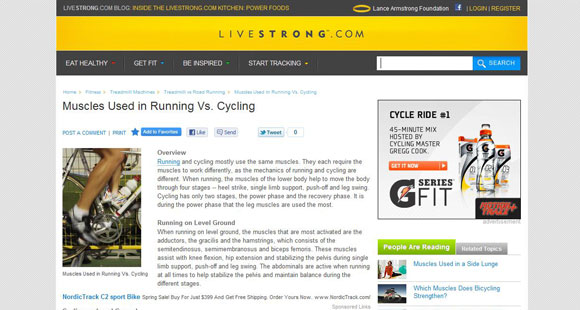
In this example, the navigation links (Eat Healthy, Get Fit, Be Inspired and Start Tracking) are in a different color and are in bold letters. Also, they are constant through all the pages which makes it easy to find them in any page.
Useful resources(books):
– Web 2.0: How-To for Educators
– Web 2.0: A Strategy Guide: Business thinking and strategies behind successful Web 2.0 implementations
– Web 2.0 Architectures: What Entrepreneurs and Information Architects Need to Know
Big-sized text
Web 2.0 is all about attracting more and more users, and what better way than to use bigger sized texts. However, if the entire page is filled with font size 48, it makes it unreadable and unattractive and no user would want to come back again. A better way is to use the bigger font to highlight the more important aspects of the content and keep the remaining ones in a lower font. This design tactic has been prevalently used in print media to garner the attention of users, and with web 2.0 it has made its foray into the virtual world as well.
Another advantage of using bigger text is that it is more accessible for people with visual disabilities and helps them understand the crux of the idea. It is also useful for people who use LCD monitors and people who just like to glance at each page. All these viewers still get to understand the goals of the website without actually having to read through the entire content.
As a designer, it’s important to make enough room for the larger text, which can be achieved by removing some elements that are unnecessary for a page. The bigger text should be meaningful and should add more depth to the design and content of the page. If the page has to present a whole lot of information, then it’s a good idea to have little to no big-sized text.
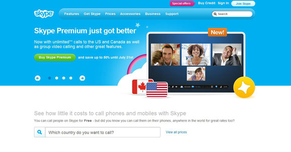
In this example, the message “Skype Premium Just Got Better” uses a bigger sized text than the remaining text, which immediately garners the attention of viewers.
More gradient
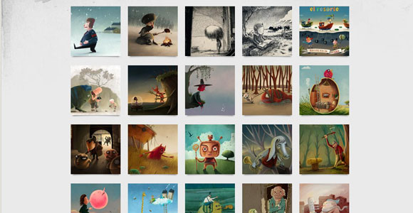
Gradients help soften an image or color and can add more depth to the design. Fading a color to dark or light can create an illusory effect that attracts users. Also, drop shadows and other highlights on navigation buttons and images can provide a visual 3D effect. It is particularly useful for creating pages that do not appear too flat and also to make it look a lot richer.
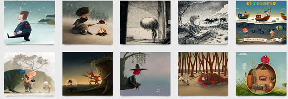
In this example, the illustrator has used generous amounts of gradient in each and every image to make it more appealing and realistic. It also provides the required softness and subtlety to the image, making it look richer and more natural.
Layout and Position
Most web 2.0 websites are positioned in the center of the browser to give it a bold and simple look. There is a lot of white space around the page that enhances the look and feel of the site. It lets you present considerable amount of information without making the page look too crammed or cluttered. Also, the position of different elements on the page can be changed to increase the visual appeal of the page. A good example of the web 2.0 design trend is using fewer columns, typically two, instead of the three or four columns used in older sites. This is to keep in tune with the idea of making the web page look bold and simple, and to easily attract the attention of the users to the essential information.
In a web 2.0 design, another prominent trend is keeping the top part of the page constant throughout the site. The top part can contain the name of the company, its logo, navigation menus and other branding information that is pertinent to the company. This top part should have a different color than the rest of the page to make it look more prominent.
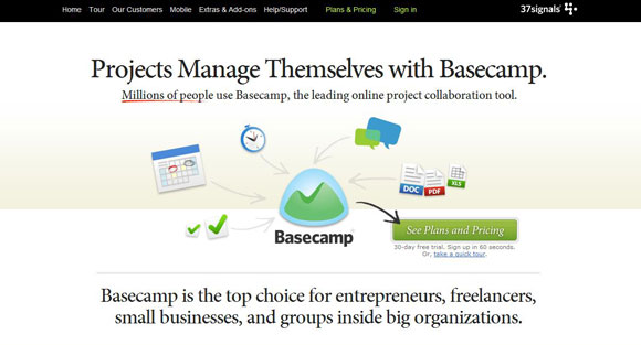
The example below has all the right layout and positioning required for web 2.0. It has a distinct header that is constant through all the pages and this header consists of the navigation menu as well as the name and logo of the company. The page is uncluttered and uses only a handful of design elements to create the right impact. Some parts of the text are bold to attract users, and the site is aesthetically designed and gives users a good idea of the products at one glance.
Conclusion
In short, web 2.0 design is all about attracting users and retaining their interest in the website for a longer period of time. It should also provide the user with the opportunity to navigate around the site easily and perform the required functionality. The above-mentioned suggestions will go a long way in creating an appealing website that is sure to bring the best results to the company.



I wonder if I may inquire as to where you found the block of images under “More Gradient”? The art is nice! I would like to go check out more of it, if possible.
Thank you!
Su
Great article, thanks for the tips.
I am sorry I did not quite understand your question.
Great article 🙂