Tools to Combine Fonts
0Nearly every time you design a web page you will be selecting more than one type of font to do it. The average is two to three, and when you choose your typography it is important that you select the ones that best go together. While some might look nice on their own, that doesn’t mean they will translate well when combined in a layout. In fact, more often than not two incompatible fonts will end up making both look bad and so ruin your entire design.

This is a big enough part of web design (and content design in general) that there are endless resources on the web dedicated to showing you the proper way to combine fonts. Most are redundant, and I prefer to keep a small handful of really useful ones on hand that I know I am going to use.
Of everything I have found online, these are my five favorite font combining resources that I think every designer should have bookmarked.
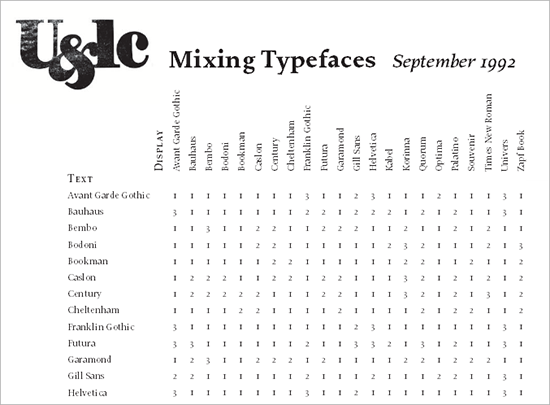
Originally published in 1992, this is still one of the best quick-fire pages that show how to combine typefaces for a proper design. It is super simple, working on a three point rating basis with all of the primary fonts you will almost always be working with. One is ‘combine at will’, two is ‘not a conservative choice’, and three is ‘think again’. Of course, this doesn’t take into account custom made fonts, but usually those are based off of a primary design that is close enough to these originals to give you a decent guideline.
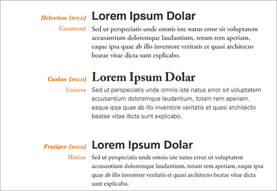
Not planning anything too outrageous or fancy, and just want a fast look at how certain typefaces look when put together? This article by BonFX takes the nineteen most common combinations and lets you see a sample of them being used in a header/text grid combo. Super easy, and it gives you a good idea of what your design might look like. Remember, designers are usually going to go with the simple fonts, not the crazy ones.
The World Of Fonts. Matching Fonts
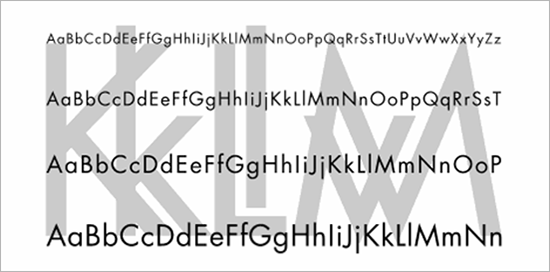
This is an old article from 1998 but I really like it, and not just because the title reminds me of “Bond, James Bond.†It is a great rundown for the beginner about using combinations in typeface for both difficult and basic projects, and how you can adapt your design to either. It also covers the importance of contrast and other elements that are sometimes ignored in other resources. If you are new to the game, this is a must-read. It is just as relevant today as it was more than a decade ago.
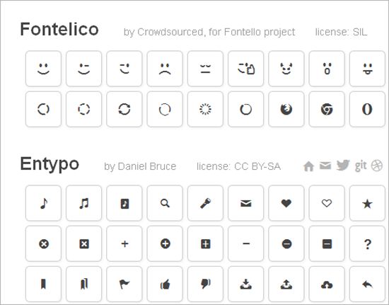
The name makes it sound like a character in a Shakespearean tragedy. But it is actually a helpful tools that takes iconic fonts made specifically for the web, and lets you combine and preview them. You just select the icons you want from the list, edit the names and then edit the codes. Downloading the web font is also easy, thanks to a giant red button in the corner. They leave nothing up to interpretation, and it is probably the easiest tool I have ever found for this purpose.

Select what area the text will be in, the font used, the size, line height and color, and boom…you are set. This tool lets you choose multiple typefaces so you can see the different letter in action. This has been a favorite of mine since it was first released.

