Top graphic design trends in 2015 so far
0We’re 3 months in 2015 so it’s a good time to take measure of the trends we’re seeing so far this year. Odds are they will continue for most of this year. Most of the currently visible trends are continuations from 2014. However, they are continuing to be adopted at a wider scale in 2015, strengthening the trends while also evolving. Overall, we’d say the focus is on content more and more: high quality images and high quality text, including strong typography.
Your website is like a 24/7 brand ambassador for your business and it must be in tip-top shape in order to impress. So, how can you set your website ahead of the rest and ensure success?
The Internet’s leading websites got where they are because they employ a combination of timeless elements and hot-right-now trends that make their pages a pleasure to browse. Use the following tips to put some new life to your site — and make your visitors want to come back for more.
Popular Design Elements for Websites (including examples)
Navigation. Sticky navigation headers and other “pinned” features (such as social media buttons) are prime trends. These enable you to get around the website from wherever you are on a page while making your page look snazzy.
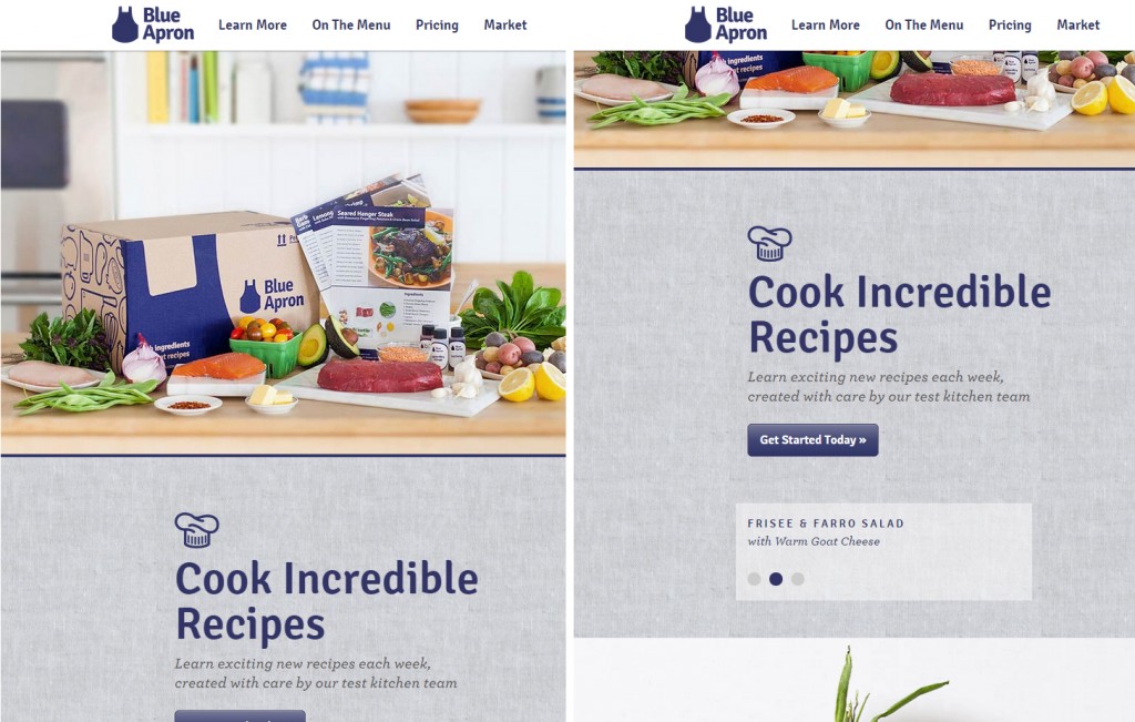
Visuals. Large photo backgrounds, paired with either parallax or continuous vertical scrolling are prominent right now. This simplifies navigation and sets an engrossing storytelling platform.
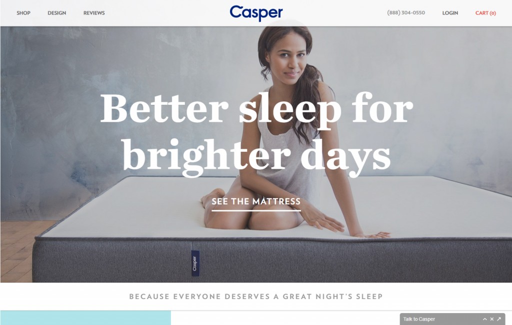
Content. Look out for slimmed-down content! It saves bandwidth and reduces loading speed. Plus, shorter or smaller content engages users more often.
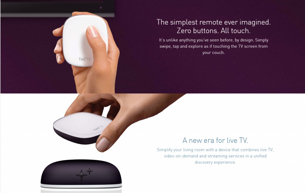
Fonts. Exaggeratedly large, crisp fonts highlight important blocks of text. This creates a smoother reading experience.
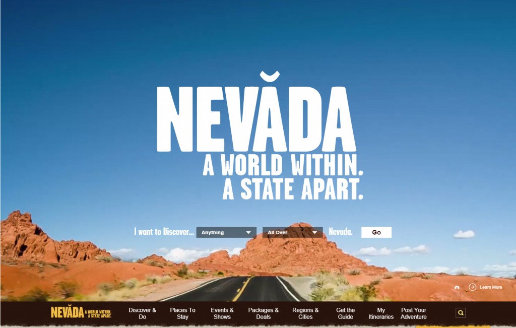
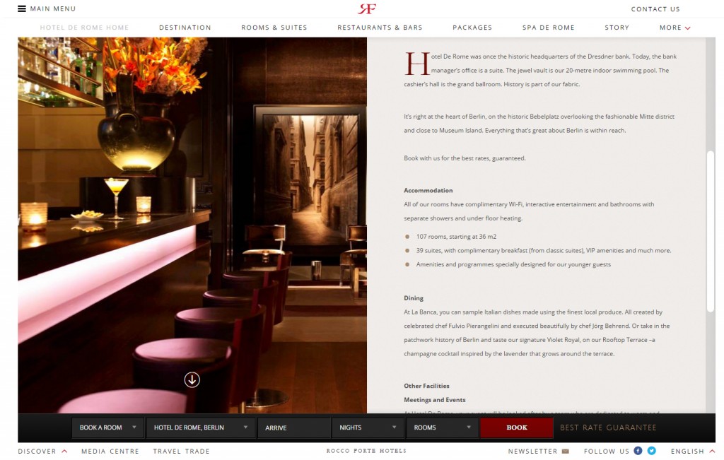
Condensing. You’ll start noticing menus hidden under a simple icon, with the option for users to hide and unhide them at will, rather a list of nav links on the homepage. This reduces visual crowding and enables the viewer to focus more fully on the page content.
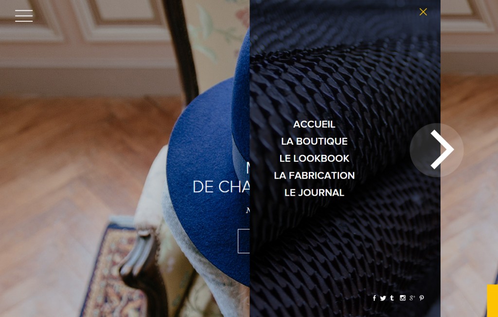
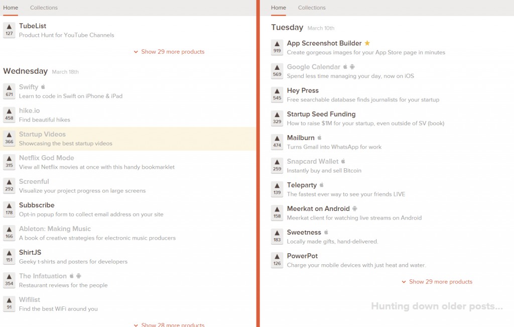
Modular Scrolling. More and more websites are starting to tailor their layouts specifically with the user in mind. Modular scrolling, allowing viewers to move different content sections on the same page separately, is an example of that. This lets users group the items they want close together — no more scrolling the whole page up and down, multiple times.
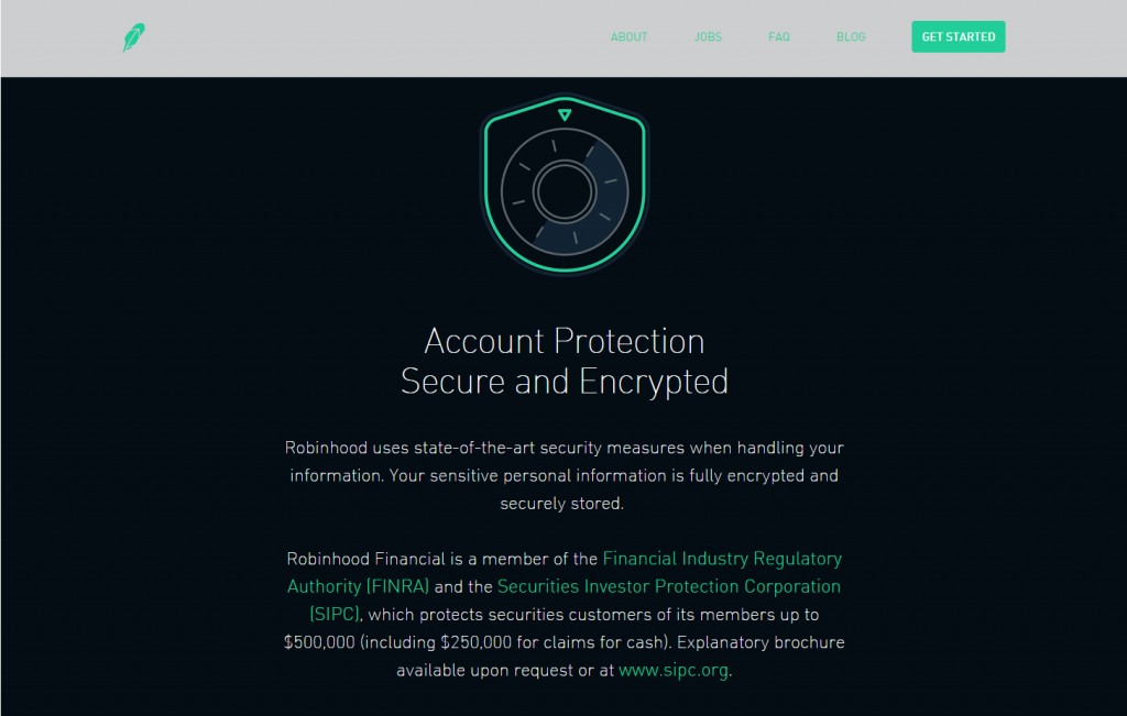
Security. Web designers are beginning to enhance security measures. This builds consumer trust by showing the site owner’s commitment to the safety of client data.
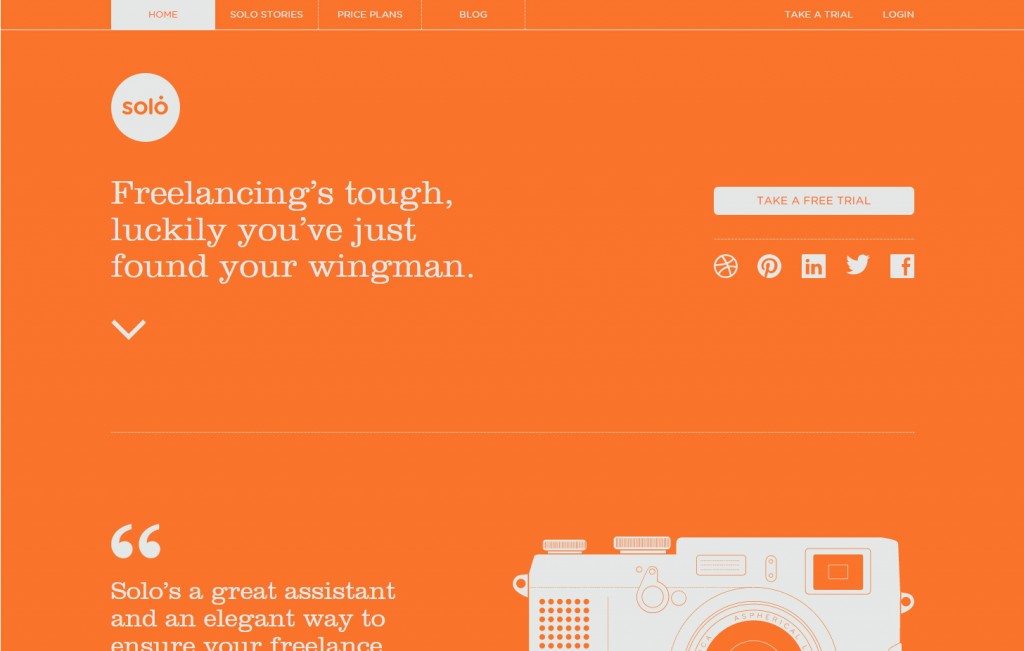
Minimalism. There will be a continued emphasis on minimalism — only essential elements are needed, but brighter, bolder colors are included to enhance them. This speaks to current design sensibilities while applying a fresh twist, keeping viewers interested.
Infinite Scrolling. Infinite scroll, meaning the “bottom” of a one-page site just takes you back to the top, is being implemented more and more. This makes the site as a whole feel more manageable and more fun to use.
Storytelling. Storytelling remains a key part of brand identity, telling the company’s own story and those of its customers. This lets people know how much their patronage is valued and invites others to participate with your business.
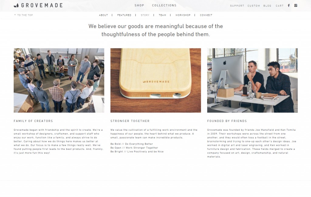
Ghost Buttons. In an attempt to create more aesthetically pleasing and seamless navigation, ghost buttons that blend with the background rather than clashing with its own color or pattern fill will have mass appeal.
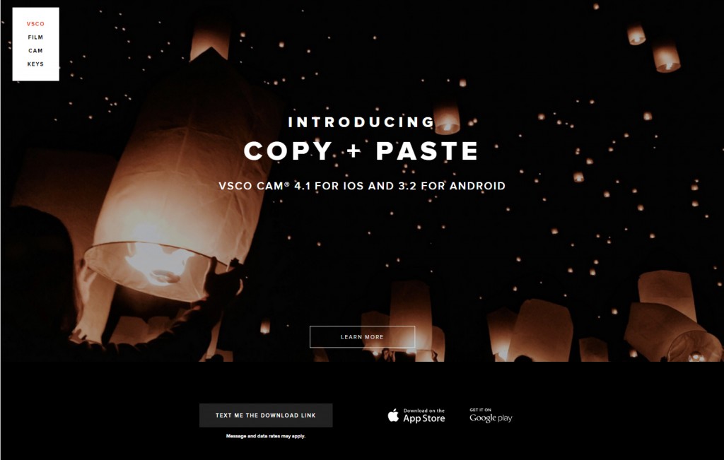
Material design. Halfway between skeuomorphic and flat design conception, this marries the best of two worlds — the throwback feel of 3D icons and the simple usability of flat design.
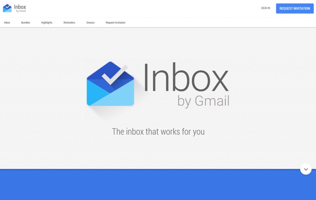
A big feature to watch for is app-like design being implemented in desktop sites. Mobile apps ease of use makes their functionality — continuous scrolling, short loading time, intuitive command buttons — ideal to lead the way in universal responsiveness. Along with an increase in app-like websites, many of 2013’s other top predictions still apply in current design philosophy.
Why These Elements are Successful
What makes these website elements so attractive to consumers? The short answer is that whatever feels “modern” is sure to draw a crowd. These trends are popular for a reason: they’ve all improved on previous decades of internet use to bring us a streamlined Web that’s more user-friendly than ever.
Today’s graphic, UI, and UX designers are doing a fantastic job of making established trends feel new. One such tactic was briefly mentioned above — working abundant color back into the minimalist aesthetic, which had been largely monochrome for a long time. While the visual contrast of black and white is a striking brand choice, it can be wearisome if overused. Colorful design is stimulating and gets people excited, especially after a period where black and white is the predominant fashion.
HubSpot’s Rachel Sprung has done a fantastic job of listing why website owners everywhere should pay attention to the main sensibilities of modern design. Creative typography, scrolling navigation, eye-catching images, and the other elements named will improve your site’s utility and its visual appeal. People can’t resist coming back to a site that gets both of these things right.
None of this is meant to say that if your website isn’t right on top of every trend, you won’t attract visitors or raise your profits. Many other factors are essential for success — trustworthy content, prompt response to feedback, and a “customer-first” service mentality. If you have all these things, redesigning your website would be the icing on the customer-satisfaction cake.
How You Can Benefit from Similar Design
Thanks to sources like The Next Web’s list of 2015 Internet trends, we can predict fairly well how consumers will respond to modern web design. For example, long scrolling pages make the high points of your brand story easier to follow, especially for mobile users. The background header photo, a favorite trend in 2014, could be removed in favor of a stricter minimalist approach. Many viewers do still find it attractive, so use your own judgment on what fits best with your website theme.
Overall, as long as your site has its basic style elements in place, you should be in good shape. While established followers may hesitate to accept change, their loyalty to your brand will only grow if you listen to their feedback and prove your dedication to making the best version of your website. If you need more in-depth guidance, Smashing Magazine has you covered.
What’s your design philosophy? How does it fit with the movements currently surfacing in 2015? Let us know what you think below!

