Twitter starts 2014 with a redesign: like it?
0Twitter.com is currently rolling out a redesign! The new design brings their website in line with their mobile app offerings for IOS and Android.
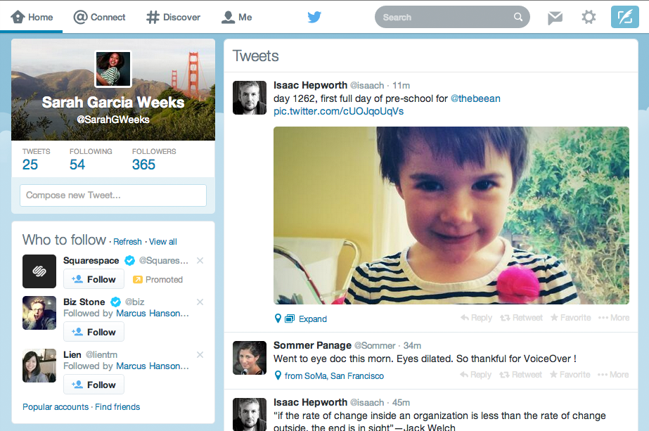
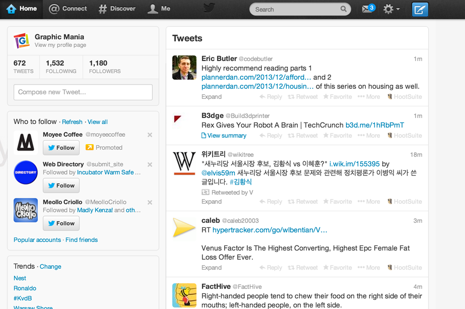
It appears the navigational elements remain the same and that the most important changes are colours. It also seems like the site is just a little bit wider than before. Overall the new colours reflect a more open look to me while also going for a more flat design feel. It feels more balanced not having an attention-grabbing dark bar in the top anymore.
See the below screenshots to compare the new and old looks of Twitter for yourself. What do you think, do you like it?
Twitter’s new look after January 13th, 2014:

Twitter’s old look before January 13th, 2014:

Share


