How to Design a Good Landing Page
1A good landing page is the cornerstone of a website’s success. Why? Because a great landing page accomplishes the most important business challenge: convincing prospects to buy. With a landing page doing its intended work, you don’t need to hire expensive sales staff or spend sleepless nights trying to win over customers over the telephone, persuading them to buy your stuff. That’s only when your landing page is flawless, otherwise you will also have to spend money like many others on buying leads, and hiring sales professionals to sell your products.
Why use landing page at the first place?
When you implement content marketing strategies, your objectives are to make readers comment, share and subscribe to your blog. With a landing page, your intentions to achieve something greater take front seat. You design pages that focus on clicks, selling products or winning new leads and building an email subscriber list. Or at least give you the permission to contact your prospects. That’s exactly why businesses use landing pages. It’s more about what visitors do on your site then simply attracting traffic to your site.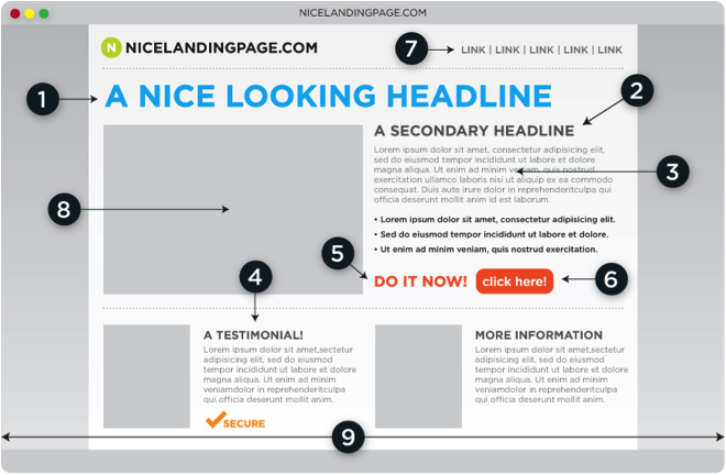
What makes a good landing page?
Making an effective landing page is never an easy thing to do. A misplaced concept, or design can lead to a page that gives no reason to visitors to stay on it for more than a second. It can be a really sad place to be in. Visitors are an impatient lot. They are anxious to make a decision or snap out of your page if it doesn’t offer them any value. Within seconds of landing on your page a visitor should be able to understand:
- What’s in it for him or her?
- How’s it better from what others are offering?
If your page communicates these two questions effectively, chances are, you will have a successful landing page. In marketing lingo, this is called as UVP, or Unique Value Proposition. As Steve Blank puts it, “UVP is a single, clear and compelling message that states why you are different and worth buying”.
Designing the best landing page that you possibly can
With importance of landing page clear in sight, it’s time to get your hands dirty and find the best possible methods to make a landing page count.
Keep it simple
The page design should be clean, simple with natural navigation and zero distractions. The basic purpose for your landing page’s existence is to drive conversion and so the design of the page should also motivate the visitor to do the same. Colors should be used smartly and while there should be intelligent use of eye-catching images. Experts say that certain color buttons such as red and green are specially useful for increasing conversions. In the end, your design should keep in mind that there should be strong contrast between your button color and the background.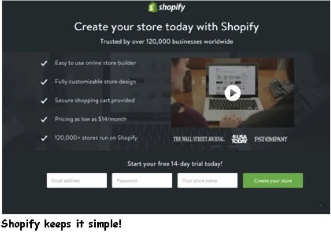
A minimal design scheme
A good design communicates without being too over the board. Thus, your landing page should be able to provide the essential information that is needed to encourage visitors but nothing extra. Too much of information can overwhelm the visitors and confuse them defeating the whole purpose of having a landing page. When you put any text in front, it should be easily scannable such as in a bullet form. Any important information you need to show should be in direct line of vision of the visitors. The less necessary information can be pushed down below; visitors don’t mind scrolling down.
Mobile friendly design
One important point that many miss is not relating your business’s digital strategy with mobile. Smartphone contributes to more than 30% of online activity now and therefore having a mobile site can even double your conversions. The customer experience of a landing page should not vary with the change of devices. If the landing page loads quickly, is easy to navigate and ultra clickable on desktop, it should behave the same way on any mobile device.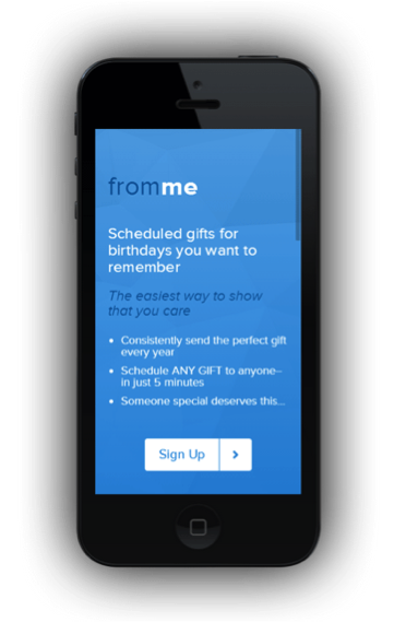
Short User forms
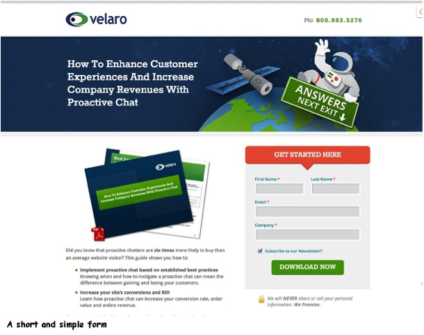
A marketer would want to collect as much data as he can from a visitor. However, with a good landing page, you have to resist this temptation as less is more. One of the most vital aspects of an excellent landing page is short forms. It is extremely important that you make users fill out as few forms as possible. The more tedious you make it for them, the less are the chances of them completing these forms and the less number of conversations. If you absolutely need to make your customers fill the form to complete the conversation then only ask the essentials. Any extra information can also be asked on the thank you page.
Trust Signals or Badges
If you want the audience to instantly connect with your landing page and approve of your business plans, it is a good idea to use some trust signals or badges. Trust signals are nothing but endorsements from some known brands that you have serviced before. There are many ways of using trust signals such as written testimonials. Trust badges are another powerful tool implemented by effective landing pages. These trust badges are mostly logos of the brands that have worked with you in the past. With these trust badges displaying prominently on your page, it is quite easy to relate why customers would give you more preference.
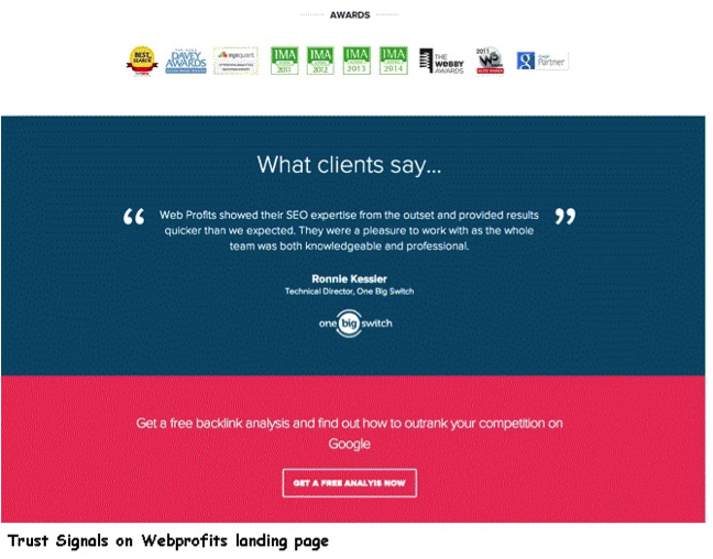
A heading that presents an unbeatable offer
You have only 8 seconds to convince users about your offer and if it’s worth pursuing or not. A heading will decide whether you are able to achieve this goal or not. Make sure you are able to present your offer in clear and concise words. Do not use a font that is too fancy or too simple. Your goal is to make a solid impact and not to win a designing award. The color scheme should match with the rest of the page and not contrast with it.
If you get these design elements right, there is no reason why your landing page wouldn’t be a success! What are your favourite landing page examples?

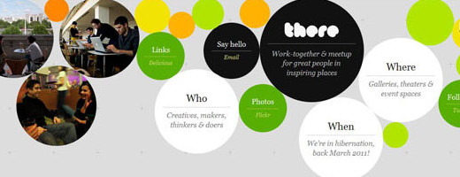


The most important thing in a perfect landing page design is “good call to action” and then content and graphics because the ultimate purpose of designing a landing page is to get sale. However you mentioned points are very helpful for designers to create something extra ordinary in landing page designing.