A logo is forever: Dos and don’ts for your brand’s logo design
0Apple. Nike. Coca-Cola. Adidas. Mercedes Benz.
The chances are that you can recall the logo of all of the above brands. As per Creativebloq, over 90 percent of the global population can successfully recognize the Coca-Cola logo.
The logo of your brand is more than just a mere symbol consisting of text, color, shape, and letters. Instead, it is the representative of the brand. In most cases, it is the first thing that the target audience gets exposes to, and hence, recognizes.
If done correctly, it helps in boosting brand awareness and recognition. While at it, it also relays the brand message across. Additionally, a logo lives forever. Once you establish recognition, you can’t drastically change your logo. If you do, you might end up losing the brand equity you have strived so hard to build.
Considering how vital a logo is for a brand and how timeless it usually is, it is imperative to get it right.

Dos for your brand’s logo design
Here are things you must do when creating a professional logo design.
1. Research and define your target audience
At the end of the day, a brand should serve one ultimate purpose- satisfying and converting the target audience into customers. You will be surprised, but the same theory holds for your branding efforts too.
If a given logo fails to impress your audience, it is of no use. Hence, begin by clearly identifying the demographics and behavior of your target audience. Then research what they like.
For starters, according to Zuza, 33 percent of the top 100 brands of the world use the color blue. But this is not enough of an insight for you to opt for a blue-colored logo.
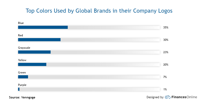 Source: Financesonline.com
Do some research and hold focus groups to understand their tastes. For instance, while teenagers might prefer a vibrant and timely logo, young adults might not want the same.
2. Keep it simple
One thing you will notice about the brand logos of iconic companies is that they are all simple and short. This is because all successful companies follow the K.I.S.S rule when designing anything. In other words, you must keep it short and simple.
Why should a logo be simple and straightforward?
Well, firstly, simple logos are easier for the target audience to remember. According to research, it already takes at least five impressions before a customer remembers a logo. You don’t want to further increase the required exposure!
Moreover, simple logos translate well into bigger and smaller dimensions without losing their meaning. For example, something complex with intricate design might look beautiful on a billboard, but on a small flyer, it will lose its complexities.
Lastly, simple and clear logos are able to stand the test of time. Regardless of how many years pass, the swoosh of Nike will always remind the masses about the brand. The brand power of such brands is so powerful that many are now letting go of their logos for certain campaigns, yet brand recognition remains intact.
This is the type of effect a thriving brand should try to achieve.
3. Be unique and meaningful
There are millions of businesses in the world. Even if you restrict yourself to one sector, the chances are that there are a handful of companies competing for a share of the mind of the consumer.
Here, it is essential to stand out from the competition. And this is a collective effort. To stand out, you must have a unique value proposition and make equally unique branding efforts.
When it comes to logo design, create something that has never been designed before. Don’t merely copy other industry players. Also, make sure that your logo is meaningful to your brand and relays the brand message.
All the great brands do so!
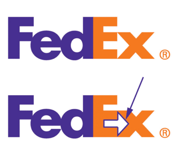 Source: Pixellogo.com
As per CNBC, FedEx has an arrow hidden between the letters ‘E’ and ‘X.’ This signifies the acceleration and speed of the delivery.
In Tostitos, the two small t’s are made to look like people that are dipping a chip into a salsa bowl placed on the letter ‘I”.
Set apart your business by creating a logo that is one-of-a-kind and relevant to your story. Taking inspiration from others is not wrong. But merely take inspiration from their technique rather than the final product.
4. Choose colors and font carefully
Did you know there is a psychology behind colors? Different colors of the spectrum end up evoking mixed emotions and feelings in people. For instance, red illustrates urgency while purple showcases royalty.
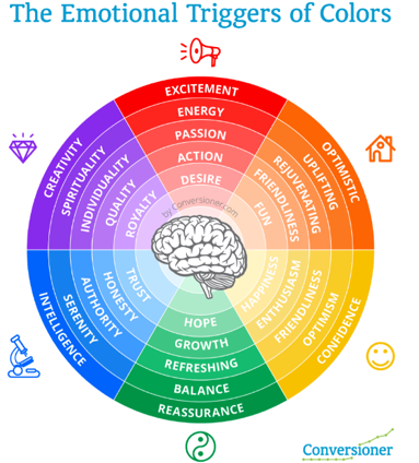 Source: Review42.com
Your logo needs to evoke the right emotions. But what is categorized as the right emotions? Well, this depends on your positioning and value proposition. Think about your brand persona. What is it that you want the masses to feel when interacting with your brand? Then choose a color that best evokes the desired feelings.
The same level of consideration needs to go to the task of choosing the font of the logo. Just like colors evoke emotions, each font signifies a distinct character. Some make a brand look bold, while others make them look informal and imperfect.
Select a font that resonates with your brand personality.
Don’ts for your brand’s logo design
Just as it is important to know what to do when designing your logo, you must also know what to avoid. Here are things you must never do when designing your brand logo.
1. Follow logo trends
Trends and fads should never be the reason you design your logo in a certain way. For instance, let’s say a given design element is prevalent right now. You design your logo based on it. A year later, the trend is no longer significant. And now, you are stuck with an outdated logo.
Also, since the trend is something that the masses follow, incorporating it in your logo design contradicts the logo’s ability to be unique.
Hence, whether it be in terms of standing out or timelessness, following yearly trends are never a good idea in the world of logos.
2. Change your logo every other year
Every brand works hard to build brand equity. It takes quite a several exposures for people to associate a given symbol with a brand. It then takes even more effort for people to associate positive feelings and emotions with the symbol.
If you choose to change your logo, above the threshold of noticeability, all your efforts will go down the drain. Suddenly, your consumers won’t recognize your brand communications when they see your marketing efforts.
 Source: Canny-creative.com
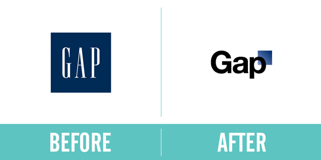
Something similar happened with Gap, whose logo change was met with such negative response that the company had no choice but to revert back to its previous logo. Learn from the mistakes of your predecessors, and never change your logo on a yearly basis.
3. Be literal
Imagine the logo of McDonald’s. Do you see the mention of fast food anywhere? Yet, anytime the M appears in front of people, they are promptly able to identify the logo as belonging to the food chain.
A creative logo is never too literal. Just because you are a restaurant doesn’t mean you have to show the imagery of a table and chef. Such designing mistakes can end up limiting your business.
Never limit yourself. You don’t know when in the future you might change your business model. For example, Amazon started off selling just books. Now, it is the largest Ecommerce platform there is. Imagine if the company had designed a logo that featured books. How outdated it would have seemed today!
4. Overdo it
Whether it be simplicity or complexity, anything that goes over the board can never have a lasting impact on the target audience. Learn the art of balancing when designing your logo.
So, don’t make it so minimalistic that it doesn’t have a meaning, to begin with. At the same time, don’t make it so complicated that the target audience begins having difficulty in remembering and recognizing your brand.
Do your research about the logos of top companies. Draw insights from their learnings.
Begin designing
All in all, logo designing is not intricate if you follow the right steps.
Begin by researching your target audience. Create a brand personality and story of your business and decide on a positioning. Then combine your insights with the law of colors and fonts to pick the perfect theme for your logo. Keep it simple yet meaningful.
Avoid copying famous brands and trends. Don’t get too literal with your logo, and don’t be extreme.
By following these simple steps, you are now ready with a logo that is meaningful, memorable, and immortal.
Now, your brand building work has officially begun. That’s right! Logo designing is just the start. You must follow it by effective marketing campaigns and a high-quality product to truly leave a mark in your sector.
Do you think there are other things you should avoid when designing a brand logo? Let us know below!


