How to deal with images and videos in a responsive website
4Introduction
Responsive web design is the development approach that creates a single design using a flexible grid that allows websites to shrink or grow depending on the size of the device they are being accessed with. Mobile internet users are expected to grow from 800 million to 1.9 billion by 2015, which means businesses that do not optimize their websites for tablets and smartphones will give many of their customers a poor experience. See 6 tips for a corporate responsive design here.
But despite all the opportunities it presents, responsive web design also comes with a host of complications. The rest of this article will seek to address issues relating to making media elements responsive, such as images and videos. The objective is to help you make a website that loads seamlessly on your customers’ hand-held devices to enhance their user experience.
Images in Responsive Web Design
We will start with responsive images. The issue with images on responsive websites is more or less the same as what developers face with navigation. As newer mobile devices are invented with higher pixel densities, the challenge is to keep each aspect of your website (especially images) as flexible as possible and to ensure that images on high-density pixel devices don’t appear blurry.
Problems with images
There is no standard for publishing images in responsive devices. Also, there is a plethora of script options to choose from to tackle this issue. Some problems include:
- Presenting images on a retina mobile and a 3G connection. Should the images be optimized in such a way that the file size reduces when low connection speeds are detected?
- The problem of ‘Art Direction’, i.e. it is not sufficient that you project the same image on various resolutions, but that each user should be able to see the optimal version for their screen width. It is more difficult to see details in a smaller image. Because of that, it may be necessary to edit or crop images for devices with smaller screens.
A solution was proposed that developers should place all variations of the image on the page, and set some CSS classes and media queries that would hide images too large for the screen and only download the one with the perfect pixel density. However, the browsers actually preload all of the images before CSS classes can be processed. This means that all images will be loaded together, making the website ‘heavier’ and the loading time even longer.
Possible Solutions for images
Before moving on, let it be clear that the perfect code or software that optimizes images for each screen doesn’t exist. What we can do instead is explore the most viable options we have, and experiment our way to near accuracy. The following is a list of possible solutions for responsive image issues:
If you are starting a new responsive website but have no clue as to how to do, you should definitely try out the Bootstrap CSS framework. It’s easy to implement. But more importantly, Bootstrap offers styles and extensible classes for fundamental HTML elements like images as well as methods to make page elements like images responsive easily.
This is a framework that helps you “crop” images and control the focus on its focal point. The technique only employs CSS and the developer simply adds the classes in the element that contains the image.
Note: Focal Point uses the hidden value for the CSS overflow property. CSS properties are responsible for the sizing, positioning, and behavior of all the elements on a web page. These elements resemble a rectangular box. The hidden property (overflow: hidden) removes any content that extends beyond the box from view. This will help you to achieve a dynamic layout, but the hidden content cannot be accessed. Also, the loading time remains the same.
If loading time is your primary consideration (and it should be), then you can also make use of CSS Sprites, especially if you are catering to user devices with retina displays. To optimize pictures for high-resolution screens, a way to reference a high-resolution image (such as an image for Apple Retina displays) is to add a larger image asset within a specific media query. This multiplies the amount of files, and can also increase the amount of selectors and file references in your CSS. By using a CSS Sprite, you only need to override the link to image asset sprite file for all the selectors that include high-resolution assets. Another advantage of using CSS sprites is that only one HTTP request is made to retrieve several images. CSS sprites are not suitable for images like photo’s that are added through the <img /> tag but can help greatly for site-wide images like icons in your header and footer.
This is another resource that automatically rescales HTML-embedded pictures on you website by detecting the screen size of the device on which the website is accessed. This is mostly a server-side solution. You need some JavaScript to run it, but it is mostly dependent on the Apache 2 Web server, PHP 5.x, and the GD library.
The best part is that Adaptive Images doesn’t require mark-up changes. Many people would have perceived that a markup-based solution would be the best one. However, a solution like Adaptive Images that does not touch your website’s markup is much easier to combine with the output of CMS’es like WordPress!
To install Adaptive Images on your Web server, you will have to alter or add an .htaccess file. In addition, you will have to upload a PHP file to your website’s root directory, and add JavaScript to your pages. Once that is done, you are good to go. The PHP script will intercept any request for an picture and will resize it on the fly as needed to your specified breakpoint sizes. These will be served on each web page automatically.
Plug-ins for responsive images in a WordPress website
Other solutions in the form of plug-ins are available for WordPress websites. The following responsive image plug-ins work the same as the <picture> element:
On a side note, several responsive themes can also be found on the usual WordPress theme websites.
Final Thoughts about images
Once again, do remember that all these viable solutions that you use to tweak images for smaller devices all have their limitations. For instance, when we talk about Adaptive Images, it requires the combination of Apache and PHP. Hence, it might not fall in line with your website’s platform or be available on your host’s server. In addition, Adaptive Images relies on your server’s ability to intercept any requests for images though the .htaccess file. This means that if your pictures are hosted on a content delivery network or any place other than your server, the script won’t work. Other issues include the fact that Adaptive Images doesn’t detect bandwidth, so it is not ideal if you are targeting 3G users. Most importantly, it doesn’t solve the art direction problem discussed above; it only rescales the original images.
The bottom line is that you need to experiment and pick out the one that suites you best.
Videos in Responsive Web Design
Videos are without a doubt important marketing tools for any websites. Hence, there is a growing need to incorporate elastic, responsive videos.
Just like images, it also a headache to scale videos and make them responsive. And it is not about the size of the video player, but even elements like the ‘Play’ button need to be optimized for a variety of devices. Here are a couple of solutions to make your movies responsive:
Optimizing Videos for WordPress
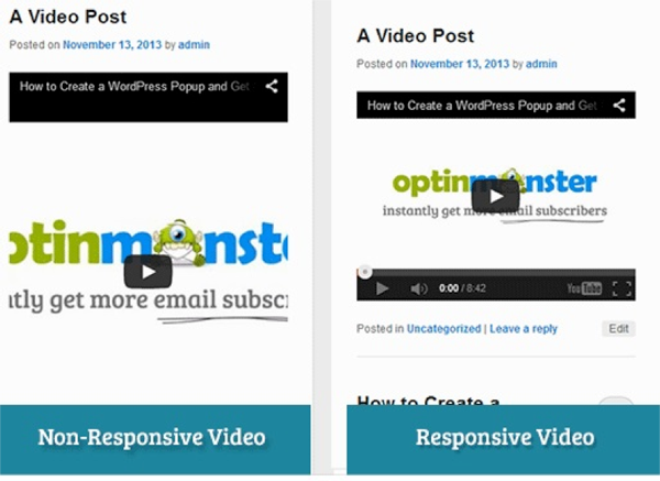
While WordPress offers many themes for responsive websites, embedded videos on these sites are by default not responsive. That is why on smaller screens, they appeared stretched and disproportionate. A great plug-in to fix this problem is FitVids. This is a jQuery plugin that enables you to make embedded videos responsive. After activating the plugin, go to Activate, followed by FitVids. Enter a CSS selector class here, and WordPress will automatically add ‘.post’ class to your publish content. After you save the changes, try to preview the video on as many screen sizes as you can to see how it works.
Here are some more plug-ins that will help you with responsive videos on WordPress websites:
Embedding Movies from Other Websites manually
YouTube and other similar video hosting sites usually include a fixed width and height in pixels as part of the embed code. For normal websites, this is not a problem, but you can’t scale such videos in a responsive layout. Using the HTML5 video element is not possible when handling default video embed code that uses iframes and objects tags. In simple terms, using the HTML5 video element will not work for video found on most video sharing sites like YouTube and Vimeo.
A way out, once again, is CSS. Specifically, you can preserve the intrinsic ratio of the video even as its container element scales down. This technique can help you embed videos from popular websites like YouTube, Vimeo, and SlideShare. You will achieve this by embedding the code with a <div> container and specify the child elements with absolute positions. This will force the embed elements to automatically expand full width.
Note that processes like stripping out video dimensions and adding a wrapper div is not that simple as well. Moreover, these techniques are not viable for websites that have a lot of videos. But if your website is already responsive but you were having issues with movies, this technique works exceptionally well.
This excellent post from DeveloperDrive covers this subject well.
Examples
To conclude this piece, here are some examples of pictures and videos that blended perfectly on a variety of screen resolutions and browsers using the solutions presented in this article:
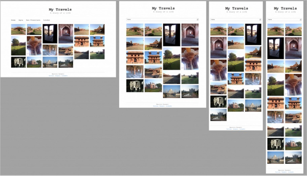
Example 1: Bootstrap and jQuery

This is an example of a minimalistic layout for a blog/portfolio using Twitter bootstrap v2.2.2 and JQuery. The former allows you to utilize a plethora of forms, modal, alert, buttons, and carousels for a responsive layout, and adding jQuery Masonry to the mix enhances the fluid layout with images. The latter allows you to achieve a variety of screen displays (3 columns layout for desktops, 2 columns for tablets, and a single column layout for smartphones).
Example 2: FitVids

This is an example of a YouTube video made responsive for a WordPress framework using FitVids. The benefit of using this plugin is that there is no setup after installation, and it resizes your videos perfectly.
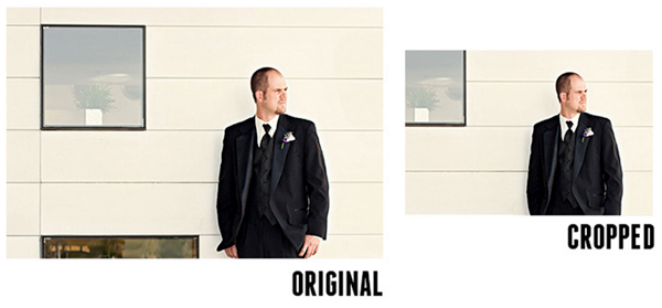
Example 3: Focal Point

This example used Focal Point to remove some of the background scenery and show the person on the photo. Hence, the web developer didn’t provide a scaled down version of the photo, but rather brought the maximum focus on the subject.
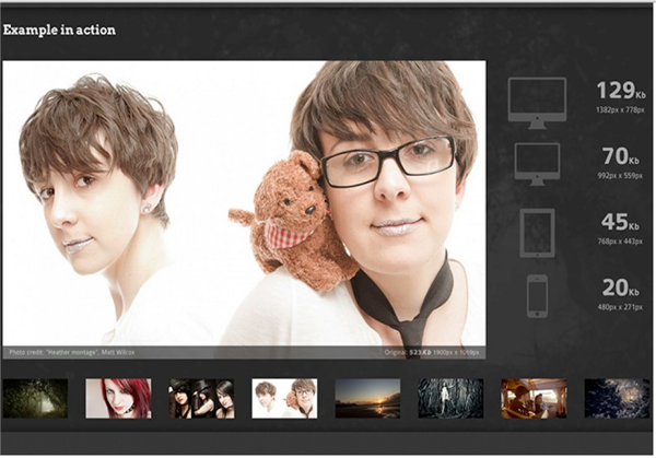
Example 4: Adaptive Images

This final example uses Adaptive Images. Developers used one htaccess file, one PHP file, and a single line of JavaScript. In fact, the htaccess and PHP file can be dragged to your root directory and the JavaScript can be added to the head of your index file. To optimally view this example, you should visit their website.
Hopefully this guide helps you enhance your responsive design to include scalable images and videos. Do you have any other tips or tricks?


Thanks…. !!!
Very interesting. I will follow your tips for the responsive website.
Boostrap and CSS Sprites are highly recommend. Thanks for this article!
Very nice article thanks.
In the event that it is responsive blog, the guests to our site from different gadgets would be feeling solace. The specimen plugins gave in the post is useful for me to post the features responsive.