The Ultimate UX Guide to Improve your Landing Page Conversion Rate
0If you ever wondered why your landing page is not performing, you might be lagging behind the user experience. Landing pages are the most common way to capture new leads or better promote a service or a product.
User experience plays a vital role in ensuring whether your landing pages work or not. Typically you only have a few seconds to convenience the visitor to stay on your page. Bad user experience will make the visitor leave the landing page without any second thoughts.
A good landing page with excellent user experience doesn’t look spammy and also improves conversion rate.
 In this article, we will be listing the 14 UX tips to improve your landing page conversion rate. So, without any delay, let’s get started.
Minimalistic Design
The minimalistic design has caught the designer’s attention in the past few years. With more sites using minimalistic design, it is time for landing pages to adopt minimalism. By using minimalistic design, you will distract the users less and ensure that they have an amazing user experience.
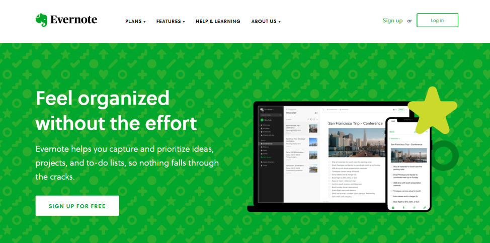
The best example that we can think of is the Evernote main webpage.
 https://evernote.com/
It has organized the content in a very appealing and minimalistic way.
Make Site Purpose Clear
Users do not like to think and that’s why you need to make sure that your site’s purpose remains clear. To make the purpose clear, you need to choose your site’s tagline and logo carefully. Ensure that the tagline does tell about what your site is about.
For example, if you are running a technology site and aimed at developers, then you should mention it directly on indirectly in your tagline. If your tech site is for smartphone users, then do it accordingly. By choosing the tagline carefully, you will help your brand to gain worldwide recognition.
Use Simple Language
As much as the design elements play a crucial role in the user’s experience, so makes the language’s difficulty. A simple language will always win over a complex narrative. People love simple words that are not hard to understand. Also, considering the fact the comprehension level of an average visitor on the web is equal to class eight standard, you need to tone down the use of difficult words.
The languages also mean the use of proper use of symbols. In short, you need to explain the concept in the best possible way.
Think From a User’s Perspective
The landing page that you are creating is going to be used by the end-user. It doesn’t matter what product or service you are trying to sell; you need to think from the user’s perspective. To learn about them, including identifying them properly. After identification, you need to decide on how to convey your message to them. This also means understanding how the service or product will benefit them.
Another big challenge is to find out how a user would react when they are asked to sign up. Lastly, think of ways you can improve the conversations.
Make Onboarding Experience Smooth as Possible
Like brick and mortar shops, your online site will also have visitors who will not stay or make actions(purchases). To improve interaction, your landing page needs to have a proper onboarding solution to ensure that users stay and interact with them.
If you are not sure which steps to take, then you need to test out two onboarding processes and see which one works best for you. This also leads us to our next point, A/B testing.
Do A/B Testing
No landing page is perfect, and you will not know which one is better until you do A/B testing. To bring the best conversion rates for your landing page, you need to do A/B testing. This means running two versions of the landing page(A and B). The one that performs better is the way to go. These tests will also enable you to learn about your audience and other aspects of your landing page including pricing, images, text, web forms, and so on.
Engage With Your Audience
Engagement is as necessary as putting fancy words and style. You can use progression or gamification to engage your audience and make sure that you utilize them in the right proportion. You can use progress, bars, points, or badges. You can also use other forms of media, including videos, audio, and so on.
Form Design
Forms are an integral part of the landing page. And, that’s why you should take special care when designing them. Forms should ask for as little information as possible. It should also be user-friendly. A good form should be trustable. That’s why you should not use bright colors. After submitting the form, the user should be in control of what he is doing and should not be redirected unnecessarily. You can also create A/B testing forms to see which one performs the best.
Powerful CTA
Call-to-action(CTA) is used so that visitors take the desired action that you aim for. If you ever set up a blog, you would know the importance of good CTA as it enables you to get more readers. The same is true for landing pages as it offers you to improve conversion rates. You should create CTAs that are good in both functionally and aesthetically. To ensure that you get the right CTA, you need to experiment a little. Try out different colors, sizes, shapes, and fonts. Once you get the right CTA, you are bound to see a spike in conversion rates.
Mobile Optimization
Mobile optimization is what differentiates a good user experience with a mediocre one. Landing pages that don’t optimize for mobile lose a lot of conversions. This is because more than half of the traffic comes from mobile.
Solve Problems and Provide a Solution
Problem-solving is also an integral part of user experience. The landing page should start with a question and solve it. The messages should be clear, and you should focus on navigation as well.
Table First Design
The last UX tip that we are going to share is the table first design. Tables are easy to read and digest and that’s why you should use tables whenever possible. Tables also function amazingly well on mobiles. For example, if you are selling a service, then you can use a table to showcase its features or the prices associated with each plan.
Say Thanks
People love gratitude and once you show gratitude to a visitor that completed an action, they will feel amazing! If a visitor signs up and gives you his email, you should go a further step and thank him! Most of the sites fail to do so, which can lower down the chances of converting the visitor to a sale.
Keep a Tab on the Site Statistics
Apart from doing A/B testing, you should also need to keep a tab on the site statistics. The most important statistic that you always need to be about is the return on investment(ROI). After all, if you do not make the conversion and have good ROI, then your landing page is not doing the required job! You also need to keep a tab on your landing page’s effectiveness and help you grow your brand.
Creating and managing landing pages is not an easy task. It requires good time and money investment, and that’s why you should keep a tab on it, and improve it whenever possible.
Emotional Design
You can also use emotional design to maximize landing page effectiveness. The landing page’s emotional design refers to the approach where you place key messages at different key positions on your landing page that the user sees first.
By doing so, you can improve the chances of converting the visitor into a subscriber or a customer.
Conclusion
As you can make out from the article, it is important to optimize your landing page from every possible angle. You should write the finest copy that lures the visitors to take action. On top of that, there should be a well-designed onboarding process that converts well. To make sure that your landing page has the best possible engagement and conversion, you need to do proper A/B testing and find out what works best for your audience.
Here, we utilized UX tips that let you improve the landing page conversion rate. So, which UX tip are you going to use in your design? Comment below and let us know. We are listening.


